User:ØverLørd/somebookdesign: Difference between revisions
(even more text added) |
m (even more text) |
||
| Line 4: | Line 4: | ||
<br> | <br> | ||
This publication was made in collaboration with Su, who is a first year student at the Fine Arts department of the PZI. The publication was given to the participants at a performance showcasing SU's practice. It is a collection of photos, text excerpts, as well as a dinner menu (for a dinner that was related to the performance), as well as titles of music pieces performed. | This publication was made in collaboration with Su, who is a first year student at the Fine Arts department of the PZI. The publication was given to the participants at a performance showcasing SU's practice. It is a collection of photos, text excerpts, as well as a dinner menu (for a dinner that was related to the performance), as well as titles of music pieces performed. | ||
<br> | <br><br> | ||
[[File:Research-1.jpg|600px]] | [[File:Research-1.jpg|600px]] | ||
<br style="clear:both;"> | <br style="clear:both;"> | ||
| Line 10: | Line 10: | ||
<br> | <br> | ||
The initial draft for the publication was made based on conversations regarding the artist's practice and the performance. This draft was then revised together with the artist before the design was finalized. the publications were printed using the office-printers and then bound and cut in the publication station. | The initial draft for the publication was made based on conversations regarding the artist's practice and the performance. This draft was then revised together with the artist before the design was finalized. the publications were printed using the office-printers and then bound and cut in the publication station. | ||
<br> | <br><br> | ||
[[File:Research-2.jpg|600px]] | [[File:Research-2.jpg|600px]] | ||
<br style="clear:both;"> | <br style="clear:both;"> | ||
| Line 17: | Line 17: | ||
A challenge in the designing of this publication was that it wanted to contain a lot of different elements: The Songs, The dinner-menu, a lot of excerpts and even more photos. Central to the artists practice are memories, thus the publication takes the form of a scrap-book. In order to room all the images it was important to give them a lot of room. As some wise-person once said "Typography is concerned with designing the white space between text". This way the contents is more free to be in dialogue with itself | A challenge in the designing of this publication was that it wanted to contain a lot of different elements: The Songs, The dinner-menu, a lot of excerpts and even more photos. Central to the artists practice are memories, thus the publication takes the form of a scrap-book. In order to room all the images it was important to give them a lot of room. As some wise-person once said "Typography is concerned with designing the white space between text". This way the contents is more free to be in dialogue with itself | ||
<br> | <br> | ||
==I came in walking backwards== | |||
[[File:Research-3.jpg|600px]] | [[File:Research-3.jpg|600px]] | ||
<br style="clear:both;"> | <br style="clear:both;"> | ||
Revision as of 17:40, 2 April 2024
In my practice I have helped various artists realize their visions of publications and printed matter. Working with these small edition and very situated publications is a great space for exploring, experimenting and interrogating form/content of such matters.
A Thirdhand Anecdote
This publication was made in collaboration with Su, who is a first year student at the Fine Arts department of the PZI. The publication was given to the participants at a performance showcasing SU's practice. It is a collection of photos, text excerpts, as well as a dinner menu (for a dinner that was related to the performance), as well as titles of music pieces performed.

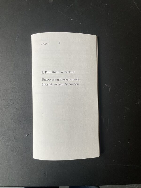
Cover of "A Thirdhand anecdote: Unsorcering Baroque music, Shostakovic and Samulnori"
The initial draft for the publication was made based on conversations regarding the artist's practice and the performance. This draft was then revised together with the artist before the design was finalized. the publications were printed using the office-printers and then bound and cut in the publication station.

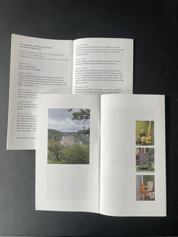
two spreads shocasing the layout of the publication
A challenge in the designing of this publication was that it wanted to contain a lot of different elements: The Songs, The dinner-menu, a lot of excerpts and even more photos. Central to the artists practice are memories, thus the publication takes the form of a scrap-book. In order to room all the images it was important to give them a lot of room. As some wise-person once said "Typography is concerned with designing the white space between text". This way the contents is more free to be in dialogue with itself


