Platform is the Problem: Difference between revisions
(Created page with "==Platform is the Problem== A side publication Riviera and Senka are working on (in preparation for Zine Camp). It's based on a shared dissatisfaction with how social media platforms limit and create behaviour online. <br> '''Pad of the publication''' [https://pad.xpub.nl/p/platform_is_the_problem] ==Brainstorm== * USB with resources * Script of our situation with trying to retrieve a Mixcloud file (limitation of that social media platform) * Podcast zine - owning the i...") |
mNo edit summary |
||
| (12 intermediate revisions by the same user not shown) | |||
| Line 1: | Line 1: | ||
==Platform is the Problem== | ==<span style="font-family: Helvetica; color: white; font-size: 30px; background-image: linear-gradient(180deg, white, black); padding: 5px;">Platform is the Problem</span>== | ||
A side publication Riviera and Senka are working on (in preparation for Zine Camp). It's based on a shared dissatisfaction with how social media platforms limit and create behaviour online. | A side publication Riviera and Senka are working on (in preparation for Zine Camp). It's based on a shared dissatisfaction with how social media platforms limit and create behaviour online. | ||
<br> | <br> | ||
'''Pad of the publication''' [https://pad.xpub.nl/p/platform_is_the_problem] | '''Pad of the publication''' [https://pad.xpub.nl/p/platform_is_the_problem] | ||
==Brainstorm== | ==<span style="font-family: Helvetica; color: white; font-size: 30px; background-image: linear-gradient(180deg, white, blue); padding: 5px;">Brainstorm</span>== | ||
* USB with resources | * USB with resources | ||
* Script of our situation with trying to retrieve a Mixcloud file (limitation of that social media platform) | * Script of our situation with trying to retrieve a Mixcloud file (limitation of that social media platform) | ||
* Podcast zine - owning the infrastructure to publish stuff as an alternative | * Podcast zine - owning the infrastructure to publish stuff as an alternative | ||
* Engraving, lindy effect and the contradictions of engraving the link | * Engraving, lindy effect and the contradictions of engraving the link | ||
[[File:Flowchart mapping- riviera.png|thumb|Flowchart mapping of approaches and content we could include in the publication]] | [[File:Flowchart mapping- riviera.png|thumb|center|800px|Flowchart mapping of approaches and content we could include in the publication]] | ||
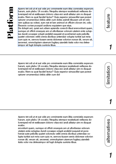
[[File:Design sketch -1.png|thumb|right|Design sketch for Platform is Problem]] | [[File:Design sketch -1.png|thumb|right|400px|Design sketch for Platform is Problem]] | ||
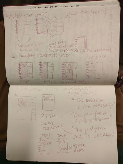
[[File:Sketches of design - senka.jpg|thumb|right|Drawn sketches of the spiral binding and cover]] | [[File:Sketches of design - senka.jpg|thumb|right|400px|Drawn sketches of the spiral binding and cover]] | ||
==Structure== | ==<span style="font-family: Helvetica; color: white; font-size: 30px; background-image: linear-gradient(180deg, white, blue); padding: 5px;">Structure</span>== | ||
* Spiral Binding (we need to find something better than the spirals they offer at the Publication station) | * Spiral Binding (we need to find something better than the spirals they offer at the Publication station) | ||
* Pages cut in three equal sizes that allow for a non-linear reading | * Pages cut in three equal sizes that allow for a non-linear reading | ||
* Three sections of: Feature (description), Implications (that the feature causes), Alternatives or See also (where we offer resources, hacks and possibilities) | * Three sections of: Feature (description), Implications (that the feature causes), Alternatives or See also (where we offer resources, hacks and possibilities) | ||
* Lasercut cover and back (the titles are cut out) | * Lasercut cover and back (the titles are cut out) | ||
* Two way reading (reading from the back is turned upside down) | * Two way reading (reading from the back is turned upside down) <br> | ||
We did not end up implementing this as it made more sense not to. Instead there where mind maps that charted down different keywords and references, which Riviera designed in LibreOffice. | |||
* Navigating elements and titles are turned 90 degrees counter clock-wise | * Navigating elements and titles are turned 90 degrees counter clock-wise | ||
* Use both Weasyprint and CSS to design the publication and the Typesetting software Riviera is familiar with. | * Use both Weasyprint and CSS to design the publication and the Typesetting software (ConTeXt) Riviera is familiar with. | ||
==Resources== | ==<span style="font-family: Helvetica; color: white; font-size: 30px; background-image: linear-gradient(180deg, white, blue); padding: 5px;">Resources</span>== | ||
* Counter Cloud Action Strike (March) [https://varia.zone/8m/] | * Counter Cloud Action Strike (March) [https://varia.zone/8m/] | ||
* Sad by Design by Geert Lovink [https://networkcultures.org/blog/publication/sad-by-design-geert-lovink/] | * Sad by Design by Geert Lovink [https://networkcultures.org/blog/publication/sad-by-design-geert-lovink/] | ||
* Lindy Effect [https://en.wikipedia.org/wiki/Lindy_effect] | * Lindy Effect [https://en.wikipedia.org/wiki/Lindy_effect] | ||
==List of Platforms== | ==<span style="font-family: Helvetica; color: white; font-size: 30px; background-image: linear-gradient(180deg, white, blue); padding: 5px;">List of Platforms</span>== | ||
#Chatting: | #Chatting: | ||
*Whatsapp | *Whatsapp | ||
| Line 68: | Line 69: | ||
*Slack | *Slack | ||
*Teams | *Teams | ||
==<span style="font-family: Helvetica; color: white; font-size: 30px; background-image: linear-gradient(180deg, white, blue); padding: 5px;">List of Features</span>== | |||
# Downloadability - not being able to download (just stream) - the ability to store and transmit | |||
# Private messaging - lack of inter-user communication | |||
# Group messaging - or lack of communication between groups - the ability to communicate to others | |||
# Direct responses | |||
# Circulation - reposting/ resharing/ reblogging - the ability to share/redistribute content | |||
# Reaction - liking/ heart-ing/ commenting - the ability to interact with the content - emojis and ___ | |||
# Data Management - how the data is stored | |||
# Deplatforming - Getting banned (User restrictions/regulations - When is someone banned or deplatformed) | |||
# Doomscrolling | |||
# ___- Who has access to the platform? Why and why not? (eg. politician not being able to join whatsapp) | |||
# Anonymity (Do you need an account to use it? Can you have a different name?) | |||
# Exclusivity - Exclusive content (a platform only shares this content and has the rights to it) | |||
# ___ - big data culture of apps with multiple separate databases (the same contacts for instance) | |||
# Privacy policy? - terms and conditions app | |||
# Ads - (and the ability to bypass them) | |||
# Use of your data ? - Access to location, gallery images, camera, microphone etc | |||
# Linking - (Instagram didn't allow for links outside of the platform for longest time) | |||
# Embedding - (embeddability into other websites platforms etc) | |||
# Payment systems - (can you provide mutual aid/ money in app) | |||
# Automatic screening of content that might be considered sensitive | |||
# Asking for verification of age (id etc) to view potentially sensitive content | |||
# Verification - (checking the truthfulness of news, sources etc) | |||
# Clickbate | |||
# Memes/ Memeability - does the platform support memes? and if it does, which? | |||
# Monetary perks - | |||
# Following | |||
# Blocking features (Can you reverse a new update?) | |||
# Blocking content and people | |||
# Publicness of posts | |||
# Curating content | |||
# Tags/Tagging - Implies a way of filtering and searching for content | |||
# Customization of profile (visually) | |||
# Profitability - Can you earn money on the platform? | |||
==<span style="font-family: Helvetica; color: white; font-size: 30px; background-image: linear-gradient(180deg, white, blue); padding: 5px;">Writing entries</span>== | |||
We wrote down a list of platform features to describe and bring closer to the reader. I wrote the odd numbers and Riviera the even ones. For me the writing tone was a bit inspired by Clara Balaguer's and Aymeric Mansoux's writing for "Can you Hear me? For the Record", I wanted it to be critical yet humorous and with a sharp focus, without beating around the bush. | |||
Later on we both took turn in copy editing and proof reading the writing. | |||
==<span style="font-family: Helvetica; color: white; font-size: 30px; background-image: linear-gradient(180deg, white, blue); padding: 5px;">Prototype</span>== | |||
Spiral binding with pages cut in three makes the publication quite flimsy and delicate. The sequence of actions I took to make the dummy/prototype were: | |||
* Cut in three | |||
* Punchole | |||
* Insert spiral | |||
The paper used for the body of the book was scavenged from the streets near my house. It included many piles of different recycled and regular paper. The tricky part about working with this kind of paper is that you have to estimate what the weight is and well as if the paper is the right size. The different shades and structure of the paper made it easier to spot that you are actually sifting through different pages. Blank paper for the dummy version was added without content as well, so that we could see the full thickness the publication will have. | |||
<gallery mode=packed heights=300px> | |||
File:Prototype-PITP.jpg | |||
File:Prototype-just paper.jpg | |||
</gallery> | |||
==<span style="font-family: Helvetica; color: white; font-size: 30px; background-image: linear-gradient(180deg, white, blue); padding: 5px;">Lasercut Cover</span>== | |||
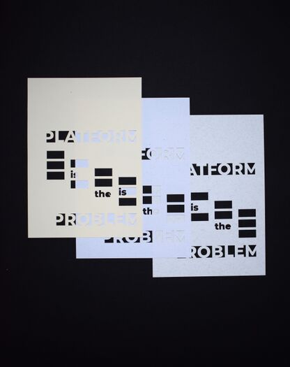
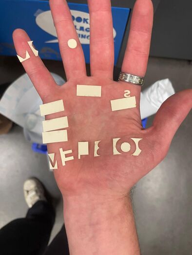
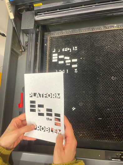
Victor was working on the cover for the publication. His idea was to play with windows/tabs of platforms. We went to lasercut it together, so I can show how the machine works. | |||
<gallery mode=packed heights=350px style="text-align:left"> | |||
File:Lasercut-this.jpg|Lasercutted cover tryouts with different paper | |||
File:Victor photo.jpg|Victor hand with lasercutted letters. Photo taken by Victor. | |||
File:Victor photo -1.jpg|Lasercut cover process. Photo taken by Victor. | |||
</gallery> | |||
==<span style="font-family: Helvetica; color: white; font-size: 30px; background-image: linear-gradient(180deg, white, blue); padding: 5px;">Instructions for assembling the ''Platform is the Problem'' publication</span>== | |||
[[File:Riviera photo-2.jpg|thumb|left|Page cutting machine demonstration. Photo taken by Riviera.]] | |||
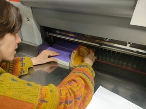
Since Senka had work during the final production of the publication but was also the person who was the most familiar with the machines and binding types, Senka wrote a little instruction manual for Riviera and Victor. The minuses (-) were used for things we had already executed and the pluses (+) for things that were still to be done. <br> | |||
<br> | |||
'''Steps:''' | |||
{| width=65% align=none | |||
|<pre style="border:1px solid black; background:#B4C5FF; color:black;"> | |||
- Print pdf | |||
- Cut to A5 using the cutting machine in the Publication station: Print Studio | |||
- Lasercut the cover | |||
+ Cut the A5 pages (excluding the page for the introduction and colophon) in 3 equal portions vertically | |||
+ Assemble each publication separately and clip it for stability. Make sure that the 3 page sections are aligned properly and that the clip covers grips 2 sections at the same time (for firmness) | |||
+ Go to the whole puncher and turn it on, try it out without changing anything on a test piece of paper (eg on A4 on the shorter side). Once you have seen where does the whole puncher cut the page, take out the part of the machine that has the punchers and remove the number that's causing the problem. Then test again. Make sure that the hole will not be cutting into the page, if this happens try to align it so that it cuts the page only slightly. If you need help ask Cristobal (man with long hair in a bun) | |||
+ Now go to ask for a spine-black one. Consult with them which size is best | |||
+ Use the machine for binding the spine very carefully. It can crush the spiral easily. Put it on a small setting first. | |||
Manually adjust if there are any inconsistencies | |||
+ Pat yourself on the back, you just produced a publication in 2 weeks. | |||
</pre> | |||
|} | |||
<br><br><br> | |||
==<span style="font-family: Helvetica; color: white; font-size: 30px; background-image: linear-gradient(180deg, white, blue); padding: 5px;">Final Version</span>== | |||
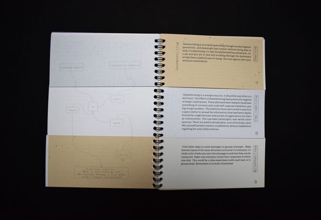
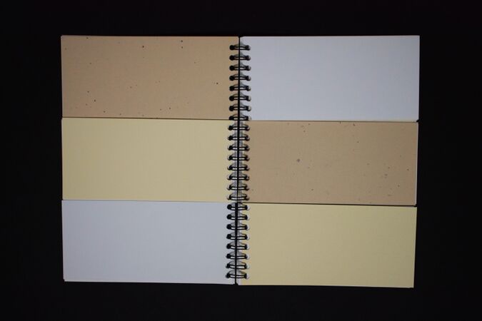
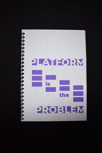
We decided to have contrasting paper, so that the lasercut cover stands out. We produced 10 zines in total. | |||
[[File:Cover final.jpg|thumb|left|350px|Cover final design]] | |||
[[File:Final intro and pages.jpg|thumb|right|530px|Final look of the intro and pages]] | |||
[[File:Detail - PITP.jpg|thumb|left|440px]] | |||
[[File:Final pages.jpg|thumb|right|440px|Final look of the spread]] | |||
Latest revision as of 09:41, 31 March 2024
Platform is the Problem
A side publication Riviera and Senka are working on (in preparation for Zine Camp). It's based on a shared dissatisfaction with how social media platforms limit and create behaviour online.
Pad of the publication [1]
Brainstorm
- USB with resources
- Script of our situation with trying to retrieve a Mixcloud file (limitation of that social media platform)
- Podcast zine - owning the infrastructure to publish stuff as an alternative
- Engraving, lindy effect and the contradictions of engraving the link
Structure
- Spiral Binding (we need to find something better than the spirals they offer at the Publication station)
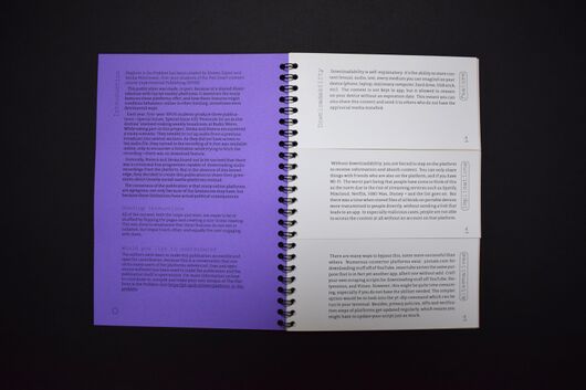
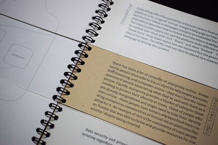
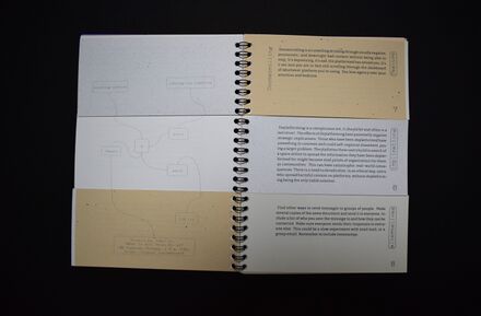
- Pages cut in three equal sizes that allow for a non-linear reading
- Three sections of: Feature (description), Implications (that the feature causes), Alternatives or See also (where we offer resources, hacks and possibilities)
- Lasercut cover and back (the titles are cut out)
- Two way reading (reading from the back is turned upside down)
We did not end up implementing this as it made more sense not to. Instead there where mind maps that charted down different keywords and references, which Riviera designed in LibreOffice.
- Navigating elements and titles are turned 90 degrees counter clock-wise
- Use both Weasyprint and CSS to design the publication and the Typesetting software (ConTeXt) Riviera is familiar with.
Resources
List of Platforms
- Chatting:
- Messenger
- Telegram
- Signal
- Omegle
- Snapchat
- BeReal
- Viber
- Kik
- Content Sharing:
- Flickr
- Youtube
- Dailymotion
- Vimeo
- Tumblr
- Tik Tok
- X (Twitter)
- Streaming:
- Twitch
- Netflix
- HBO Max
- Disney +
- Spotify
- Mixcloud
- YouTube Music
- Fediverse
- Mastodon
- Forums
- 4Chan
- ?
- Discord
- Zulip
- Slack
- Teams
List of Features
- Downloadability - not being able to download (just stream) - the ability to store and transmit
- Private messaging - lack of inter-user communication
- Group messaging - or lack of communication between groups - the ability to communicate to others
- Direct responses
- Circulation - reposting/ resharing/ reblogging - the ability to share/redistribute content
- Reaction - liking/ heart-ing/ commenting - the ability to interact with the content - emojis and ___
- Data Management - how the data is stored
- Deplatforming - Getting banned (User restrictions/regulations - When is someone banned or deplatformed)
- Doomscrolling
- ___- Who has access to the platform? Why and why not? (eg. politician not being able to join whatsapp)
- Anonymity (Do you need an account to use it? Can you have a different name?)
- Exclusivity - Exclusive content (a platform only shares this content and has the rights to it)
- ___ - big data culture of apps with multiple separate databases (the same contacts for instance)
- Privacy policy? - terms and conditions app
- Ads - (and the ability to bypass them)
- Use of your data ? - Access to location, gallery images, camera, microphone etc
- Linking - (Instagram didn't allow for links outside of the platform for longest time)
- Embedding - (embeddability into other websites platforms etc)
- Payment systems - (can you provide mutual aid/ money in app)
- Automatic screening of content that might be considered sensitive
- Asking for verification of age (id etc) to view potentially sensitive content
- Verification - (checking the truthfulness of news, sources etc)
- Clickbate
- Memes/ Memeability - does the platform support memes? and if it does, which?
- Monetary perks -
- Following
- Blocking features (Can you reverse a new update?)
- Blocking content and people
- Publicness of posts
- Curating content
- Tags/Tagging - Implies a way of filtering and searching for content
- Customization of profile (visually)
- Profitability - Can you earn money on the platform?
Writing entries
We wrote down a list of platform features to describe and bring closer to the reader. I wrote the odd numbers and Riviera the even ones. For me the writing tone was a bit inspired by Clara Balaguer's and Aymeric Mansoux's writing for "Can you Hear me? For the Record", I wanted it to be critical yet humorous and with a sharp focus, without beating around the bush. Later on we both took turn in copy editing and proof reading the writing.
Prototype
Spiral binding with pages cut in three makes the publication quite flimsy and delicate. The sequence of actions I took to make the dummy/prototype were:
- Cut in three
- Punchole
- Insert spiral
The paper used for the body of the book was scavenged from the streets near my house. It included many piles of different recycled and regular paper. The tricky part about working with this kind of paper is that you have to estimate what the weight is and well as if the paper is the right size. The different shades and structure of the paper made it easier to spot that you are actually sifting through different pages. Blank paper for the dummy version was added without content as well, so that we could see the full thickness the publication will have.
Lasercut Cover
Victor was working on the cover for the publication. His idea was to play with windows/tabs of platforms. We went to lasercut it together, so I can show how the machine works.
Instructions for assembling the Platform is the Problem publication
Since Senka had work during the final production of the publication but was also the person who was the most familiar with the machines and binding types, Senka wrote a little instruction manual for Riviera and Victor. The minuses (-) were used for things we had already executed and the pluses (+) for things that were still to be done.
Steps:
- Print pdf
- Cut to A5 using the cutting machine in the Publication station: Print Studio
- Lasercut the cover
    + Cut the A5 pages (excluding the page for the introduction and colophon) in 3 equal portions vertically
    + Assemble each publication separately and clip it for stability. Make sure that the 3 page sections are aligned properly and that the clip covers grips 2 sections at the same time (for firmness)
    + Go to the whole puncher and turn it on, try it out without changing anything on a test piece of paper (eg on A4 on the shorter side). Once you have seen where does the whole puncher cut the page, take out the part of the machine that has the punchers and remove the number that's causing the problem. Then test again. Make sure that the hole will not be cutting into the page, if this happens try to align it so that it cuts the page only slightly. If you need help ask Cristobal (man with long hair in a bun)
    + Now go to ask for a spine-black one. Consult with them which size is best
    + Use the machine for binding the spine very carefully. It can crush the spiral easily. Put it on a small setting first.
         Manually adjust if there are any inconsistencies
                        + Pat yourself on the back, you just produced a publication in 2 weeks.
|
Final Version
We decided to have contrasting paper, so that the lasercut cover stands out. We produced 10 zines in total.


