1or2images: Difference between revisions
No edit summary |
No edit summary |
||
| (30 intermediate revisions by the same user not shown) | |||
| Line 1: | Line 1: | ||
(in progress) | |||
=== ''1 or 2 images (some notes on)'' === | |||
brief synopsis-description: | |||
a visual comparison between two seemingly completely different images - a painting by mark rothko and google earth's imagery around north sentinel island | |||
first outcome of my NS island research project | |||
==== process/progress ==== | |||
how i got there (notes) | |||
- | |||
the google earth imagery was one of the first materials i gathered when i started my research on ns island. at first my attention was all centered on the island itself. i was somehow obsessed in trying to get every image i could find of it, as if by doing so i could somehow grasp its essence, its meaning, or something like that | |||
of course one of the first thing i did was looking for the island in google earth, scanning it from above, trying to get as close as i could. while doing so, in my scanning all over and zooming in and out i discovered something that i was not expecting and that caught my eye. | |||
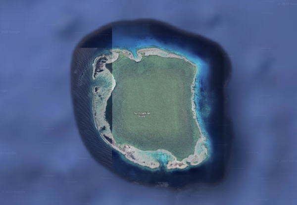
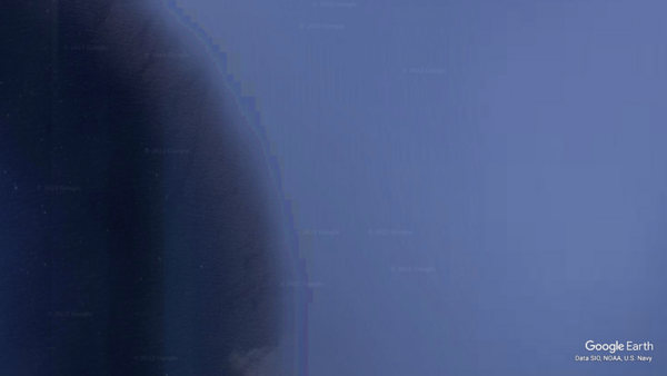
i noticed that google earth has satellite-pictured/mapped the island’s surrounding ocean only up to a certain radius. at a certain - quite regular - distance from the island’s shores, the satellite imagery abruptly ends, and the surrounding ocean is left un-mapped/un-pictured in a blank, solid, generic blue color, meaning by all odds that it has no interest in mapping it out. only the island, and its immediate surrounding is considered worth of representation, and in fact it is fully covered by google’s satellite imagery. | |||
what i found intuitively interesting is what happens at the border, along the treshold/edge between the unmapped-unrepresented and the mapped-represented. in fact, all around the island, there is a line that divides the solid blue from the satellite imagery of the ocean. it is not precisely a line, but more of a circular strip of clustered pixels, jerkily fading from solid abstract blue to ocean’s aerial imagery. it’s a barrier, a treshold between the not-worth-being-represented and the worth-of-being-represented, between the non-interest and the interest, between non image and image. a glitched gradient between what is in and what is (left) out of google's gaze. | |||
i guess this happens around every other island that google earth has mapped - at a sufficient distance from the mainland - but i felt this was particularly interesting in regards to this specific island - its status as an unknown, mysterious, inaccessible place, at the same time scary and captivating, whose images are impossible. | |||
i started thinking of this edge as a sort of symbolic-metaphorical statement for the development of my interest towards this island and my intention of making a film around it - quite literally in this case | |||
this strip of blueish pixels seems to bear the essential meaning of the case of north sentinel island. what is at stake seems to be the clash between the effort, attempt, desire, possibility to know and control through images and the island’s struggle to resist this attack | |||
the superimposition of a grid-shaped gaze that controls through images. | |||
another interesting thing in these satellite imagery are google trademarks arranged in a regular - square? - pattern all upon the island and the surrounding ocean. again, this superimposition of pattern, knowledge, detectability, control, measurement. | |||
instead of scanning the island from above, as i was thinking to do before, i resolved to start by scanning this line, going around the island without showing it. suggesting there’s something in the middle, but focusing on the treshold between representing and not representing. | |||
[[File:Screen Shot 2022-11-16 at 20.32.31.png|left|frameless|600x600px]] | |||
[[File:Screen Shot 2022-12-06 at 08.40.33.png|frameless|600x600px]] | |||
- | |||
the rothko painting came out during a monday afternoon tutorial with david, beginning of december 2022. | |||
i was showing him the visual materials that i had been gathering as part of my ns island project and talking about how i felt the focus of the project was shifting from the island itself to the point of view of those - us? - who strived to "make knowledge/sense" by capturing it in images and producing discourse around it. old maps, satellite imagery, ethnographic documentations, but also videogames, podcast, youtube livestreams, fictional short films and novels. the mixed feeling of attraction/fear, the need, the desire, the tension for/towards such an unknown, mysterious, indefinite place. a necessary counterweight? (deleuze's text on desert islands) | |||
i was also already - and still am - gathering imagery that despite being unrelated to the island itself, reminded me of it, brought my mind to it. | |||
a coffee spot on my studio desk that looked terrifically similar to the island's shape in those old maps that i had been downloading and zooming in and copping the whole day. | |||
a dark shade in the background of caspar friedrich's monk by the sea that could have well been the island. | |||
and so on. | |||
we were observing and speculating about the google earth edge around the island, and David suggested me to look for "rothko blue painting" as that edge and those colours reminded him of some of rothko's abstract expressionist pieces | |||
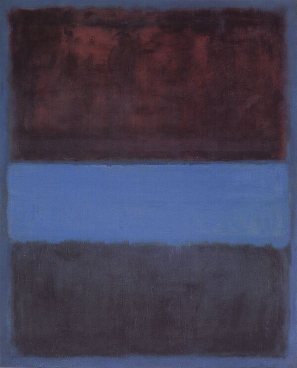
we stumbled upon ''No. 61 (Rust and Blue)'' | |||
[[File:8ebda6e0bb49645cf3615b62aa1fecaa.jpg|frameless|742x742px]] | |||
we started discussing the possible relation between these two images. so different yet, maybe, so similar. | |||
one seemingly fully realistic, transparent, the other fully abstract and opaque, one made anonymously, automatically by google satellites, the other made by the hands and eyes of the most famous painter of the xx century | |||
but both of these two images feature edges as key elements in their composition | |||
edges as unstable, liminal, see-through, more-than-two-dimensional borders between surfaces, as places of clash, friction, chromatic cross contamination. | |||
what if these edges are gateways to finding answers to the same questions? what if these two images come from the same, shared need of mankind to make sense, make meaning of the world through images, by making images of it? | |||
- | |||
i then decided to use these two images and their speculative comparison as the subject for my EYE film project | |||
i first tried to get in touch with moca in la - the museum where the painting is exhibited - and rothko collection to get a high resolution photographic copy of the painting. managed to get a positiv e reply but they set way too restricting limits to the use of the image. | |||
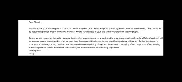
''"Dear Claudio,'' | |||
''We appreciate your reaching out in order to obtain an image of CR# 492 No. 61 (Rust and Blue) [Brown Blue, Brown on Blue], 1953. While we do not usually provide images of Rothko artworks, we are sympathetic to your use within your graduate degree project.'' | |||
''Before we can release an image to you, as with any other usage request we would need to know more specifics about how Rothko’s artwork will be featured in your project, and in what context. Also the use would be limited to your specific project only without any further distribution or broadcast of the image in any medium, also there can be no overprinting of text onto the artwork or cropping of the image area of the painting. If this is agreeable, please let us know more about your intentions once you are ready to proceed.'' | |||
''Best regards,'' | |||
''Henry"'' | |||
[[File:Untitledqfw2g .jpg|frameless|600x600px]] | |||
basically everything I intended to do with the image was prohibited. fuck it. | |||
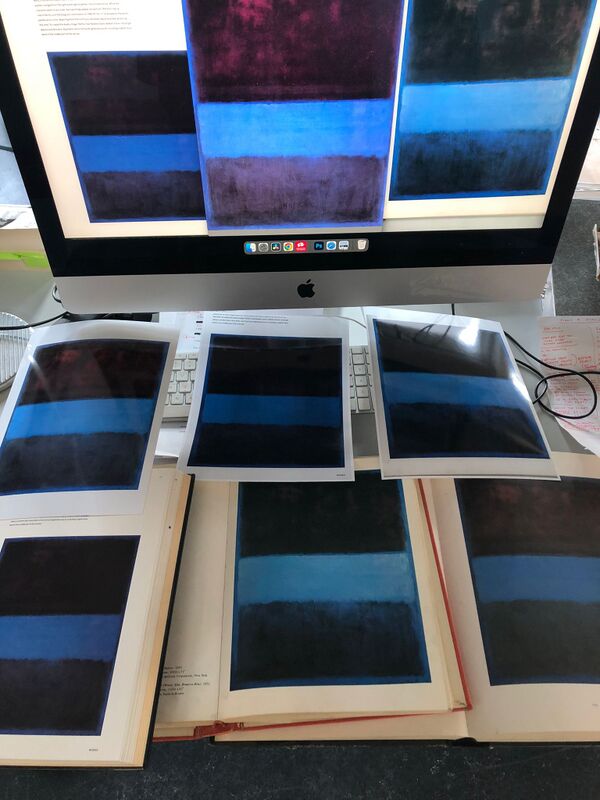
i resolved to go for the diy route and use a scan from a book from wdka's library. | |||
there were at least three books with the rothko painting in them. I chose the one that looked the most realistic/neutral in terms of color reproduction | |||
[[File:WhatsApp_Image_2022-12-12_at_11.55.52.jpg|frameless|800x800px]] | |||
i realised it was much more interesting - and very relevant to the topics that I was trying to address with the piece and with my overall research - to use the two images in their mediated form. the rothko painting as a downscaled print in an art history book, the google imagery as a video scrolling screenshot on my studio imac | |||
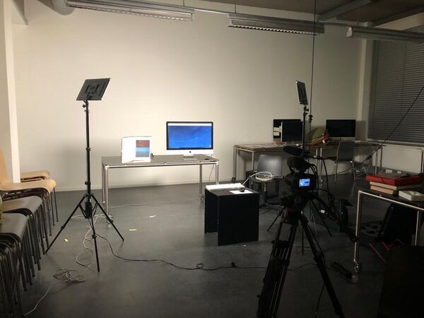
i then staged the two images and their mediums. rented some equipment, built a small set in pzi's big project space | |||
[[File:WhatsApp Image 2023-01-26 at 09.25.10-2.jpg|frameless|600x600px]] | |||
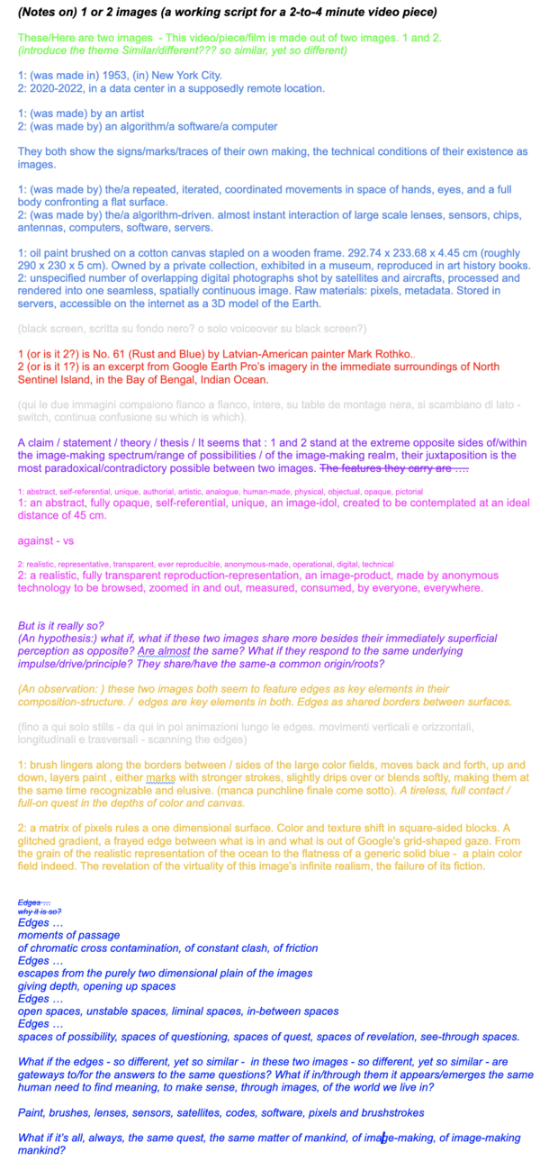
I wrote a script for a voiceover | |||
[[File:1or2imagesworkingscript1.png|frameless|1289x1289px]] | |||
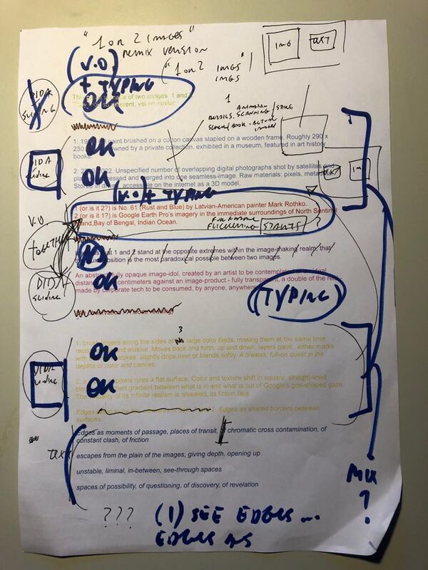
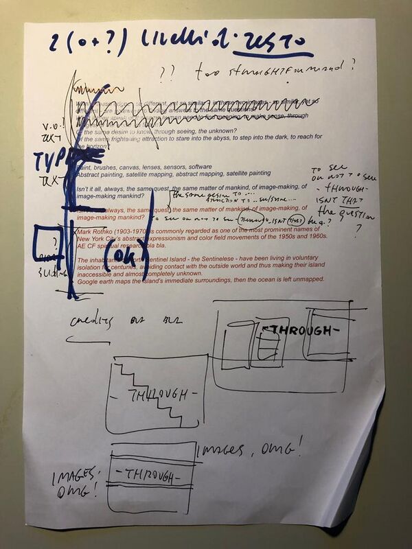
i constantly edited and re-edited the script while working on the piece | |||
[[File:WhatsApp Image 2023-01-26 at 09.25.11.jpg|frameless|800x800px]][[File:WhatsApp Image 2023-01-26 at 09.25.11-2.jpg|frameless|800x800px]] | |||
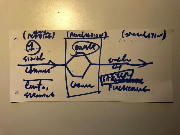
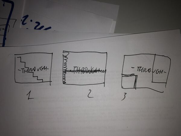
sketched a lot as well | |||
[[File:WhatsApp Image 2023-01-26 at 09.25.11-32.jpg|frameless|600x600px]] | |||
[[File:A1B85D8E-F107-491C-8CF7-CA5CE84A6611.jpg|frameless|600x600px]] | |||
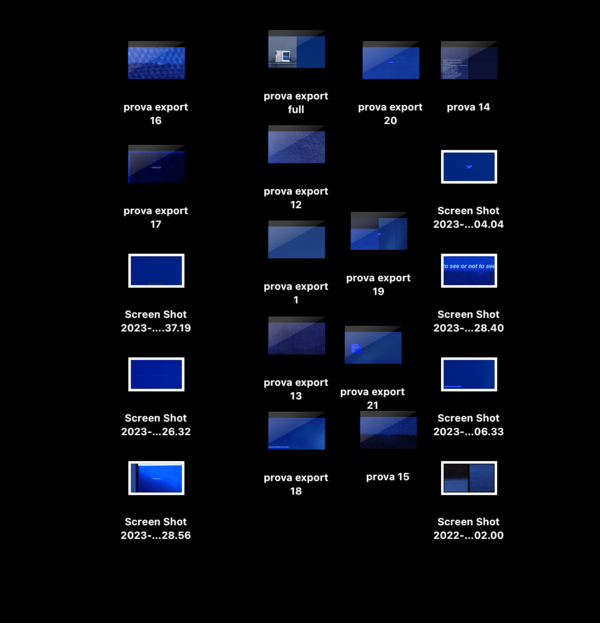
did a lot of editing work, screenshot notes and trial exports | |||
[[File:Screen Shot 2023-01-11 at 19.18.35.png|frameless|623x623px]] | |||
ended up making three/four subsequent versions of the piece. each of them features the same elements, arranged in a different structure and used in different ways. | |||
first version | |||
https://youtu.be/mJOio-zOOik | |||
overflowing voiceover - the two images are clearly presented at the very beginning of the piece - a cold close-reading in an essayistic-didactic tone and very rigid structure in chapters/sections - very fast pace - very formal editing style/choices | |||
second/third version | |||
https://youtu.be/B4sQEVRwZoc | |||
got rid of the voiceover - started using the text as a visual element on screen - two types of texts - descriptive foot/side-notes to the two images + speculative questioning in the center of the screen - images are still revealed midway through the piece - still quite strong essayistic tone conveyed by the text and the formal structure of the piece - started playing around in a more visual way - fast cuts bouncing between different "versions" of the images, blue flickering, light-scanning-deep-ocean overlay | |||
""""final version"""" | |||
https://youtu.be/uiU2NtINSYY | |||
text in form of more personal fragmented notes, less of a voiceover transcipt - more fragmented, more open - still conceptual description vibe but not in a truth-imposing way - no more split screen middle part - more space/time to images on single screen, to watch at them more intuitively, in a less directed way - names of the images are revealed only at the end of the piece - blue flickering/background as inter-element between the two images - different aspect ratios (4:3 to give the sense of a closer, in-depth reading of the images) | |||
<nowiki>------</nowiki> | |||
at the test screening at EYE film museum the DCP of my piece was corrupt and could not be played fully. Having to send in a new DCP, I had the chance to comply my obsessive-perfectionist-everchanging mind and make a new, fifth (?) version of the piece | |||
https://youtu.be/ERnV6DgVFes | |||
brought back in the blue boxes and their switching placement on the two sides of the screen, on the edge of the 4:3 aspect ratio - but kept the fragmented/notes-like version of the text - made the blue flicker/intercut full screen and not 4:3 - did some extra fine tuning on the timing between text and images | |||
==== Afterthoughts (what I've learnt from making this piece, what I want to do with it, what directions to follow next) ==== | |||
- my work, my way of making, of thinking, of writing, has a strong conceptual approach. both steve and laura noticed it and told me i should make good use of it. observe, study, read about conceptual art and conceptual/structural filmmaking. understand their tools, weapons, ways of making and make them part of my practice too. tautology - objective description is one of them | |||
- try to convey my thoughts and ideas in a more visual way, through the tools that i have as an image-maker. every gesture that i make in editing has to be meaningful and intentional. being visual does not mean to remove text-words from my work, but rather use those also in a visual way - experiment with fonts, effects, ways of incorporating a text in moving images so that they can make sense together - work on the relationship between images and texts, not just subtitles | |||
- be specific, rigorous, precise - every gesture, every choice has to be meaningful, even the slightest (how long is my film? how many frames? why is every element there in that way?) - ask myself these questions while editing - be formally intentional - it makes huge difference | |||
- but also try to be less elegant, cold, dry, work in a more instictual-associative-freeform way - be less self disciplined with my images (i guess thjs may sound contradictory with the previous point - but i feel i should and can find a good balance between the two | |||
- random editing doesnt work at all, it just looks ugly and messy. if I want some | |||
- give enough space/time to every element of the piece - dont be afraid of leaving something on screen for too long - sometimes it is needed | |||
- experiment more with the flickering effect - understand why it is used by other filmmakers (structural films, but also more contemporary - ex rachel rose) and understand how to achieve it | |||
-think myself as a videoartist rather than a filmmaker - maybe it's just a matter of words and labels, but it makes me feel as if more freedom is allowed | |||
- i am very interested in this whole research direction on image-making / media theory / self-reflection on the status/meaning/structure of (moving) images - I should work more on these lines in the future (24x1 project maybe?) | |||
i intend to keep working on this piece | |||
try to re-edit it, use it as a playground (a serious one though) to experiment with the language that I want to develop as a videoartist | |||
get more into the media specificity of these two images - really get at the core of their being images | |||
through text - keep using the fragmented/unedited notes format - i think it works well - but push my descriptions forward - use the weapon of tautology more - play with the friction between (seemingly) objective descriptions and the two images - with tautology - with the ambiguity of the different mediums | |||
- reintroduce the blue descriptive boxes - do not make them overpower the images, find a balance | |||
but also through the way the two images are edited together - movements/animations | |||
reflect on the types of materials/elements/gestures I am using and the ways that i am using them - everything has to be meaningful | |||
[[User:123cld]] | [[User:123cld]] | ||
Latest revision as of 12:48, 1 February 2023
(in progress)
1 or 2 images (some notes on)
brief synopsis-description:
a visual comparison between two seemingly completely different images - a painting by mark rothko and google earth's imagery around north sentinel island
first outcome of my NS island research project
process/progress
how i got there (notes)
-
the google earth imagery was one of the first materials i gathered when i started my research on ns island. at first my attention was all centered on the island itself. i was somehow obsessed in trying to get every image i could find of it, as if by doing so i could somehow grasp its essence, its meaning, or something like that
of course one of the first thing i did was looking for the island in google earth, scanning it from above, trying to get as close as i could. while doing so, in my scanning all over and zooming in and out i discovered something that i was not expecting and that caught my eye.
i noticed that google earth has satellite-pictured/mapped the island’s surrounding ocean only up to a certain radius. at a certain - quite regular - distance from the island’s shores, the satellite imagery abruptly ends, and the surrounding ocean is left un-mapped/un-pictured in a blank, solid, generic blue color, meaning by all odds that it has no interest in mapping it out. only the island, and its immediate surrounding is considered worth of representation, and in fact it is fully covered by google’s satellite imagery.
what i found intuitively interesting is what happens at the border, along the treshold/edge between the unmapped-unrepresented and the mapped-represented. in fact, all around the island, there is a line that divides the solid blue from the satellite imagery of the ocean. it is not precisely a line, but more of a circular strip of clustered pixels, jerkily fading from solid abstract blue to ocean’s aerial imagery. it’s a barrier, a treshold between the not-worth-being-represented and the worth-of-being-represented, between the non-interest and the interest, between non image and image. a glitched gradient between what is in and what is (left) out of google's gaze.
i guess this happens around every other island that google earth has mapped - at a sufficient distance from the mainland - but i felt this was particularly interesting in regards to this specific island - its status as an unknown, mysterious, inaccessible place, at the same time scary and captivating, whose images are impossible.
i started thinking of this edge as a sort of symbolic-metaphorical statement for the development of my interest towards this island and my intention of making a film around it - quite literally in this case
this strip of blueish pixels seems to bear the essential meaning of the case of north sentinel island. what is at stake seems to be the clash between the effort, attempt, desire, possibility to know and control through images and the island’s struggle to resist this attack
the superimposition of a grid-shaped gaze that controls through images.
another interesting thing in these satellite imagery are google trademarks arranged in a regular - square? - pattern all upon the island and the surrounding ocean. again, this superimposition of pattern, knowledge, detectability, control, measurement.
instead of scanning the island from above, as i was thinking to do before, i resolved to start by scanning this line, going around the island without showing it. suggesting there’s something in the middle, but focusing on the treshold between representing and not representing.
-
the rothko painting came out during a monday afternoon tutorial with david, beginning of december 2022.
i was showing him the visual materials that i had been gathering as part of my ns island project and talking about how i felt the focus of the project was shifting from the island itself to the point of view of those - us? - who strived to "make knowledge/sense" by capturing it in images and producing discourse around it. old maps, satellite imagery, ethnographic documentations, but also videogames, podcast, youtube livestreams, fictional short films and novels. the mixed feeling of attraction/fear, the need, the desire, the tension for/towards such an unknown, mysterious, indefinite place. a necessary counterweight? (deleuze's text on desert islands)
i was also already - and still am - gathering imagery that despite being unrelated to the island itself, reminded me of it, brought my mind to it.
a coffee spot on my studio desk that looked terrifically similar to the island's shape in those old maps that i had been downloading and zooming in and copping the whole day.
a dark shade in the background of caspar friedrich's monk by the sea that could have well been the island.
and so on.
we were observing and speculating about the google earth edge around the island, and David suggested me to look for "rothko blue painting" as that edge and those colours reminded him of some of rothko's abstract expressionist pieces
we stumbled upon No. 61 (Rust and Blue)
we started discussing the possible relation between these two images. so different yet, maybe, so similar.
one seemingly fully realistic, transparent, the other fully abstract and opaque, one made anonymously, automatically by google satellites, the other made by the hands and eyes of the most famous painter of the xx century
but both of these two images feature edges as key elements in their composition
edges as unstable, liminal, see-through, more-than-two-dimensional borders between surfaces, as places of clash, friction, chromatic cross contamination.
what if these edges are gateways to finding answers to the same questions? what if these two images come from the same, shared need of mankind to make sense, make meaning of the world through images, by making images of it?
-
i then decided to use these two images and their speculative comparison as the subject for my EYE film project
i first tried to get in touch with moca in la - the museum where the painting is exhibited - and rothko collection to get a high resolution photographic copy of the painting. managed to get a positiv e reply but they set way too restricting limits to the use of the image.
"Dear Claudio,
We appreciate your reaching out in order to obtain an image of CR# 492 No. 61 (Rust and Blue) [Brown Blue, Brown on Blue], 1953. While we do not usually provide images of Rothko artworks, we are sympathetic to your use within your graduate degree project.
Before we can release an image to you, as with any other usage request we would need to know more specifics about how Rothko’s artwork will be featured in your project, and in what context. Also the use would be limited to your specific project only without any further distribution or broadcast of the image in any medium, also there can be no overprinting of text onto the artwork or cropping of the image area of the painting. If this is agreeable, please let us know more about your intentions once you are ready to proceed.
Best regards,
Henry"
basically everything I intended to do with the image was prohibited. fuck it.
i resolved to go for the diy route and use a scan from a book from wdka's library.
there were at least three books with the rothko painting in them. I chose the one that looked the most realistic/neutral in terms of color reproduction
i realised it was much more interesting - and very relevant to the topics that I was trying to address with the piece and with my overall research - to use the two images in their mediated form. the rothko painting as a downscaled print in an art history book, the google imagery as a video scrolling screenshot on my studio imac
i then staged the two images and their mediums. rented some equipment, built a small set in pzi's big project space
I wrote a script for a voiceover
i constantly edited and re-edited the script while working on the piece
sketched a lot as well
did a lot of editing work, screenshot notes and trial exports
ended up making three/four subsequent versions of the piece. each of them features the same elements, arranged in a different structure and used in different ways.
first version
overflowing voiceover - the two images are clearly presented at the very beginning of the piece - a cold close-reading in an essayistic-didactic tone and very rigid structure in chapters/sections - very fast pace - very formal editing style/choices
second/third version
got rid of the voiceover - started using the text as a visual element on screen - two types of texts - descriptive foot/side-notes to the two images + speculative questioning in the center of the screen - images are still revealed midway through the piece - still quite strong essayistic tone conveyed by the text and the formal structure of the piece - started playing around in a more visual way - fast cuts bouncing between different "versions" of the images, blue flickering, light-scanning-deep-ocean overlay
""""final version""""
text in form of more personal fragmented notes, less of a voiceover transcipt - more fragmented, more open - still conceptual description vibe but not in a truth-imposing way - no more split screen middle part - more space/time to images on single screen, to watch at them more intuitively, in a less directed way - names of the images are revealed only at the end of the piece - blue flickering/background as inter-element between the two images - different aspect ratios (4:3 to give the sense of a closer, in-depth reading of the images)
------
at the test screening at EYE film museum the DCP of my piece was corrupt and could not be played fully. Having to send in a new DCP, I had the chance to comply my obsessive-perfectionist-everchanging mind and make a new, fifth (?) version of the piece
brought back in the blue boxes and their switching placement on the two sides of the screen, on the edge of the 4:3 aspect ratio - but kept the fragmented/notes-like version of the text - made the blue flicker/intercut full screen and not 4:3 - did some extra fine tuning on the timing between text and images
Afterthoughts (what I've learnt from making this piece, what I want to do with it, what directions to follow next)
- my work, my way of making, of thinking, of writing, has a strong conceptual approach. both steve and laura noticed it and told me i should make good use of it. observe, study, read about conceptual art and conceptual/structural filmmaking. understand their tools, weapons, ways of making and make them part of my practice too. tautology - objective description is one of them
- try to convey my thoughts and ideas in a more visual way, through the tools that i have as an image-maker. every gesture that i make in editing has to be meaningful and intentional. being visual does not mean to remove text-words from my work, but rather use those also in a visual way - experiment with fonts, effects, ways of incorporating a text in moving images so that they can make sense together - work on the relationship between images and texts, not just subtitles
- be specific, rigorous, precise - every gesture, every choice has to be meaningful, even the slightest (how long is my film? how many frames? why is every element there in that way?) - ask myself these questions while editing - be formally intentional - it makes huge difference
- but also try to be less elegant, cold, dry, work in a more instictual-associative-freeform way - be less self disciplined with my images (i guess thjs may sound contradictory with the previous point - but i feel i should and can find a good balance between the two
- random editing doesnt work at all, it just looks ugly and messy. if I want some
- give enough space/time to every element of the piece - dont be afraid of leaving something on screen for too long - sometimes it is needed
- experiment more with the flickering effect - understand why it is used by other filmmakers (structural films, but also more contemporary - ex rachel rose) and understand how to achieve it
-think myself as a videoartist rather than a filmmaker - maybe it's just a matter of words and labels, but it makes me feel as if more freedom is allowed
- i am very interested in this whole research direction on image-making / media theory / self-reflection on the status/meaning/structure of (moving) images - I should work more on these lines in the future (24x1 project maybe?)
i intend to keep working on this piece
try to re-edit it, use it as a playground (a serious one though) to experiment with the language that I want to develop as a videoartist
get more into the media specificity of these two images - really get at the core of their being images
through text - keep using the fragmented/unedited notes format - i think it works well - but push my descriptions forward - use the weapon of tautology more - play with the friction between (seemingly) objective descriptions and the two images - with tautology - with the ambiguity of the different mediums
- reintroduce the blue descriptive boxes - do not make them overpower the images, find a balance
but also through the way the two images are edited together - movements/animations
reflect on the types of materials/elements/gestures I am using and the ways that i am using them - everything has to be meaningful
