MathildeThesisDraft: Difference between revisions
No edit summary |
|||
| (19 intermediate revisions by 2 users not shown) | |||
| Line 1: | Line 1: | ||
[[MathildeNewDraft]] | |||
==SECOND DRAFT 21-02-22== | ==SECOND DRAFT 21-02-22== | ||
| Line 4: | Line 5: | ||
['''Below I have made some suggestions and made comments The earlier version is below this one:'''] | ['''Below I have made some suggestions and made comments The earlier version is below this one:'''] | ||
'''''New text since (10-02-2022)''''' | |||
| Line 39: | Line 39: | ||
[Steve asks: In On Photography Susan Sontag mentions a type of photo which is``a thin slice of space [and] time (Sontag 1979). Please unpack what Sontag means by that term and discuss it in relation to your own use of the term 'slice of life' photography]] | [Steve asks: In On Photography Susan Sontag mentions a type of photo which is``a thin slice of space [and] time (Sontag 1979). Please unpack what Sontag means by that term and discuss it in relation to your own use of the term 'slice of life' photography]] | ||
=='''Style studies and experiments'''== | =='''Style studies and experiments'''== | ||
| Line 56: | Line 46: | ||
<b> | <b> | ||
[[file:MNCT-2021-08-10-DSC06417.jpg|500px]] | [[file:MNCT-2021-08-10-DSC06417.jpg|500px]] | ||
In this image,my model appears to be in an industrial environment - a new city. It looks like it's a back room of a business. Lighting is very harsh and cinematic. What makes lighting cinematic in my work, is that it alludes to something off screen. It tells us a story of something that might be happening. Implication that she is reacting to where the lighting is coming from - perhaps a door has just opened. There is a narrative here; there is a cautiousness in her eyes almost, but at the same time she looks almost bored and uncaring. This could be a work environment and she shouldn't be smoking. Smoking is used a lot as a way of de-stressing, maybe she hates her job and she is coping with it by smoking. The idea was that she was working in a soup kitchen and sabotaging her work; her hair is too polished almost for the job. Like she is dressing for the job she wants and not for the one she has. It's a badge of her independence. | |||
[[file:MNCT-2021-10-22-DSC00346.jpg|500px]] | [[file:MNCT-2021-10-22-DSC00346.jpg|500px]] | ||
This is supposed to look like an analog clubbing snapshot, and not like a cinema still. | This is supposed to look like an analog clubbing snapshot, and not like a cinema still. | ||
<br></br> | <br></br> | ||
In this image, the model is on a night out, wearing a glittery dress. Her ponytail is a very polished one with the hair embellishments. It’s very much a clubbing outfit. | |||
<br></br> | <br></br> | ||
Harsher lighting that was supposed to imitate a harsh flash from the camera itself. There’s a harsh light beam on the side of her face; almost the product of using a fast flash. The light it not supposed to be perfect, it’s supposed to capture the subject quickly and in the moment. I also used a star filter in order to place an emphasis on the glitter and because it gives the photo a more 80’s feel. | Harsher lighting that was supposed to imitate a harsh flash from the camera itself. There’s a harsh light beam on the side of her face; almost the product of using a fast flash. The light it not supposed to be perfect, it’s supposed to capture the subject quickly and in the moment. I also used a star filter in order to place an emphasis on the glitter and because it gives the photo a more 80’s feel. | ||
| Line 90: | Line 80: | ||
The model has statuesque pose; like a doll. It might be, in this series of photos, taken before the other two pictures were taken. It looks a little bit more like she has just arrived, she looks a lot more proper and composed compared to the other pictures. And even though she isn't looking at the camera, it seems like she is a little more aware that she is being photographed. By the doll-like and statuesque pose, I would think that she is some sort of heiress living in the 50's or 40's, an example of a portrait I would compare it to is seen on the right. I wanted to use flash-like light, to make it look like a deliberate portrait, and not so much a cinematic still, as mentioned above. | The model has statuesque pose; like a doll. It might be, in this series of photos, taken before the other two pictures were taken. It looks a little bit more like she has just arrived, she looks a lot more proper and composed compared to the other pictures. And even though she isn't looking at the camera, it seems like she is a little more aware that she is being photographed. By the doll-like and statuesque pose, I would think that she is some sort of heiress living in the 50's or 40's, an example of a portrait I would compare it to is seen on the right. I wanted to use flash-like light, to make it look like a deliberate portrait, and not so much a cinematic still, as mentioned above. | ||
<br></br> | <br></br> | ||
</b> | |||
These images were shot digitally and colour graded and lit to have an analogue and cinematic blend style. This promotes, to me, the best of both worlds; combining my digital shooting method with the style and nostalgia of an analog look. I want these photographs to have a feeling of being a quick snapshot while at the same time being a little too dreamy and stylised to create the feeling of it being a memory that is romanticised. | These images were shot digitally and colour graded and lit to have an analogue and cinematic blend style. This promotes, to me, the best of both worlds; combining my digital shooting method with the style and nostalgia of an analog look. I want these photographs to have a feeling of being a quick snapshot while at the same time being a little too dreamy and stylised to create the feeling of it being a memory that is romanticised. | ||
| Line 133: | Line 122: | ||
Asking myself the question "Why do I want to make it?" more clearly helped me inch closer to what I really want to make and how I want to make it. | Asking myself the question "Why do I want to make it?" more clearly helped me inch closer to what I really want to make and how I want to make it. | ||
I have always been moved by "slice of life" type images and artworks, there is something poetic '''[what does that term mean to you?]'''about a piece of artwork that shows you a normal everyday scenario that you are not a part of and can still give that feeling of having been there. It gives me a feeling of now-ness while never actually having experienced that particular moment. Examples of these kinds of moments in the movies Totoro and Kiki's Delivery Service below, in which an absolutely mundane moment is captured, however I am transported to relaxing, stress free summer days. | I have always been moved by "slice of life" type images and artworks, there is something poetic '''[what does that term mean to you?]'''about a piece of artwork that shows you a normal everyday scenario that you are not a part of and can still give that feeling of having been there. It gives me a feeling of now-ness while never actually having experienced that particular moment. Examples of these kinds of moments in the movies Totoro and Kiki's Delivery Service below, in which an absolutely mundane moment is captured, however I am transported to relaxing, stress free summer days. | ||
| Line 141: | Line 129: | ||
Going back to this realisation and ultimately accepting it as my foundation for how I view art, has made me realise I want to go back to these inspirations and use my childhood motivations as the source for my work.<b> | Going back to this realisation and ultimately accepting it as my foundation for how I view art, has made me realise I want to go back to these inspirations and use my childhood motivations as the source for my work.<b> Another big reason for choosing Ghibli as a foundation for my inspiration, is because it not only connects to my escapism, but because as an Asian woman growing up in the Netherlands I didn't have much media that I felt I could connect to. | ||
<br></br> | <br></br> | ||
== | ==In and out of fashion== | ||
<br></br> | <br></br> | ||
[[file:waserette1.jpg|600px]]<br> | |||
[[file:waserette1.jpg|600px]]<br> | |||
''laundrette 1'' | |||
[[file:waserette2.jpg|300px]] | |||
''laundrette 2'' | |||
<br></br> | <br></br> | ||
I want to get away from the fashion direction where the pose and the gaze define it as such. | I want to get away from the fashion direction where the pose and the gaze define it as such. The two images above , ''laundrette 1'' and ''laundrette 2'' (2022) show this transition. In the 2nd laundrette image the model is looking in the camera with an attitude; she's very present and she accepts the focus; she does not blend into the background and therefore the model is the most important thing in this picture. This is contrast to picture 1 where the model's presentation is more modest; more in the 'slice of life' there is more interaction with her surroundings; the pose is less to be seen and more natural. She is interested in something other than the viewer. The gaze is difference. The 'stage' is bigger, we can see more. This pose is more natural. | ||
In 2 she is sitting in a washing machine; why? In a fashion photo it seems natural but in a 'slice of life photo it wouldn't look like that is a natural position for her to just be in. In 2 she takes control of the photo, and in picture 1 it feels like I am taking control of the photo and what is happening. | In 2 she is sitting in a washing machine; why? In a fashion photo it seems natural but in a 'slice of life photo it wouldn't look like that is a natural position for her to just be in. In 2 she takes control of the photo, and in picture 1 it feels like I am taking control of the photo and what is happening. | ||
[[file:MNCT-2022-01-07-DSC03111-scrnshot.png|500px]] | [[file:MNCT-2022-01-07-DSC03111-scrnshot.png|500px]] | ||
The setting is a blue hour, but there’s a strip of light on the models face. It clearly cuts off at just bellow his shoulders; insinuating that it might be a flash light or a car headlight shining on him. Also because the light is very warm compared to his surroundings. This lighting to me, feels like it’s more cinematic. It’s telling us something about the narrative; it’s not just there to light the subject. | |||
<br></br> | |||
His pose is a little slouchy, which suggests that he is kind of done with his day. He is wearing a white collared shirt, but it’s not ironed and his buttons are open, his blazer has dropped to around his elbows; he is a white collar corporate man but does he want to be? His longer hair suggests a bit of rebellion and wanting to retain identity. | |||
<br></br> | |||
He is reacting to this light, but he doesn’t look like he was waiting for it. This suggests that this man might have wanted to have a solo, pensive walk in nature to clear his head, but someone has found him or is interrupting him. He doesn’t seem happy that he is not alone right now, he seems annoyed. | |||
<br></br> | |||
| Line 168: | Line 175: | ||
[<<Please make this image bigger, so we can make a comparison between your image and the film still] | [<<Please make this image bigger, so we can make a comparison between your image and the film still] | ||
My inspiration for this photograph was the movie Minari. ''bellow there's a gallery film still of what I mean, but not sure if I want to include it because now my work just looks like a dollar store knock off sheesh'' | |||
'''[Steve comments: Ha! But there is a tradition of artists and filmmakers REENACTING scenes from famous films. Artists like Pierre Huyghe and Gavin Turk made their reputations through appropriating images from famous art and film. Doing this sets up a lot of interesting questions about identity and originality. Looking back at Cindy Sherman, even in the early 1960s she was reenacting film stills. I strongly think if reenactment is part of the motivation of your work you should embrace it and acknowledge it... If we look at you own work alongside these famous artists, we can recognise the same fascination and interest; this is the mode of 'remediation' and 'post production' which is well established in art discourse, all you need to do is acknowledge it. We are all always quoting from other texts, images and films, the artists below acknowledge this- that we build our identities and the way we present to the world from existing images, you are doing the same, collecting images from different parts of your life and building something which is your own...]''' | '''[Steve comments: Ha! But there is a tradition of artists and filmmakers REENACTING scenes from famous films. Artists like Pierre Huyghe and Gavin Turk made their reputations through appropriating images from famous art and film. Doing this sets up a lot of interesting questions about identity and originality. Looking back at Cindy Sherman, even in the early 1960s she was reenacting film stills. I strongly think if reenactment is part of the motivation of your work you should embrace it and acknowledge it... If we look at you own work alongside these famous artists, we can recognise the same fascination and interest; this is the mode of 'remediation' and 'post production' which is well established in art discourse, all you need to do is acknowledge it. We are all always quoting from other texts, images and films, the artists below acknowledge this- that we build our identities and the way we present to the world from existing images, you are doing the same, collecting images from different parts of your life and building something which is your own...]''' | ||
| Line 199: | Line 208: | ||
[[file:MNCT-2022-02-17-DSC05629-scrnshot.png|500px]] | [[file:MNCT-2022-02-17-DSC05629-scrnshot.png|500px]] | ||
| Line 214: | Line 214: | ||
'''Komorebi:''' In real life, the space between the canopy and branches allows sunlight to gently filter through. In Japan, the dappled light this creates is called komorebi (pronounced koh-mo-reh-bee) and is made up of the kanji characters for tree (木), shine through (漏れ), and sun (日) | '''Komorebi:''' In real life, the space between the canopy and branches allows sunlight to gently filter through. In Japan, the dappled light this creates is called komorebi (pronounced koh-mo-reh-bee) and is made up of the kanji characters for tree (木), shine through (漏れ), and sun (日) | ||
<br></br> | <br></br> | ||
This is one of my latest experiments with the term "Komorebi" in mind | This is one of my latest experiments with the term "Komorebi" in mind</b> | ||
''I still have to write a text on this, but I only shot it this week so I haven't had much time to really let the work sink in!'' | ''I still have to write a text on this, but I only shot it this week so I haven't had much time to really let the work sink in!'' | ||
use the method we discussed for each image | |||
the model | |||
lighting | |||
costume | |||
imagined situation | |||
We discussed these | |||
1) feels like and open space; a dreamscape; what does the shadow do? It makes her see weightless; flatness of shadow form of model | |||
2. there is a beginning and an end to it, a window frame in which the model appears to be pushing herself. in 2 the shadows of the canopy feels like she is in nature (clouds or under a tree) The gaze: the model insisted in looking | |||
Write about the models: now noticing the differences between models. a) fluent in the way she does it, like she is telling a story and b) a posing model which his more 'editorial' and presentational of a particular thing... I'm finding out who I prefer to work with.. maybe models who respond to the situation and allow a flow... 'micro-narrative' - her own bubble with her own story... | |||
[[file:MNCT-giascrnshot1.png|500px]] | [[file:MNCT-giascrnshot1.png|500px]] | ||
| Line 240: | Line 254: | ||
'''*[https://www.macba.cat/en/art-artists/artists/lamelas-david/film-script-manipulacion-mensaje ''Film Script (Manipulation of Meaning)''(1972) David Lamelas] (1)''' | '''*[https://www.macba.cat/en/art-artists/artists/lamelas-david/film-script-manipulacion-mensaje ''Film Script (Manipulation of Meaning)''(1972) David Lamelas] (1)''' | ||
David Lamelas creates a "film" by projecting a series of cinematic photography slides (almost like film stills) next to each other. This relates to my project as my goal is to also create a scene by using a combination of photographs. | David Lamelas creates a "film" by projecting a series of cinematic photography slides (almost like film stills) next to each other. This relates to my project as my goal is to also create a scene by using a combination of photographs. | ||
[[file:David_Lamelas.jpeg|500px]] | [[file:David_Lamelas.jpeg|500px]] | ||
[What is similar, what is different to your own work? Maybe bring in a Lamelas image and compare it with one of your own... or compare how he makes a series of 'movie' like images and how you make a series...] | |||
<Make these images larger. | |||
[<Make these images larger.] | |||
==Notes from earlier versions== | ==Notes from earlier versions== | ||
| Line 256: | Line 275: | ||
My parents are from Surinam and I would refer to myself as "a fake Asian" as I am mixed Chinese-Vietnamese-Whatever and did not grow up traditionally with Asian culture. So even though Anime is very much Japanese, because I wouldn't place myself in a certain country, I would try to have this connection with anything Asia-related. I feel like growing up I kind of became ashamed of my appearance and kind of got away from accepting myself; however as I turned 25 I felt like I want to embrace what, and who I am. And therefore I have also turned my interest into almost exclusively Asian photographers, from all of Asia. Because I don't see myself in any one of those cultures specifically, I like comparing styles from different countries. And it's something I would love to explore more. | My parents are from Surinam and I would refer to myself as "a fake Asian" as I am mixed Chinese-Vietnamese-Whatever and did not grow up traditionally with Asian culture. So even though Anime is very much Japanese, because I wouldn't place myself in a certain country, I would try to have this connection with anything Asia-related. I feel like growing up I kind of became ashamed of my appearance and kind of got away from accepting myself; however as I turned 25 I felt like I want to embrace what, and who I am. And therefore I have also turned my interest into almost exclusively Asian photographers, from all of Asia. Because I don't see myself in any one of those cultures specifically, I like comparing styles from different countries. And it's something I would love to explore more. | ||
<br></br> | <br></br> | ||
Another thing I would like to see more of, is the re-appropriation of cultural cliches and see someone wear a kimono, or African dress with pride in a Western country. I know people who are embarrassed to wear their traditional dress. So I would like to see this normalised. In the Netherlands I have seen a lot of Dutch people "dress up" as a person of color, which I think is very tasteless. I hate seeing the use of an Asian straw hat as a way to almost ridicule and stereotype one people. I want more of my work to also dabble in this re-appropriation. | Another thing I would like to see more of, is the re-appropriation of cultural cliches and see someone wear a kimono, or African dress with pride in a Western country. I know people who are embarrassed to wear their traditional dress. So I would like to see this normalised. In the Netherlands I have seen a lot of Dutch people "dress up" as a person of color, which I think is very tasteless. I hate seeing the use of an Asian straw hat as a way to almost ridicule and stereotype one people. I want more of my work to also dabble in this re-appropriation. | ||
<br></br | <br></br> | ||
However, that being said; I am not necessarily interested in creating work that is heavy with political messaging and I'm not interested it presenting it with those connotations. | |||
However, that being said; I am not necessarily interested in creating work that is heavy with political messaging and I'm not interested it presenting it with those connotations. [S suggests<<Here you are defining yourself in NEGATIVE TERMS. Rather than ay what you DON'T want to do, describe what you DO want to do in positive terms.] | |||
[S suggests<<Here you are defining yourself in NEGATIVE TERMS. Rather than ay what you DON'T want to do, describe what you DO want to do in positive terms.] </b> | |||
<gallery> | <gallery> | ||
| Line 272: | Line 291: | ||
After coming to this realisation I also found my interest in the dark and moody aesthetic dwindle and finding a new interest in the lighter and cheerful color palette of Ghibli. A movie that is very in line with this slice of life, summer and stress free aesthetic was the movie "Sideways" by Alexander Payne, in which two friends travel to wine country to enjoy a relaxing and intellectually stimulating holiday. | After coming to this realisation I also found my interest in the dark and moody aesthetic dwindle and finding a new interest in the lighter and cheerful color palette of Ghibli. A movie that is very in line with this slice of life, summer and stress free aesthetic was the movie "Sideways" by Alexander Payne, in which two friends travel to wine country to enjoy a relaxing and intellectually stimulating holiday. | ||
[Steve notes: you choose a lot of images of people lying down, and you make a lot of images of people lying down] | |||
I also became interested in Japanese analog photographers, who also use this lighter style and palette that studio Ghibli uses (Which may or may not be in correlation to one another). I found two photographers, Kuji Rena (2) and Iwakura Shiori (3), that embody this aesthetic in their work quite well. | I also became interested in Japanese analog photographers, who also use this lighter style and palette that studio Ghibli uses (Which may or may not be in correlation to one another). I found two photographers, Kuji Rena (2) and Iwakura Shiori (3), that embody this aesthetic in their work quite well. | ||
| Line 294: | Line 314: | ||
And so: Slice of life, romanticising the mundane, appreciating the moment, being mindful is the direction I want to take my work in. Snapshots rather than film stills. The reason I am stepping off the "film still" concept is because I feel that forces my work in a more anti-personal direction, because it is a rule that the model would not be able to interact with the camera. Stepping off of calling my work film stills, will give me more freedom to experiment with and find value in my work without having to label it specifically. | And so: Slice of life, romanticising the mundane, appreciating the moment, being mindful is the direction I want to take my work in. Snapshots rather than film stills. The reason I am stepping off the "film still" concept is because I feel that forces my work in a more anti-personal direction, because it is a rule that the model would not be able to interact with the camera. Stepping off of calling my work film stills, will give me more freedom to experiment with and find value in my work without having to label it specifically. | ||
<b> | <b> | ||
What do I value about the work I have made: I am going back to my source - me at my purest form, when I was a kid- I got removed from that in recent years and want to connect with that. For example: the work in the launderette below. The colours give a whimsical view, casual and playful. It is a chore doing the washing but from the point of view of a child anything can be interesting. This is why Ghibli is a useful source. | What do I value about the work I have made: I am going back to my source - me at my purest form, when I was a kid- I got removed from that in recent years and want to connect with that. For example: the work in the launderette below. The colours give a whimsical view, casual and playful. It is a chore doing the washing but from the point of view of a child anything can be interesting. This is why Ghibli is a useful source. | ||
[Steve notes: there are a lot of pictures of people lying down in the pictures you choose and in the pictures you make...] | |||
=Relation to a larger context= | =Relation to a larger context= | ||
| Line 330: | Line 352: | ||
I choose these movies as my references because some of them have a "slice of life" element to them. Scenic/cinematographic and story wise I feel like they can have a relatability to different types of people because they can be interpreted in your own way, while still having a concrete idea of what is happening. | I choose these movies as my references because some of them have a "slice of life" element to them. Scenic/cinematographic and story wise I feel like they can have a relatability to different types of people because they can be interpreted in your own way, while still having a concrete idea of what is happening. | ||
[cut from above]Below is a good example of what the memories would look like. They are scenarios that are all part of a bigger journey. It tells how the character experiences her journey. It is a relatable moment with which we can empathise and almost transport ourselves into that scenario and how we would feel ourselves. | |||
[S: is this a 'cinematic experience'? Unpack what is happening here- unpack what the relation between cinema and memory are for you. Are your photos cinema stills? If so, what does it mean to make a cinema still? Are What is the relation between 'slice of life' pictures, movie stills and your photos?] | |||
<gallery> | |||
Sliceoflife.GIF|" Journey" by Sean Sevestre (2021) | |||
</gallery> | |||
=Who can help you and how?= | =Who can help you and how?= | ||
| Line 397: | Line 429: | ||
='''''New text since last meeting (10-02-2022)'''''= | ='''''New text since last meeting (10-02-2022)'''''= | ||
= Toward Slice of life works= | = Toward Slice of life works= | ||
| Line 435: | Line 466: | ||
<b> | <b> | ||
[[file:MNCT-2021-08-10-DSC06417.jpg|500px]] | [[file:MNCT-2021-08-10-DSC06417.jpg|500px]] | ||
My model appears to be in an industrial environment - a new city. It looks like it's a back room of a business. Lighting is very harsh and cinematic. What makes lighting cinematic in my work, is that it alludes to something off screen. It tells us a story of something that might be happening. Implication that she is reacting to where the lighting is coming from - perhaps a door has just opened. There is a narrative here; there is a cautiousness in her eyes almost, but at the same time she looks almost bored and uncaring. This could be a work environment and she shouldn't be smoking. Smoking is used a lot as a way of de-stressing, maybe she hates her job and she is coping with it by smoking. The idea was that she was working in a soup kitchen and sabotaging her work; her hair is too polished almost for the job. Like she is dressing for the job she wants and not for the one she has. It's a badge of her independence. | My model appears to be in an industrial environment - a new city. It looks like it's a back room of a business. Lighting is very harsh and cinematic. What makes lighting cinematic in my work, is that it alludes to something off screen. It tells us a story of something that might be happening. Implication that she is reacting to where the lighting is coming from - perhaps a door has just opened. There is a narrative here; there is a cautiousness in her eyes almost, but at the same time she looks almost bored and uncaring. This could be a work environment and she shouldn't be smoking. Smoking is used a lot as a way of de-stressing, maybe she hates her job and she is coping with it by smoking. The idea was that she was working in a soup kitchen and sabotaging her work; her hair is too polished almost for the job. Like she is dressing for the job she wants and not for the one she has. It's a badge of her independence. | ||
[[file:MNCT-2021-10-22-DSC00346.jpg|500px]] | [[file:MNCT-2021-10-22-DSC00346.jpg|500px]] | ||
This wasn’t supposed to have the look of a cinema still, the purpose of this photo was to make it look like an analog clubbing snapshot. | This wasn’t supposed to have the look of a cinema still, the purpose of this photo was to make it look like an analog clubbing snapshot. | ||
<br></br> | <br></br> | ||
| Line 470: | Line 501: | ||
<br></br> | <br></br> | ||
</b> | |||
These images were shot digitally and colour graded and lit to have an analogue and cinematic blend style. This promotes, to me, the best of both worlds; combining my digital shooting method with the style and nostalgia of an analog look. I want these photographs to have a feeling of being a quick snapshot while at the same time being a little too dreamy and stylised to create the feeling of it being a memory that is romanticised. | These images were shot digitally and colour graded and lit to have an analogue and cinematic blend style. This promotes, to me, the best of both worlds; combining my digital shooting method with the style and nostalgia of an analog look. I want these photographs to have a feeling of being a quick snapshot while at the same time being a little too dreamy and stylised to create the feeling of it being a memory that is romanticised. | ||
| Line 519: | Line 551: | ||
Going back to this realisation and ultimately accepting it as my foundation for how I view art, has made me realise I want to go back to these inspirations and use my childhood motivations as the source for my work.<b | Going back to this realisation and ultimately accepting it as my foundation for how I view art, has made me realise I want to go back to these inspirations and use my childhood motivations as the source for my work.<b> Another big reason for choosing Ghibli as a foundation for my inspiration, is because it not only connects to my escapism, but because as an Asian woman growing up in the Netherlands I didn't have much media that I felt I could connect to. | ||
<br></br> | <br></br> | ||
My parents are from Surinam and I would refer to myself as "a fake Asian" as I am mixed Chinese-Vietnamese-Whatever and did not grow up traditionally with Asian culture. So even though Anime is very much Japanese, because I wouldn't place myself in a certain country, I would try to have this connection with anything Asia-related. I feel like growing up I kind of became ashamed of my appearance and kind of got away from accepting myself; however as I turned 25 I felt like I want to embrace what, and who I am. And therefore I have also turned my interest into almost exclusively Asian photographers, from all of Asia. Because I don't see myself in any one of those cultures specifically, I like comparing styles from different countries. And it's something I would love to explore more. | My parents are from Surinam and I would refer to myself as "a fake Asian" as I am mixed Chinese-Vietnamese-Whatever and did not grow up traditionally with Asian culture. So even though Anime is very much Japanese, because I wouldn't place myself in a certain country, I would try to have this connection with anything Asia-related. I feel like growing up I kind of became ashamed of my appearance and kind of got away from accepting myself; however as I turned 25 I felt like I want to embrace what, and who I am. And therefore I have also turned my interest into almost exclusively Asian photographers, from all of Asia. Because I don't see myself in any one of those cultures specifically, I like comparing styles from different countries. And it's something I would love to explore more. | ||
<br></br> | <br></br> | ||
Another thing I would like to see more of, is the re-appropriation of cultural cliches and see someone wear a kimono, or African dress with pride in a Western country. I know people who are embarrassed to wear their traditional dress. So I would like to see this normalised. In the Netherlands I have seen a lot of Dutch people "dress up" as a person of color, which I think is very tasteless. I hate seeing the use of an Asian straw hat as a way to almost ridicule and stereotype one people. I want more of my work to also dabble in this re-appropriation. | Another thing I would like to see more of, is the re-appropriation of cultural cliches and see someone wear a kimono, or African dress with pride in a Western country. I know people who are embarrassed to wear their traditional dress. So I would like to see this normalised. In the Netherlands I have seen a lot of Dutch people "dress up" as a person of color, which I think is very tasteless. I hate seeing the use of an Asian straw hat as a way to almost ridicule and stereotype one people. I want more of my work to also dabble in this re-appropriation. | ||
<br></br | <br></br> | ||
However, that being said; I am not necessarily interested in creating work that is heavy with political messaging and I'm not interested it presenting it with those connotations. [S suggests<<Here you are defining yourself in NEGATIVE TERMS. Rather than ay what you DON'T want to do, describe what you DO want to do in positive terms.]</b> | |||
However, that being said; I am not necessarily interested in creating work that is heavy with political messaging and I'm not interested it presenting it with those connotations. [S suggests<<Here you are defining yourself in NEGATIVE TERMS. Rather than ay what you DON'T want to do, describe what you DO want to do in positive terms.] | |||
<gallery> | <gallery> | ||
| Line 562: | Line 592: | ||
And so: Slice of life, romanticising the mundane, appreciating the moment, being mindful is the direction I want to take my work in. Snapshots rather than film stills. The reason I am stepping off the "film still" concept is because I feel that forces my work in a more anti-personal direction, because it is a rule that the model would not be able to interact with the camera. Stepping off of calling my work film stills, will give me more freedom to experiment with and find value in my work without having to label it specifically. | And so: Slice of life, romanticising the mundane, appreciating the moment, being mindful is the direction I want to take my work in. Snapshots rather than film stills. The reason I am stepping off the "film still" concept is because I feel that forces my work in a more anti-personal direction, because it is a rule that the model would not be able to interact with the camera. Stepping off of calling my work film stills, will give me more freedom to experiment with and find value in my work without having to label it specifically. | ||
<b> | <b> | ||
What do I value about the work I have made: I am going back to my source - me at my purest form, when I was a kid- I got removed from that in recent years and want to connect with that. For example: the work in the launderette below. The colours give a whimsical view, casual and playful. It is a chore doing the washing but from the point of view of a child anything can be interesting. This is why Ghibli is a useful source. | What do I value about the work I have made: I am going back to my source - me at my purest form, when I was a kid- I got removed from that in recent years and want to connect with that. For example: the work in the launderette below. The colours give a whimsical view, casual and playful. It is a chore doing the washing but from the point of view of a child anything can be interesting. This is why Ghibli is a useful source. | ||
<br></br> | <br></br> | ||
| Line 569: | Line 599: | ||
<br></br> | <br></br> | ||
I want to get away from the fashion direction where the pose and the gaze define it as such. For instance in the 2nd laundrette image the model is looking in the camera with an attitude; she's very present and she accepts the focus; she does not blend into the background and therefore the model is the most important thing in this picture. this is contrast to picture 1 where the model's presentation is more modest; more in the 'slice of life' there is more interaction with her surroundings; the pose is less to be seen and more natural. She is interested in something other than the viewer. The gaze is difference. The 'stage' is bigger, we can see more. This pose is more natural; in 2 she is sitting in a washing machine; why? In a fashion photo it seems natural but in a 'slice of life photo it wouldn't look like that is a natural position for her to just be in. In 2 she takes control of the photo, and in picture 1 it feels like OI am taking control of the photo and what is happening. | I want to get away from the fashion direction where the pose and the gaze define it as such. For instance in the 2nd laundrette image the model is looking in the camera with an attitude; she's very present and she accepts the focus; she does not blend into the background and therefore the model is the most important thing in this picture. this is contrast to picture 1 where the model's presentation is more modest; more in the 'slice of life' there is more interaction with her surroundings; the pose is less to be seen and more natural. She is interested in something other than the viewer. The gaze is difference. The 'stage' is bigger, we can see more. This pose is more natural; in 2 she is sitting in a washing machine; why? In a fashion photo it seems natural but in a 'slice of life photo it wouldn't look like that is a natural position for her to just be in. In 2 she takes control of the photo, and in picture 1 it feels like OI am taking control of the photo and what is happening. | ||
[[file:MNCT-2022-01-07-DSC03111-scrnshot.png|500px]] | [[file:MNCT-2022-01-07-DSC03111-scrnshot.png|500px]] | ||
| Line 580: | Line 610: | ||
</gallery> | </gallery> | ||
The setting is a blue hour, but there’s a strip of light on the models face. It clearly cuts off at just bellow his shoulders; insinuating that it might be a flash light or a car headlight shining on him. Also because the light is very warm compared to his surroundings. This lighting to me, feels like it’s more cinematic. It’s telling us something about the narrative; it’s not just there to light the subject. | The setting is a blue hour, but there’s a strip of light on the models face. It clearly cuts off at just bellow his shoulders; insinuating that it might be a flash light or a car headlight shining on him. Also because the light is very warm compared to his surroundings. This lighting to me, feels like it’s more cinematic. It’s telling us something about the narrative; it’s not just there to light the subject. | ||
<br></br> | <br></br> | ||
| Line 608: | Line 624: | ||
'''Komorebi:''' In real life, the space between the canopy and branches allows sunlight to gently filter through. In Japan, the dappled light this creates is called komorebi (pronounced koh-mo-reh-bee) and is made up of the kanji characters for tree (木), shine through (漏れ), and sun (日) | '''Komorebi:''' In real life, the space between the canopy and branches allows sunlight to gently filter through. In Japan, the dappled light this creates is called komorebi (pronounced koh-mo-reh-bee) and is made up of the kanji characters for tree (木), shine through (漏れ), and sun (日) | ||
<br></br> | <br></br> | ||
This is one of my latest experiments with the term "Komorebi" in mind. | This is one of my latest experiments with the term "Komorebi" in mind. | ||
</b> | |||
''I still have to write a text on this, but I only shot it this week so I haven't had much time to really let the work sink in!'' | ''I still have to write a text on this, but I only shot it this week so I haven't had much time to really let the work sink in!'' | ||
Latest revision as of 10:55, 31 March 2022
SECOND DRAFT 21-02-22
[Below I have made some suggestions and made comments The earlier version is below this one:]
New text since (10-02-2022)
Introduction:
Toward Slice of life works
Before joining the Piet Zwart I experimented with creating cinematic scenes, almost like a screenshot out of a movie. The examples below were created with a scene in mind where the character in the story is either on their way somewhere or waiting for something. Back then I created the images with the ultimate goal of wanting to achieve a "slice of life" type of storytelling, however I felt that they lacked the narrative depth that I am currently in search of.
Untitled A study on slice of life photographs.
[Steve notes: new suggested edit of intro- bringing in the biographical stuff you wrote last week...]
While these images are no longer representative of my current work and research, the underlying goal that I was trying to create is still an ongoing journey for me.
My parents are from Surinam and I would refer to myself as "a fake Asian" as I am mixed Chinese-Vietnamese-Whatever. I did not grow up traditionally with Asian culture. As I turned 25 I felt like I want to embrace what and who I am. I have turned my interest into almost exclusively Asian photographers and film makers from all over Asia. Because I don't see myself in any one of those cultures specifically, I like comparing styles from different countries. This is reflected in the work I have been making over the past year or so, and it's something I would love to explore more.
The dictionary definition of Slice of Life is: "a realistic representation of everyday experience in a film, play, or book." But what does it mean to me? To me slice of life work romanticises the mundane. I would see it as an analysis in which the work would highlight a "boring" scenario but find a way to highlight a certain beauty or calmness in that moment. Almost like a mindfulness practice of the photographer.
One of the first experiments that I did at the Piet Zwart was an analysis on memory.
I wanted to recreate moments of intimacy that provoke and convey emotion.
[what emotion and why?]
These works would, too, have a "slice of life" element to them; by which I mean, universally relatable, specific moments that we all share. This concept also touched on the subject of mindfulness; these memories would be shot and composed in the way that I remember them: in fragments and details of a moment that comprise a story. Like being transported back to that moment.
[a) One look Susan Sontag's meaning of Slice of life, On Photography. b) look at the idea of the 'everyday' in culture and art.
[Steve asks: In On Photography Susan Sontag mentions a type of photo which is``a thin slice of space [and] time (Sontag 1979). Please unpack what Sontag means by that term and discuss it in relation to your own use of the term 'slice of life' photography]]
Style studies and experiments
Before I started experimenting with the memories; I focussed on style. Using the vocabulary of photography and cinema I tried to establish what this changes in my narrative. What does lighting do to a certain mood of the photograph? What does composition do with the intensity of a scene? And what do colours tell us about a moment?
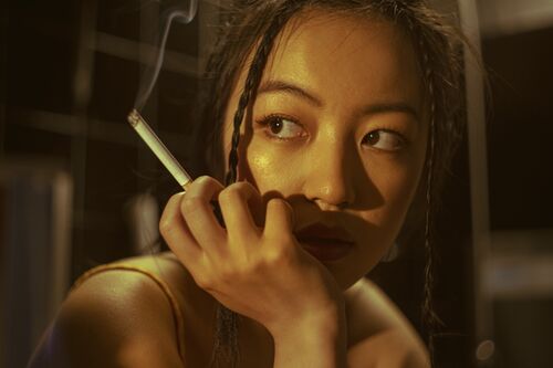
In this image,my model appears to be in an industrial environment - a new city. It looks like it's a back room of a business. Lighting is very harsh and cinematic. What makes lighting cinematic in my work, is that it alludes to something off screen. It tells us a story of something that might be happening. Implication that she is reacting to where the lighting is coming from - perhaps a door has just opened. There is a narrative here; there is a cautiousness in her eyes almost, but at the same time she looks almost bored and uncaring. This could be a work environment and she shouldn't be smoking. Smoking is used a lot as a way of de-stressing, maybe she hates her job and she is coping with it by smoking. The idea was that she was working in a soup kitchen and sabotaging her work; her hair is too polished almost for the job. Like she is dressing for the job she wants and not for the one she has. It's a badge of her independence.
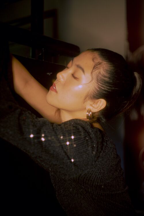
This is supposed to look like an analog clubbing snapshot, and not like a cinema still.
In this image, the model is on a night out, wearing a glittery dress. Her ponytail is a very polished one with the hair embellishments. It’s very much a clubbing outfit.
Harsher lighting that was supposed to imitate a harsh flash from the camera itself. There’s a harsh light beam on the side of her face; almost the product of using a fast flash. The light it not supposed to be perfect, it’s supposed to capture the subject quickly and in the moment. I also used a star filter in order to place an emphasis on the glitter and because it gives the photo a more 80’s feel.
I used a digital camera with the use of a helios lens. This lens doesn’t have autofocus and tones down the colours a little bit, creating a dreamier look. This use of forced manual focus, allows me feel like I’m using my own analog camera while still shooting digital; it’s kind of like I’m trying to find a shooting style that mixes these two elements of analog and digital shooting styles.
The pose is very disconnected to the camera. She’s not noticing that someone is photographing her. Her eyes are closed; she is very much basking in a private feeling of euphoria. She is feeling the music or the drugs. She is either not present at all or too present.
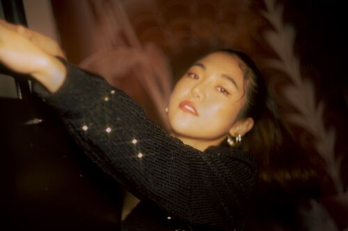
This image has the same imaged story as the last one, however there’s more movement. The model is noticing the camera, but it feels like she’s still not entirely making contact with the camera. She has a dreamy, disconnected look in her eyes.
The focus is not entirely on her face, but a piece of arm just in front of it. This implies movement; as if she swung backward as the photographer was taking the photo.
These photos, to me, are a perfect example of an “in the moment” photo, because it doesn’t feel like the model is specifically there to be photographed. The Photographer is documenting a moment. This is because the model has this disconnected look from the photographer. So while she is aware of him; it’s almost like her attention isn’t on specifically taking this photo.
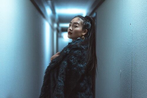
These images were greatly inspired by the style of the movie "In the Mood for Love" By Wong Kar wai. This film a particular colour range; a yellow-greenish, mostly warm toned aesthetic with a high contrast and yet a softness to it. I will also draw on the influence of asian analog photographers who use a similar aesthetic of this grainy, green toned, nostalgic aesthetic. With this style, I want these images to put the viewer in a particular nostalgic place.
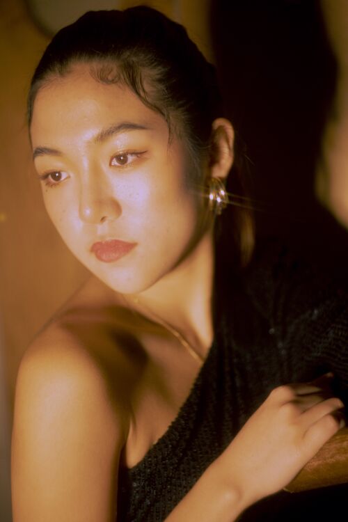
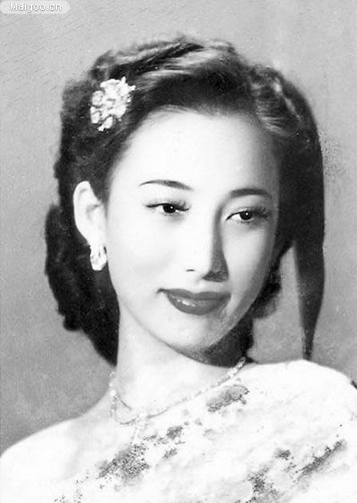
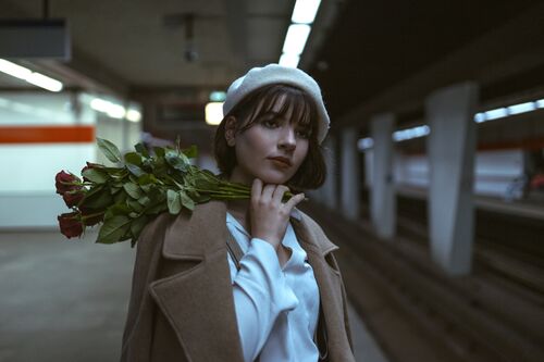
The model has statuesque pose; like a doll. It might be, in this series of photos, taken before the other two pictures were taken. It looks a little bit more like she has just arrived, she looks a lot more proper and composed compared to the other pictures. And even though she isn't looking at the camera, it seems like she is a little more aware that she is being photographed. By the doll-like and statuesque pose, I would think that she is some sort of heiress living in the 50's or 40's, an example of a portrait I would compare it to is seen on the right. I wanted to use flash-like light, to make it look like a deliberate portrait, and not so much a cinematic still, as mentioned above.
These images were shot digitally and colour graded and lit to have an analogue and cinematic blend style. This promotes, to me, the best of both worlds; combining my digital shooting method with the style and nostalgia of an analog look. I want these photographs to have a feeling of being a quick snapshot while at the same time being a little too dreamy and stylised to create the feeling of it being a memory that is romanticised.
I'm trying to make a classic asian aesthetics; I only follow asian photography Korean, Japanese and Chinese aesthetic. I did not grow in this culture but want to connect with it. Perhaps this is common with 2nd and 3rd generation immigrants. I feel a real need to connect with these aesthetics and the culture.
Please make these images bigger
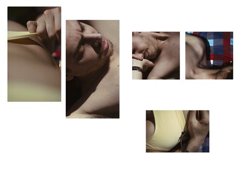
New section: actual 'memories'
Then I moved on to the creation of the actual 'memories'.
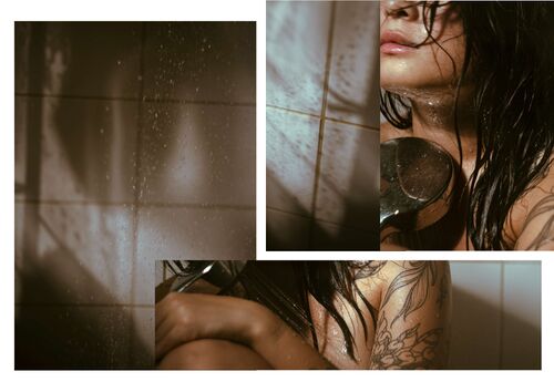
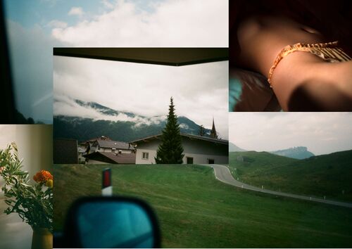
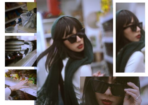
[these images are 'stacked' Why? What happens if you arrange these images in a series, how do you read them as narrative? Lt's talk through what different experiences the viewer has with different arrangements of these images.]
These images are fragments and details of a moment pieced together to create a larger story. These ‘collages’ are works that show how I remember moments; in small and intimate fragments that together create the whole memory. I wanted them to have an intense and intimate feeling to it by taking details and almost vague composition in order for the audience to have to guess what is happening. In a way inviting active thought and fantasy to the work. By also incorporating the darker/moodier style of the my previous style experiment; I wanted to create a bittersweet memory that is focussed on intimacy.
By using intimate and/or vague compositions, I tried to create a sense of wonder in the audience. Combining these in a couple of different ways, I wanted to see what the image would tell as a collage. By three out of four of the examples, I used myself or my boyfriend as a foundation in order to warm up to taking these intimate compositions and seeing if the work actually made the impact on me that I wanted. In the fourth image (in the supermarket) I used the Helios lens, that is only focussed manually, and shot my model in a way that conveyed movement and out of focus. A blurry memory.
This is the foundation on which I wanted to build my project, exploring more within the realm of intimacy starting with myself as a way of warming up to these intimate compositions. I thought a lot about wanting to convey intimacy and emotion in my work. My first thought on these themes was memories because I felt like having lived life, remembering and having experiences and looking back at them, reminiscing, can be a very intimate and emotional experience. However as I made the work I started to wonder if this is really the direction I wanted to go in.
My first qualm about this work was; while I like the style that I was drawing my inspiration from, I did not like that I shoved my work into a very depressing palette and aesthetic. While making the experiments about the memories I wondered if this represented me right now, or if it was an echo from the work and style that I started out with. I felt like keeping up with this style stunted my possible growth and development as a photographer.
My goal at first was to make memories that are universally relatable in an attempt to make anyone feel the emotions of that particular moment, however I felt like that foundation would be very removed from me as a person and what makes my work interesting is because it’s my work in particular. So how would I make my work more hyper personal? What makes my work MINE?
Asking myself the question "Why do I want to make it?" more clearly helped me inch closer to what I really want to make and how I want to make it.
I have always been moved by "slice of life" type images and artworks, there is something poetic [what does that term mean to you?]about a piece of artwork that shows you a normal everyday scenario that you are not a part of and can still give that feeling of having been there. It gives me a feeling of now-ness while never actually having experienced that particular moment. Examples of these kinds of moments in the movies Totoro and Kiki's Delivery Service below, in which an absolutely mundane moment is captured, however I am transported to relaxing, stress free summer days.
Another big reason I want to create this type of art is because slice of life Anime was a big part of my escapism sources in childhood. They were essentially a coping mechanism for my younger self to deal with an unstable environment by mentally transporting myself into different, more stress free and wholesome worlds.
Going back to this realisation and ultimately accepting it as my foundation for how I view art, has made me realise I want to go back to these inspirations and use my childhood motivations as the source for my work. Another big reason for choosing Ghibli as a foundation for my inspiration, is because it not only connects to my escapism, but because as an Asian woman growing up in the Netherlands I didn't have much media that I felt I could connect to.
In and out of fashion
laundrette 2
I want to get away from the fashion direction where the pose and the gaze define it as such. The two images above , laundrette 1 and laundrette 2 (2022) show this transition. In the 2nd laundrette image the model is looking in the camera with an attitude; she's very present and she accepts the focus; she does not blend into the background and therefore the model is the most important thing in this picture. This is contrast to picture 1 where the model's presentation is more modest; more in the 'slice of life' there is more interaction with her surroundings; the pose is less to be seen and more natural. She is interested in something other than the viewer. The gaze is difference. The 'stage' is bigger, we can see more. This pose is more natural.
In 2 she is sitting in a washing machine; why? In a fashion photo it seems natural but in a 'slice of life photo it wouldn't look like that is a natural position for her to just be in. In 2 she takes control of the photo, and in picture 1 it feels like I am taking control of the photo and what is happening.
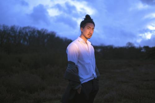
The setting is a blue hour, but there’s a strip of light on the models face. It clearly cuts off at just bellow his shoulders; insinuating that it might be a flash light or a car headlight shining on him. Also because the light is very warm compared to his surroundings. This lighting to me, feels like it’s more cinematic. It’s telling us something about the narrative; it’s not just there to light the subject.
His pose is a little slouchy, which suggests that he is kind of done with his day. He is wearing a white collared shirt, but it’s not ironed and his buttons are open, his blazer has dropped to around his elbows; he is a white collar corporate man but does he want to be? His longer hair suggests a bit of rebellion and wanting to retain identity.
He is reacting to this light, but he doesn’t look like he was waiting for it. This suggests that this man might have wanted to have a solo, pensive walk in nature to clear his head, but someone has found him or is interrupting him. He doesn’t seem happy that he is not alone right now, he seems annoyed.
[<<Please make this image bigger, so we can make a comparison between your image and the film still]
My inspiration for this photograph was the movie Minari. bellow there's a gallery film still of what I mean, but not sure if I want to include it because now my work just looks like a dollar store knock off sheesh
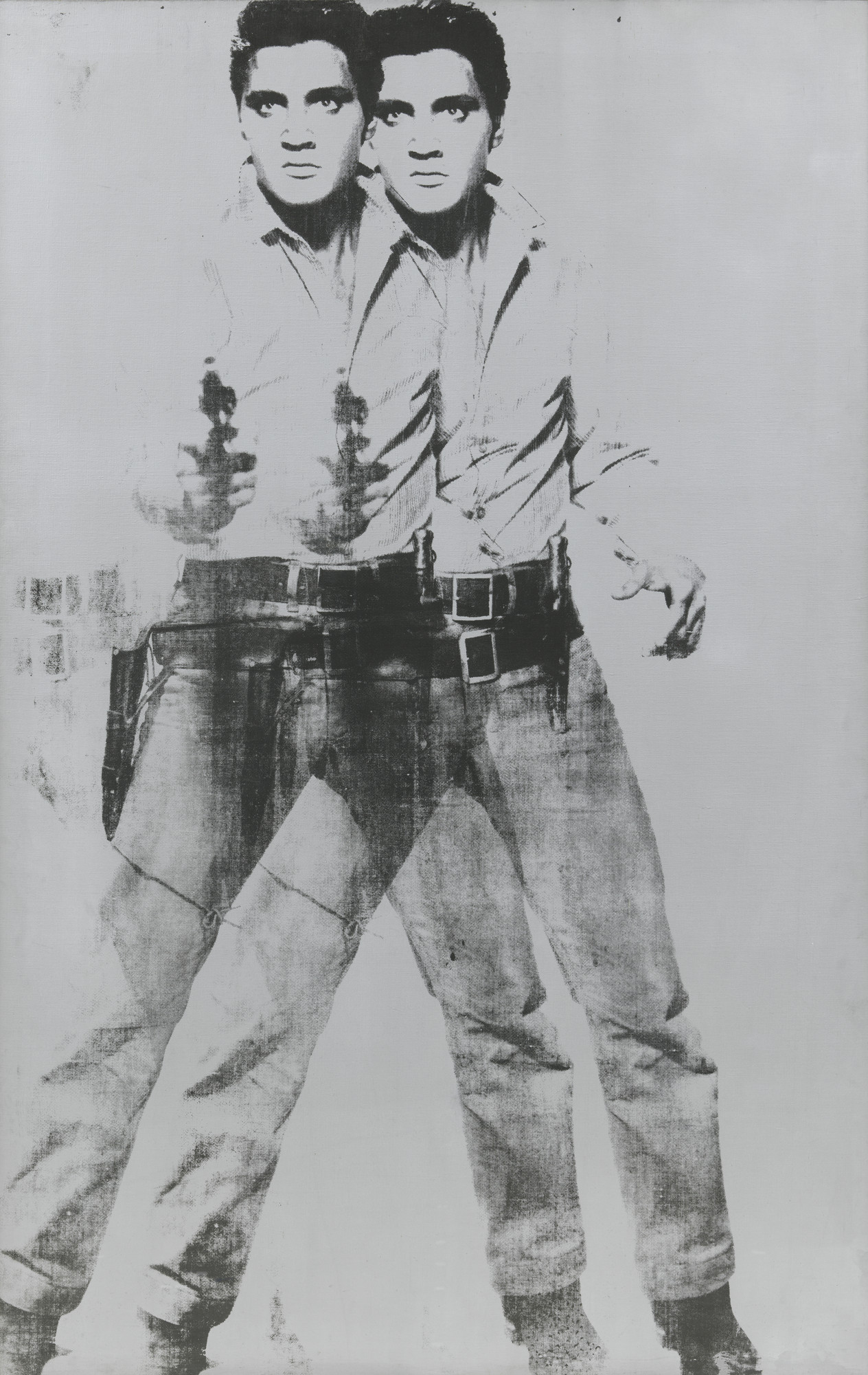
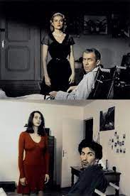
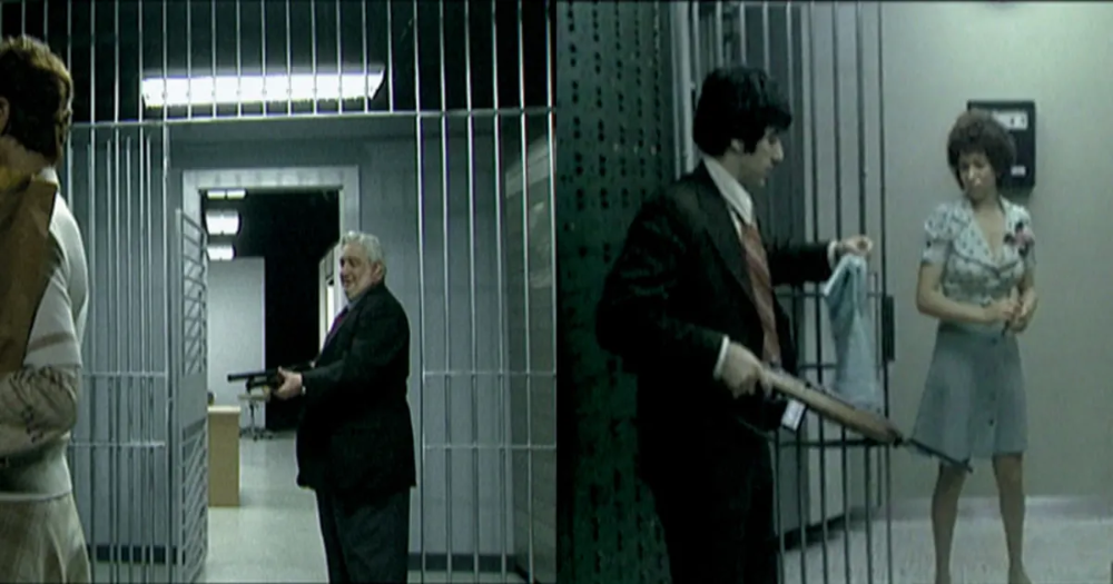
[Steve comments: Ha! But there is a tradition of artists and filmmakers REENACTING scenes from famous films. Artists like Pierre Huyghe and Gavin Turk made their reputations through appropriating images from famous art and film. Doing this sets up a lot of interesting questions about identity and originality. Looking back at Cindy Sherman, even in the early 1960s she was reenacting film stills. I strongly think if reenactment is part of the motivation of your work you should embrace it and acknowledge it... If we look at you own work alongside these famous artists, we can recognise the same fascination and interest; this is the mode of 'remediation' and 'post production' which is well established in art discourse, all you need to do is acknowledge it. We are all always quoting from other texts, images and films, the artists below acknowledge this- that we build our identities and the way we present to the world from existing images, you are doing the same, collecting images from different parts of your life and building something which is your own...]
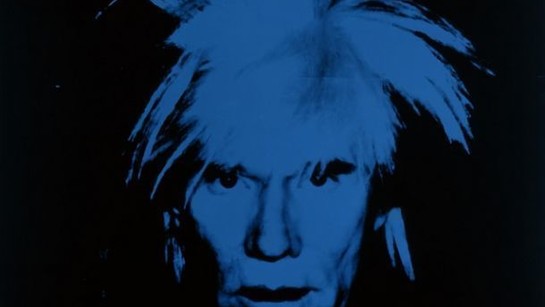
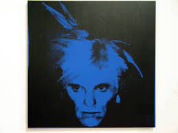
Warhol
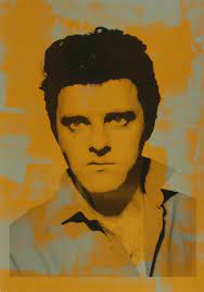
Gavin Turk as Warhol
Warhol's Elvis
Gavin Turk as Warhol's Elvis
Huyghe's re-enactment of Hitchcock's Rear Window
Pierre Huyghe's re-enactment of Sidney Lumet's Dog Day Afternoon
[Steve comments: Earlier in the text you state that you want to reappropriate these forms from asian culture and that is important to you. You should OWN this desire and recognise that desire in Cindy Sherman and the artists illustrated above to do the same. We live in a visual culture which mashes, rips, steals and borrows- we can use this as a way to fashion our own identities and to make sense of the world around us.]
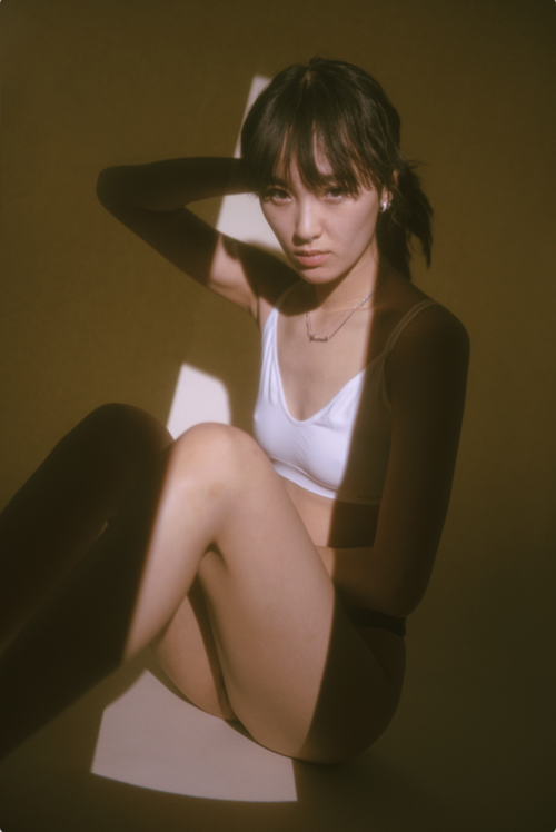
Komorebi: In real life, the space between the canopy and branches allows sunlight to gently filter through. In Japan, the dappled light this creates is called komorebi (pronounced koh-mo-reh-bee) and is made up of the kanji characters for tree (木), shine through (漏れ), and sun (日)
This is one of my latest experiments with the term "Komorebi" in mind
I still have to write a text on this, but I only shot it this week so I haven't had much time to really let the work sink in!
use the method we discussed for each image
the model
lighting
costume
imagined situation
We discussed these
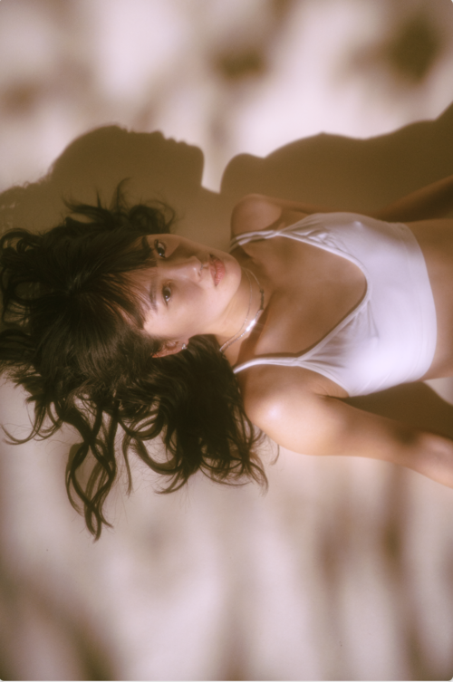
1) feels like and open space; a dreamscape; what does the shadow do? It makes her see weightless; flatness of shadow form of model
2. there is a beginning and an end to it, a window frame in which the model appears to be pushing herself. in 2 the shadows of the canopy feels like she is in nature (clouds or under a tree) The gaze: the model insisted in looking
Write about the models: now noticing the differences between models. a) fluent in the way she does it, like she is telling a story and b) a posing model which his more 'editorial' and presentational of a particular thing... I'm finding out who I prefer to work with.. maybe models who respond to the situation and allow a flow... 'micro-narrative' - her own bubble with her own story...
Re-enactment, re-mediation and postproduction
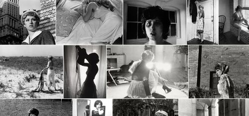
In this series Cindy Sherman created self portraits in which she creates distinguished cinematic film stills. In Cindy Sherman - Untitled Film Stills, 1977-1980 Josephine Van de Walle writes: "Cindy Sherman played with the slipperiness of identity. In Untitled Film Stills, but also in all her later series, it is always Sherman herself who is in front of the camera. Yet these images are never really self-portraits. Sherman uses photography as a tool to deceive, and evades her own personality by taking on different identities." [1] This relates to my project as I am creating artificial memories and scenes that have a genuine quality to them, while at the same time being mostly, if not completely, staged.
Untitled Film Stills (1977-1980) Cindy Sherman (2)
[<<Steve comments: great! Please unpack this more. Discuss you practice in relation to others who restage 'found' images]
[Please make reference images bigger]
[Steve asks: In On Photography Susan Sontag mentions a type of photo which is ``a thin slice of space [and] time (Sontag 1979). Please unpack what Sontag means by that term and discuss it in relation to your own use of the term 'slice of life' photography]
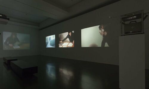
*Film Script (Manipulation of Meaning)(1972) David Lamelas (1) David Lamelas creates a "film" by projecting a series of cinematic photography slides (almost like film stills) next to each other. This relates to my project as my goal is to also create a scene by using a combination of photographs.
[What is similar, what is different to your own work? Maybe bring in a Lamelas image and compare it with one of your own... or compare how he makes a series of 'movie' like images and how you make a series...]
[<Make these images larger.]
Notes from earlier versions
context and motivation
[Steve suggests; move this to the front [see above]
My parents are from Surinam and I would refer to myself as "a fake Asian" as I am mixed Chinese-Vietnamese-Whatever and did not grow up traditionally with Asian culture. So even though Anime is very much Japanese, because I wouldn't place myself in a certain country, I would try to have this connection with anything Asia-related. I feel like growing up I kind of became ashamed of my appearance and kind of got away from accepting myself; however as I turned 25 I felt like I want to embrace what, and who I am. And therefore I have also turned my interest into almost exclusively Asian photographers, from all of Asia. Because I don't see myself in any one of those cultures specifically, I like comparing styles from different countries. And it's something I would love to explore more.
Another thing I would like to see more of, is the re-appropriation of cultural cliches and see someone wear a kimono, or African dress with pride in a Western country. I know people who are embarrassed to wear their traditional dress. So I would like to see this normalised. In the Netherlands I have seen a lot of Dutch people "dress up" as a person of color, which I think is very tasteless. I hate seeing the use of an Asian straw hat as a way to almost ridicule and stereotype one people. I want more of my work to also dabble in this re-appropriation.
However, that being said; I am not necessarily interested in creating work that is heavy with political messaging and I'm not interested it presenting it with those connotations.
[S suggests<<Here you are defining yourself in NEGATIVE TERMS. Rather than ay what you DON'T want to do, describe what you DO want to do in positive terms.]
After coming to this realisation I also found my interest in the dark and moody aesthetic dwindle and finding a new interest in the lighter and cheerful color palette of Ghibli. A movie that is very in line with this slice of life, summer and stress free aesthetic was the movie "Sideways" by Alexander Payne, in which two friends travel to wine country to enjoy a relaxing and intellectually stimulating holiday.
[Steve notes: you choose a lot of images of people lying down, and you make a lot of images of people lying down]
I also became interested in Japanese analog photographers, who also use this lighter style and palette that studio Ghibli uses (Which may or may not be in correlation to one another). I found two photographers, Kuji Rena (2) and Iwakura Shiori (3), that embody this aesthetic in their work quite well.
The reason these works speak to me is not only the style which are aesthetically very much in line with the Ghibli style, but also because they have a quiet dignity to them. They are subtle and personal and are a perfect example of the romanticisation of the mundane. It's seeing the beauty in the little moments and enjoying them to the fullest. Celebrating what is most important in life: the joy of living, whenever and whatever we are doing.
And while celebrating the joy of living might be one of the most "Live, laugh, love" things to say; to me this new direction is a very personal one because anxiety, depression and darkness have been a big part of my life. And thus I am not surprised the dark and moody style was once my reality, because that is how I viewed the world. Now, with me healing mentally, I am able to appreciate and see the beauty of life and suddenly looking to experiencing it; and mindfulness is a big part of that.
And so: Slice of life, romanticising the mundane, appreciating the moment, being mindful is the direction I want to take my work in. Snapshots rather than film stills. The reason I am stepping off the "film still" concept is because I feel that forces my work in a more anti-personal direction, because it is a rule that the model would not be able to interact with the camera. Stepping off of calling my work film stills, will give me more freedom to experiment with and find value in my work without having to label it specifically.
What do I value about the work I have made: I am going back to my source - me at my purest form, when I was a kid- I got removed from that in recent years and want to connect with that. For example: the work in the launderette below. The colours give a whimsical view, casual and playful. It is a chore doing the washing but from the point of view of a child anything can be interesting. This is why Ghibli is a useful source.
[Steve notes: there are a lot of pictures of people lying down in the pictures you choose and in the pictures you make...]
Relation to a larger context
This project will be my contribution to the slice of life style art. Below some screenshots of the movie Minari, which is about a Korean family in America that struggles to life off of a new farm they just moved to. While it's not spectacular in the same way that action movies are, and even though not everyone suffers the exact same struggles as they do; there is still a relatability in the way that the family is trying to keep afloat together, while still finding small hopeful moments in each other.
I hope to create the same types of artworks where the viewer can have a relatability in my work that is entirely shaped by how their life experiences are. Essentially finding common ground, despite different pasts, presents and futures.
Bibliography and references
Texts
- The Power of Now - Echkart Tolle " => [The book] presents itself as a discussion about how people interact with themselves and others. The concept of self reflection and presence in the moment."
- Once More... with Feeling: Reenactment in Contemporary Art and Culture, Robert Blackson, Art Journal Vol. 66, No. 1 (Spring, 2007), pp. 28-40 [<<you can get this text from jstor]
- Experience, Memory Re-enactment, Steve Rushton ed
Films
- In the Mood for Love Wong Kar-wai (2000)
- Minari Lee Isaac Chung (2021)
- My Neighbour Totoro Hayao Miyazaki (1988)
- Kiki's Delivery Service Hayao Miyazaki (1989)
- Sideways Alexander Payne (2004)
I choose these movies as my references because some of them have a "slice of life" element to them. Scenic/cinematographic and story wise I feel like they can have a relatability to different types of people because they can be interpreted in your own way, while still having a concrete idea of what is happening.
[cut from above]Below is a good example of what the memories would look like. They are scenarios that are all part of a bigger journey. It tells how the character experiences her journey. It is a relatable moment with which we can empathise and almost transport ourselves into that scenario and how we would feel ourselves.
[S: is this a 'cinematic experience'? Unpack what is happening here- unpack what the relation between cinema and memory are for you. Are your photos cinema stills? If so, what does it mean to make a cinema still? Are What is the relation between 'slice of life' pictures, movie stills and your photos?]
Who can help you and how?
Right now I have found some courses on Domestika that might be beneficial to the research I am doing:
- Self-Portrait as a Personal Diary by Daniella Benedetti
- Emotive Photography: Create Real, Up-close Images by Carol Peña
Other than that I've been asked some critical questions that I struggle with and can help me closer to my goal, like:
- What makes a photograph cross the line of being more a pretty photo?
- Is this project more about mindfulness rather than the theme I am building this proposal around?
- How do I train myself to speak more about my work with deeper layers?
- Can I create a poetic layering in images without literally layering them?
- What would happen if I make this project more hyper-personal to my experiences instead of making work that I would deem "universally relatable?"
- What would happen if I dive more into the source of the "why do I want to make this?" question? (Escapism)
As I have made more of these "memory" experiments, I found that I don't necessarily know if that is the direction I want to take exactly and narratively. I would like to continue with the style references and I am very interested in creating an experience close to these memories, but perhaps not exactly that way. By asking myself these questions above, I would like to see if my project takes me in a direction that I am connected to a little bit more. Having more tutorials during my process can potentially help me unlock the "answer" I am looking for a little more,
Possible Exhibition outcomes/experiments
As for the exhibition; I would like to create a space in which it feels like the audience is "thrown" into these artificial memories that I created. I want this to feel organic and almost whimsical, like walking into a fantasy world made of memories. Therefore, I would love to eventually experiment with the following scenarios:
- Projection on Cloth (1): This would be a room where the audience would walk through a maze of cloth with projections on them as cloth is organic and the movement of the material brings a whimsy to the experience. This cloth could be a wrinkled type of linen to show the fragmentation and imperfections recalled of memories.
- Fragmented projections (2): This would be one or several walls with fragmented images projected on them. They would be changing constantly like as if you're watching someone remember different memories at once.
- Hanging polaroids (3): This installation would be comprised of lots of printed photos on thread. The audience would be walking in between them as if overwhelmed by all the life experiences and memories.
Within these installations I would be experimenting with music and lighting but do not yet know what particular lighting and music I would use as of yet and is a question I will be answering during my experiment.
Timetable
Oct-dec
- Make LOTS of prototypes, experiment all day, every day; experiment with narrative devices, find out what works and what doesn't; try out different display possibilities
- Shoot with models - main focus on developing analog style, composition experiments. Try to have a shoot every other week with the models, hoping to get more of a knack to storytelling compositions and will experiment with crops of the images in combination with each other.
- My own intimate moments - Main focus on composition.
Jan-Feb
- Shoots with models - Combine composition and style
- Start really experimenting with display possibilities
Feb-
- The work as a result of these experiments.
FIRST DRAFT
Untitled
A study on slice of life photographs.
New text since last meeting (10-02-2022)
Toward Slice of life works
In the previous work I did before joining PZ I’ve experimented a lot with creating cinematic scenes, almost like a screenshot out of a movie. These examples below were created with a scene in mind where the character in the story is either on their way somewhere or waiting for something. Back then I created the images with the ultimate goal of wanting to achieve this slice of life type of storytelling that is the goal of the thesis I am writing, however I felt that they lacked the narrative depth that I am currently in search of.
While these images are no longer representative of my current work and research, the underlying goal that I was trying to create is still an ongoing journey for me.
The dictionary definition of Slice of Life is: "a realistic representation of everyday experience in a film, play, or book." But what does it mean to me? To me slice of life work romanticises the mundane. I would see it as an analysis in which the work would highlight a "boring" scenario but find a way to highlight a certain beauty or calmness in that moment. Almost like a mindfulness practice of the photographer. [a) One look Susan Sontag's meaning of Slice of life, On Photography. b) look at the idea of the 'everyday' in culture and art. [Steve asks: In On Photography Susan Sontag mentions a type of photo which is``a thin slice of space [and] time (Sontag 1979). Please unpack what Sontag means by that term and discuss it in relation to your own use of the term 'slice of life' photography]]
One of the first experiments that I did was an analysis on memory.
I wanted to recreate moments of intimacy that provoke and convey emotion. These works would, too, have a "slice of life" element to them; by which I mean, universally relatable, specific moments that we all share. This concept also touched on the subject of mindfulness; these memories would be shot and composed in the way that I remember them: in fragments and details of a moment that comprise a story. Like being transported back to that moment.
The example below is a good example of what the memories would look like. They are scenarios that are all part of a bigger journey. It is telling is how the character experiences her journey. It is a relatable moment with which we can empathise and almost transport ourselves into that scenario and how we would feel ourselves.
[S: is this a 'cinematic experience'? Unpack what is happening here- unpack what the relation between cinema and memory are for you. Are your photos cinema stills? If so, what does it mean to make a cinema still? Are What is the relation between 'slice of life' pictures, movie stills and your photos?]
Style studies and experiments
Before I started experimenting with the memories; I focussed on style. Using the vocabulary of photography and cinema I tried to establish what this changes in my narrative. What does lighting do to a certain mood of the photograph? What does composition do with the intensity of a scene? And what do colours tell us about a moment?
My model appears to be in an industrial environment - a new city. It looks like it's a back room of a business. Lighting is very harsh and cinematic. What makes lighting cinematic in my work, is that it alludes to something off screen. It tells us a story of something that might be happening. Implication that she is reacting to where the lighting is coming from - perhaps a door has just opened. There is a narrative here; there is a cautiousness in her eyes almost, but at the same time she looks almost bored and uncaring. This could be a work environment and she shouldn't be smoking. Smoking is used a lot as a way of de-stressing, maybe she hates her job and she is coping with it by smoking. The idea was that she was working in a soup kitchen and sabotaging her work; her hair is too polished almost for the job. Like she is dressing for the job she wants and not for the one she has. It's a badge of her independence.
This wasn’t supposed to have the look of a cinema still, the purpose of this photo was to make it look like an analog clubbing snapshot.
The model is on a night out, she is wearing a glittery dress. Her ponytail is a very polished one with the hair embellishments. It’s very much a clubbing outfit.
Harsher lighting that was supposed to imitate a harsh flash from the camera itself. There’s a harsh light beam on the side of her face; almost the product of using a fast flash. The light it not supposed to be perfect, it’s supposed to capture the subject quickly and in the moment. I also used a star filter in order to place an emphasis on the glitter and because it gives the photo a more 80’s feel.
I used a digital camera with the use of a helios lens. This lens doesn’t have autofocus and tones down the colours a little bit, creating a dreamier look. This use of forced manual focus, allows me feel like I’m using my own analog camera while still shooting digital; it’s kind of like I’m trying to find a shooting style that mixes these two elements of analog and digital shooting styles.
The pose is very disconnected to the camera. She’s not noticing that someone is photographing her. Her eyes are closed; she is very much basking in a private feeling of euphoria. She is feeling the music or the drugs. She is either not present at all or too present.

This image has the same imaged story as the last one, however there’s more movement. The model is noticing the camera, but it feels like she’s still not entirely making contact with the camera. She has a dreamy, disconnected look in her eyes.
The focus is not entirely on her face, but a piece of arm just in front of it. This implies movement; as if she swung backward as the photographer was taking the photo.
These photos, to me, are a perfect example of an “in the moment” photo, because it doesn’t feel like the model is specifically there to be photographed. The Photographer is documenting a moment. This is because the model has this disconnected look from the photographer. So while she is aware of him; it’s almost like her attention isn’t on specifically taking this photo.
These images were greatly inspired by the style of the movie "In the Mood for Love" By Wong Kar wai. This film a particular colour range; a yellow-greenish, mostly warm toned aesthetic with a high contrast and yet a softness to it. I will also draw on the influence of asian analog photographers who use a similar aesthetic of this grainy, green toned, nostalgic aesthetic. With this style, I want these images to put the viewer in a particular nostalgic place.


The model has statuesque pose; like a doll. It might be, in this series of photos, taken before the other two pictures were taken. It looks a little bit more like she has just arrived, she looks a lot more proper and composed compared to the other pictures. And even though she isn't looking at the camera, it seems like she is a little more aware that she is being photographed. By the doll-like and statuesque pose, I would think that she is some sort of heiress living in the 50's or 40's, an example of a portrait I would compare it to is seen on the right. I wanted to use flash-like light, to make it look like a deliberate portrait, and not so much a cinematic still, as mentioned above.
These images were shot digitally and colour graded and lit to have an analogue and cinematic blend style. This promotes, to me, the best of both worlds; combining my digital shooting method with the style and nostalgia of an analog look. I want these photographs to have a feeling of being a quick snapshot while at the same time being a little too dreamy and stylised to create the feeling of it being a memory that is romanticised.
I'm trying to make a classic asian aesthetics; I only follow asian photography Korean, Japanese and Chinese aesthetic. I did not grow in this culture but want to connect with it. Perhaps this is common with 2nd and 3rd generation immigrants. I feel a real need to connect with these aesthetics and the culture.
Then I moved on to the creation of the actual 'memories'.
[these images are 'stacked' Why? What happens if you arrange these images in a series, how do you read them as narrative? Lt's talk through what different experiences the viewer has with different arrangements of these images.]
What
Fragments and details of a moment pieced together to create a larger story. These ‘collages’ are works that show how I remember moments; in small and intimate fragments that together create the whole memory.  I wanted them to have an intense and intimate feeling to it by taking details and almost vague composition in order for the audience to have to guess what is happening. In a way inviting active thought and fantasy to the work. By also incorporating the darker/moodier style of the my previous style experiment; I wanted to create a bittersweet memory that is focussed on intimacy.

How
By using intimate and/or vague compositions, I tried to create a sense of wonder in the audience. Combining these in a couple of different ways, I wanted to see what the image would tell as a collage. By three out of four of the examples, I used myself or my boyfriend as a foundation in order to warm up to taking these intimate compositions and seeing if the work actually made the impact on me that I wanted. In the fourth image (in the supermarket) I used the Helios lens, that is only focussed manually, and shot my model in a way that conveyed movement and out of focus. A blurry memory.

Why
This is the foundation on which I wanted to build my project, exploring more within the realm of intimacy starting with myself as a way of warming up to these intimate compositions. I thought a lot about wanting to convey intimacy and emotion in my work. My first thought on these themes was memories because I felt like having lived life, remembering and having experiences and looking back at them, reminiscing, can be a very intimate and emotional experience. However as I made the work I started to wonder if this is really the direction I wanted to go in.
My first qualm about this work was; while I like the style that I was drawing my inspiration from, I did not like that I shoved my work into a very depressing palette and aesthetic. While making the experiments about the memories I wondered if this represented me right now, or if it was an echo from the work and style that I started out with. I felt like keeping up with this style stunted my possible growth and development as a photographer.
My goal at first was to make memories that are universally relatable in an attempt to make anyone feel the emotions of that particular moment, however I felt like that foundation would be very removed from me as a person and what makes my work interesting is because it’s my work in particular. So how would I make my work more hyper personal? What makes my work MINE?
Asking myself the question "Why do I want to make it?" more clearly helped me inch closer to what I really want to make and how I want to make it.
Why do you want to make it?
I have always been moved by "slice of life" type images and artworks, there is something poetic [what does that term mean to you?]about a piece of artwork that shows you a normal everyday scenario that you are not a part of and can still give that feeling of having been there. It gives me a feeling of now-ness while never actually having experienced that particular moment. Examples of these kinds of moments in the movies Totoro and Kiki's Delivery Service below, in which an absolutely mundane moment is captured, however I am transported to relaxing, stress free summer days.
Another big reason I want to create this type of art is because slice of life Anime was a big part of my escapism sources in childhood. They were essentially a coping mechanism for my younger self to deal with an unstable environment by mentally transporting myself into different, more stress free and wholesome worlds.
Going back to this realisation and ultimately accepting it as my foundation for how I view art, has made me realise I want to go back to these inspirations and use my childhood motivations as the source for my work. Another big reason for choosing Ghibli as a foundation for my inspiration, is because it not only connects to my escapism, but because as an Asian woman growing up in the Netherlands I didn't have much media that I felt I could connect to.
My parents are from Surinam and I would refer to myself as "a fake Asian" as I am mixed Chinese-Vietnamese-Whatever and did not grow up traditionally with Asian culture. So even though Anime is very much Japanese, because I wouldn't place myself in a certain country, I would try to have this connection with anything Asia-related. I feel like growing up I kind of became ashamed of my appearance and kind of got away from accepting myself; however as I turned 25 I felt like I want to embrace what, and who I am. And therefore I have also turned my interest into almost exclusively Asian photographers, from all of Asia. Because I don't see myself in any one of those cultures specifically, I like comparing styles from different countries. And it's something I would love to explore more.
Another thing I would like to see more of, is the re-appropriation of cultural cliches and see someone wear a kimono, or African dress with pride in a Western country. I know people who are embarrassed to wear their traditional dress. So I would like to see this normalised. In the Netherlands I have seen a lot of Dutch people "dress up" as a person of color, which I think is very tasteless. I hate seeing the use of an Asian straw hat as a way to almost ridicule and stereotype one people. I want more of my work to also dabble in this re-appropriation.
However, that being said; I am not necessarily interested in creating work that is heavy with political messaging and I'm not interested it presenting it with those connotations. [S suggests<<Here you are defining yourself in NEGATIVE TERMS. Rather than ay what you DON'T want to do, describe what you DO want to do in positive terms.]
After coming to this realisation I also found my interest in the dark and moody aesthetic dwindle and finding a new interest in the lighter and cheerful color palette of Ghibli. A movie that is very in line with this slice of life, summer and stress free aesthetic was the movie "Sideways" by Alexander Payne, in which two friends travel to wine country to enjoy a relaxing and intellectually stimulating holiday.
I also became interested in Japanese analog photographers, who also use this lighter style and palette that studio Ghibli uses (Which may or may not be in correlation to one another). I found two photographers, Kuji Rena (2) and Iwakura Shiori (3), that embody this aesthetic in their work quite well.
The reason these works speak to me is not only the style which are aesthetically very much in line with the Ghibli style, but also because they have a quiet dignity to them. They are subtle and personal and are a perfect example of the romanticisation of the mundane. It's seeing the beauty in the little moments and enjoying them to the fullest. Celebrating what is most important in life: the joy of living, whenever and whatever we are doing.
And while celebrating the joy of living might be one of the most "Live, laugh, love" things to say; to me this new direction is a very personal one because anxiety, depression and darkness have been a big part of my life. And thus I am not surprised the dark and moody style was once my reality, because that is how I viewed the world. Now, with me healing mentally, I am able to appreciate and see the beauty of life and suddenly looking to experiencing it; and mindfulness is a big part of that.
And so: Slice of life, romanticising the mundane, appreciating the moment, being mindful is the direction I want to take my work in. Snapshots rather than film stills. The reason I am stepping off the "film still" concept is because I feel that forces my work in a more anti-personal direction, because it is a rule that the model would not be able to interact with the camera. Stepping off of calling my work film stills, will give me more freedom to experiment with and find value in my work without having to label it specifically.
What do I value about the work I have made: I am going back to my source - me at my purest form, when I was a kid- I got removed from that in recent years and want to connect with that. For example: the work in the launderette below. The colours give a whimsical view, casual and playful. It is a chore doing the washing but from the point of view of a child anything can be interesting. This is why Ghibli is a useful source.
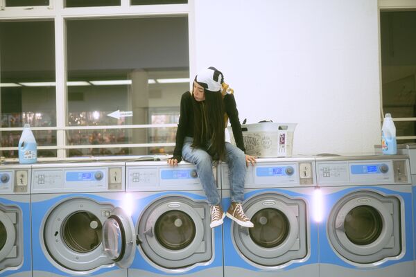
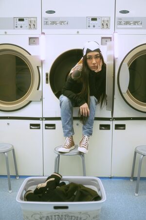
I want to get away from the fashion direction where the pose and the gaze define it as such. For instance in the 2nd laundrette image the model is looking in the camera with an attitude; she's very present and she accepts the focus; she does not blend into the background and therefore the model is the most important thing in this picture. this is contrast to picture 1 where the model's presentation is more modest; more in the 'slice of life' there is more interaction with her surroundings; the pose is less to be seen and more natural. She is interested in something other than the viewer. The gaze is difference. The 'stage' is bigger, we can see more. This pose is more natural; in 2 she is sitting in a washing machine; why? In a fashion photo it seems natural but in a 'slice of life photo it wouldn't look like that is a natural position for her to just be in. In 2 she takes control of the photo, and in picture 1 it feels like OI am taking control of the photo and what is happening.
My inspiration for this photograph was the movie Minari. bellow there's a gallery film still of what I mean, but not sure if I want to include it because now my work just looks like a dollar store knock off sheesh
The setting is a blue hour, but there’s a strip of light on the models face. It clearly cuts off at just bellow his shoulders; insinuating that it might be a flash light or a car headlight shining on him. Also because the light is very warm compared to his surroundings. This lighting to me, feels like it’s more cinematic. It’s telling us something about the narrative; it’s not just there to light the subject.
His pose is a little slouchy, which suggests that he is kind of done with his day. He is wearing a white collared shirt, but it’s not ironed and his buttons are open, his blazer has dropped to around his elbows; he is a white collar corporate man but does he want to be? His longer hair suggests a bit of rebellion and wanting to retain identity.
He is reacting to this light, but he doesn’t look like he was waiting for it. This suggests that this man might have wanted to have a solo, pensive walk in nature to clear his head, but someone has found him or is interrupting him. He doesn’t seem happy that he is not alone right now, he seems annoyed.
Komorebi: In real life, the space between the canopy and branches allows sunlight to gently filter through. In Japan, the dappled light this creates is called komorebi (pronounced koh-mo-reh-bee) and is made up of the kanji characters for tree (木), shine through (漏れ), and sun (日)
This is one of my latest experiments with the term "Komorebi" in mind.
I still have to write a text on this, but I only shot it this week so I haven't had much time to really let the work sink in!
Relation to a larger context
This project will be my contribution to the slice of life style art. Below some screenshots of the movie Minari, which is about a Korean family in America that struggles to life off of a new farm they just moved to. While it's not spectacular in the same way that action movies are, and even though not everyone suffers the exact same struggles as they do; there is still a relatability in the way that the family is trying to keep afloat together, while still finding small hopeful moments in each other.
I hope to create the same types of artworks where the viewer can have a relatability in my work that is entirely shaped by how their life experiences are. Essentially finding common ground, despite different pasts, presents and futures.
Who can help you and how?
Right now I have found some courses on Domestika that might be beneficial to the research I am doing:
- Self-Portrait as a Personal Diary by Daniella Benedetti
- Emotive Photography: Create Real, Up-close Images by Carol Peña
Other than that I've been asked some critical questions that I struggle with and can help me closer to my goal, like:
- What makes a photograph cross the line of being more a pretty photo?
- Is this project more about mindfulness rather than the theme I am building this proposal around?
- How do I train myself to speak more about my work with deeper layers?
- Can I create a poetic layering in images without literally layering them?
- What would happen if I make this project more hyper-personal to my experiences instead of making work that I would deem "universally relatable?"
- What would happen if I dive more into the source of the "why do I want to make this?" question? (Escapism)
As I have made more of these "memory" experiments, I found that I don't necessarily know if that is the direction I want to take exactly and narratively. I would like to continue with the style references and I am very interested in creating an experience close to these memories, but perhaps not exactly that way. By asking myself these questions above, I would like to see if my project takes me in a direction that I am connected to a little bit more. Having more tutorials during my process can potentially help me unlock the "answer" I am looking for a little more,
Possible Exhibition outcomes/experiments
As for the exhibition; I would like to create a space in which it feels like the audience is "thrown" into these artificial memories that I created. I want this to feel organic and almost whimsical, like walking into a fantasy world made of memories. Therefore, I would love to eventually experiment with the following scenarios:
- Projection on Cloth (1): This would be a room where the audience would walk through a maze of cloth with projections on them as cloth is organic and the movement of the material brings a whimsy to the experience. This cloth could be a wrinkled type of linen to show the fragmentation and imperfections recalled of memories.
- Fragmented projections (2): This would be one or several walls with fragmented images projected on them. They would be changing constantly like as if you're watching someone remember different memories at once.
- Hanging polaroids (3): This installation would be comprised of lots of printed photos on thread. The audience would be walking in between them as if overwhelmed by all the life experiences and memories.
Within these installations I would be experimenting with music and lighting but do not yet know what particular lighting and music I would use as of yet and is a question I will be answering during my experiment.
Timetable
Oct-dec
- Make LOTS of prototypes, experiment all day, every day; experiment with narrative devices, find out what works and what doesn't; try out different display possibilities
- Shoot with models - main focus on developing analog style, composition experiments. Try to have a shoot every other week with the models, hoping to get more of a knack to storytelling compositions and will experiment with crops of the images in combination with each other.
- My own intimate moments - Main focus on composition.
Jan-Feb
- Shoots with models - Combine composition and style
- Start really experimenting with display possibilities
Feb-
- The work as a result of these experiments.
References/bibliography
Films
- In the Mood for Love Wong Kar-wai (2000)
- Minari Lee Isaac Chung (2021)
- My Neighbour Totoro Hayao Miyazaki (1988)
- Kiki's Delivery Service Hayao Miyazaki (1989)
- Sideways Alexander Payne (2004)
I choose these movies as my references because some of them have a "slice of life" element to them. Scenic/cinematographic and story wise I feel like they can have a relatability to different types of people because they can be interpreted in your own way, while still having a concrete idea of what is happening.
Art
*Film Script (Manipulation of Meaning)(1972) David Lamelas (1)
David Lamelas creates a "film" by projecting a series of cinematic photography slides (almost like film stills) next to each other. This relates to my project as my goal is to also create a scene by using a combination of photographs.
*Untitled Film Stills (1977-1980) Cindy Sherman (2)
In this series Cindy Sherman created self portraits in which she creates distinguished cinematic film stills. In Cindy Sherman - Untitled Film Stills, 1977-1980 Josephine Van de Walle writes: "Cindy Sherman played with the slipperiness of identity. In Untitled Film Stills, but also in all her later series, it is always Sherman herself who is in front of the camera. Yet these images are never really self-portraits. Sherman uses photography as a tool to deceive, and evades her own personality by taking on different identities." [2] This relates to my project as I am creating artificial memories and scenes that have a genuine quality to them, while at the same time being mostly, if not completely, staged.
Texts
- The Power of Now - Echkart Tolle " => [The book] presents itself as a discussion about how people interact with themselves and others. The concept of self reflection and presence in the moment."
- Once More... with Feeling: Reenactment in Contemporary Art and Culture, Robert Blackson, Art Journal Vol. 66, No. 1 (Spring, 2007), pp. 28-40 [<<you can get this text from jstor]
[Steve asks: In On Photography Susan Sontag mentions a type of photo which is
``a thin slice of space [and] time (Sontag 1979). Please unpack what Sontag means by that term and discuss it in relation to your own use of the term 'slice of life' photography]

