Nami-project proposal: Difference between revisions
| Line 124: | Line 124: | ||
===<p style="font-family:helvetica">References / Bibilography</p>=== | ===<p style="font-family:helvetica">References / Bibilography</p>=== | ||
<li>Lialina, O ( | <li>Lialina, O (2020), From Me to My, Berlin, DE, Critical Interface (https://interfacecritique.net/book/olia-lialina-from-my-to-me/)</li> | ||
Another history of the WWW, 2020 | |||
<li>Lurroso, S. (Feb, 2021), The User Condition, the Lectorate Design of KABK (https://theusercondition.computer/)</li> | <li>Lurroso, S. (Feb, 2021), The User Condition, the Lectorate Design of KABK (https://theusercondition.computer/)</li> | ||
<li>Müller, B. (Sep, 2018a), Why Do All Websites Look the Same?, Modus (https://modus.medium.com/on-the-visual-weariness-of-the-web-8af1c969ce73)</li> | <li>Müller, B. (Sep, 2018a), Why Do All Websites Look the Same?, Modus (https://modus.medium.com/on-the-visual-weariness-of-the-web-8af1c969ce73)</li> | ||
<li>Müller, B. (Nov, 2018b), Balancing Creativity and Usability, Medium (https://borism.medium.com/balancing-creativity-and-usability-9bb2cd0fe929)</li> | <li>Müller, B. (Nov, 2018b), Balancing Creativity and Usability, Medium (https://borism.medium.com/balancing-creativity-and-usability-9bb2cd0fe929)</li> | ||
Revision as of 20:44, 21 November 2021
Why do you want to make?
As someone who has been studying Graphic design and working with it, I’ve been striving to find a way to be financially independent, not leaving the design industry. I am pretty much convinced that I position myself as a graphic designer, especially a web publisher, and will be working in the mainstream design industry.
It’s not hard for me to imagine most of my future tasks will be likely to embody websites with certain styles of aesthetic, formats, and functions, which are given by clients for obvious commercial purposes. From a realistic point of view, most of these works wouldn't offer me space for innovative and challenging design approaches.
But then I am, and will be, one of the designers feeling sorry about the repetitions of all the identical websites. This is honestly a dilemma for me in terms of compromising my regrets about the lack of diversity in web today with the demands of the industry.
On the other hand, however, I believe I can use my recognition of the dilemma to navigate my future career with balanced attitudes. Thus I would like to investigate the background structure under my question: "Why do most websites look so identical today?", "Why are they losing diversity?". The exploration will mainly be accompanied by researching how websites are created in the commercial design field. (In which process through? + Under which agenda?)
Looking into the influential factors of the industry will help me to understand the current challenges of the web context.
What and how do you want to make?
I expect the outcome of my project will be an archival website, documenting the exploratory questions:
- What is the background of the gradual absence of diversity in the web design industry, and how do designers and developers perceive this?
And I will explore these questions through desk and field research.
- Desk research: Reading
- Field research: Interviewing and Making participatory workshops
- In which circumstances do developers and designers extract codes from frameworks such as Bootstrap and React?
- How does it helpful/frustrative when using them?
- How do they deal with issues when they can't find the desired codes from such libraries? (ex. Some might have approached to fit their design to the frameworks so that they compromised to keep their creativities.
In contrast, some might have approached, (over)writing or implementing their own codes with research embody the result as they want.) - Have they ever had frustration to balance their creativity and work efficiency? or not really?
- Have do they perceive the ‘mobile-first’ approach?
- (Ask to net artists): How do you make your web works? (Practical process) + How much do you care making your website to be responsive on all viewports?
- Activities will be mainly rendering a few simple HTML page layouts (already made by css/javascript frameworks) together, but mainly with their knowledge and research, without relying on the code snippets from frameworks.
Target participants are both people having only a basic capacity of coding and professionals in the practice.
Through the workshops I'd like to see how do the HTML pages not using the frameworks look, and in which logic did participants code.
1) Interviewing designers and developers in the industry, asking practical process of their works (structure of the company, tools they use...), their perceptions of it, etc.
2) 0rganising coding workshops. [Clumsy code]
The format of the archival web is relevant in that I aim to explore how all the research records will be making a (new) connection, contextualised each other, not just being juxtaposed by an obsession with a term like 'objectivity'.
This archive will be meaningful for designers and developers to overview the circular structure in the field and contemplate their stances, and even use it as a context of a further discussion.
Timeline
Oct 2021˜ Dec 2021:
Nov 2021 - Dec 2021
So far my interviewees list : Francesco from XPUB1, Thomas Waalskaar (XPUB alumni, media researcher, graphic designer),Julia Luteijn (A net artist), Sander Sturing (a developer in Studio Dumbar)
Nov 2021 - Mar 2021
Dec 2021
(How photos, voice records, films, will be placed in the web context, then linked each other?
Nov 2021 ~ April 2022
Jan 2022
Feb 2022 ˜
Feb 2022 ~ Mar 2022
Apr 2022
May 2022˜
Relation to my previous practice and a larger context
My trajectory in XPUB can explain why I am particularly interested in the web context. The first year in the course was composed of making a collective publication each semester, called ‘Special Issue’. The mechanism of it was working, learning together then communicating with audiences as a group. The projects were created by collages of each student's individual interpret of subject matters. In the process of documenting my interpretation, I particularly enjoyed spreading my narratives into the ‘web’ format. Although I didn’t have advanced technical knowledge in HTML, CSS, and Javascript, I’ve been very charmed by various possibilities in aesthetics and tools of making the pages.
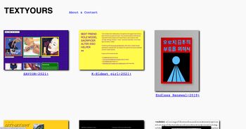
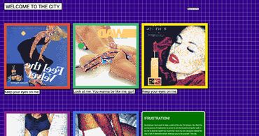
This attraction in HTML world has inspired me to create my personal essay website called ‘TEXTYOURS[[1]]’ in March 2020.
In the platform, I’ve been experimenting to create hand-made web pages with stories I wanted to talk about. Also, the stories are displayed in visual languages that I personally found relevant to the contents.
The level of completion of the works is admittedly amateuristic from a professional perspective. Yet, for me, this process has been a big part of my artistic statement as I feel great freedom and intimacy, unlike in other websites having all the similar aesthetics and moving systems under the name of professionalism.
And this enjoyment has gradually triggered me critical questions:
These have naturally motivated me to look into the structure of the web design industry.
And while doing pre-research for writing this proposal, I’ve realised some professional designers(UI/UX, Graphic) have been also making some critical voices about the status quo. For instance, Boris Müller, a UI/UX designer and professor, keeps writing about the scarcity of diversity and creativity in the web design market.
Web design today seems to be driven by technical and ideological constraints rather than creativity and ideas. Every page consists of containers in containers in containers; sometimes text, sometimes images. Nothing is truly designed, it’s simply assumed. (from his essay on Medium: Why Do All Websites Look the Same?)
Another relevant example is arguments made by Olia Lialina, a Net artist, theorist, experimental film and video critic, and curator. Through many writings and projects, she has expressed her regrets on the gradual disappearance of the personal webpage, which was used to be active in the past.
Nor was there some sort of evolution or natural development that would make people stop building their personal websites. Professionalisation or faster Internet, which you could hear as reasons for amateur pages dying out, could have become the reasons for the opposite, for a brighter, rich and long tradition of people building their cyberhomes themselves. (from her essay : From Me To My)
They all commonly warn about iterations of certain mechanisms on a discipline. Thus my personal question eventually all resonates to a larger social context.
Who can help you and how?
References / Bibilography
Another history of the WWW, 2020

