Nami's archive for graduation project: Difference between revisions
| Line 36: | Line 36: | ||
Tripadvisor's flat design | Tripadvisor's flat design | ||
[[File:tripadvisor1.png| | [[File:tripadvisor1.png|400px|frameless|none|Tripadvisor's web landing]] | ||
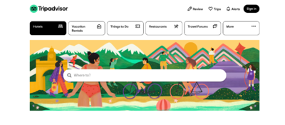
[[File:tripadvisor2.png| | [[File:tripadvisor2.png|400px|frameless|none|flat buttons(linsk)]] | ||
</ul> | </ul> | ||
Revision as of 12:03, 10 November 2021
Starting point : Why all the websites look the same today?
Questions
Target audiences
Designers and front-end developers currently working in the industry.
Research
Aesthetics
-
<Flat deisgn>
- What is Flat design?
- Reading an article Why the Flat Design Trend is Hurting Usability (from :https://www.vandelaydesign.com/why-the-flat-design-trend-is-hurting-usability/)
- Interesting study : Flat UI Elements Attract Less Attention and Cause Uncertainty
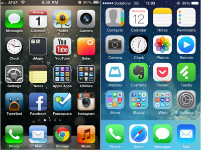
Before the iOS change to a flat look, icons resembled how they appeared in real life, but now the icons look more like illustrations and much less like real life objects. When Jony Ive, Apple’s Senior Vice President of Design, explained the reason why iOS 7 went with a flat design, he pointed out that people are now comfortable with touch screens and no longer need real world representations. “So there was an incredible liberty in not having to reference the physical world so literally. We were trying to create an environment that was less specific. It got design out of the way.”
Flat designs work well in responsive websites as well, since flat designs are based on a grid. The Archie Wilkinson website below is an excellent example of just how beautifully a flat design transfers between differently sized display devices. The navigation menu, the image, the icons all line up neatly and cleanly on a smaller screen, and the flat design keeps it from looking crowded on such a small space.
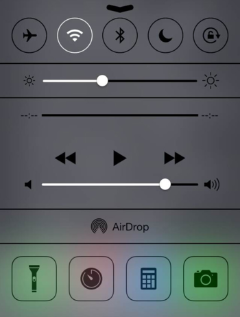
The iPhone Control Center is so flat, it’s hard to tell if any of the icons are buttons.
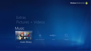
Two large complaints about flat designs are that they are not intuitive and are simply way too confusing. Without the visual cues that help users know which icons are buttons, interfaces and websites leave many users frustrated. Windows 8 created their flat design specifically for tablets, and it works pretty well for tablet users since swiping through the interface works for a touch screen. However, desktop users with a mouse have trouble learning how to manuever through the interface.
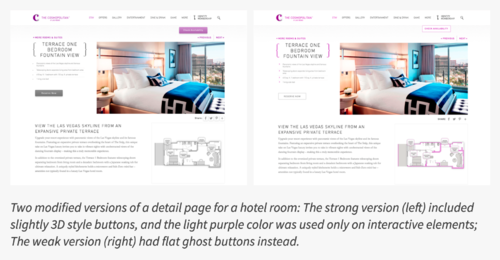
Nielsen Norman Group took 9 web pages from live websites and modified them to create two nearly identical versions of each page, with the same layout, content and visual style. The two versions differed only in the use of strong, weak, or absent signifiers for interactive elements (buttons, links, tabs, sliders).
In result,
- The average amount of time was significantly higher on the weak-signifier versions than the strong-signifier versions.
- On average participants spent 22% more time (i.e., slower task performance) looking at the pages with weak signifiers.
The average number of fixations was significantly higher on the weak-signifier versions than the strong-signifier versions. On average, people had 25% more fixations on the pages with weak signifiers.
Tripadvisor's flat design
-
<Brutalist design>
- example1:brutalistwebsites.com
- example2: hoverstat.es
-
<A middle-ground between skeuomorphism and flat design by Jakob Nielsen>
Tools
-
Bootstrap
-
React
