Mia/Captain's Log: Difference between revisions
| Line 353: | Line 353: | ||
*painted, photographed and printed landscape (art-historical context) | *painted, photographed and printed landscape (art-historical context) | ||
*being destroyed and becoming a cityscape? | *being destroyed and becoming a cityscape? | ||
*have an opening scene e.g. hand-print with the paint to contextualise and give an anchor that the viewer always refers later in the film (morphing of the landscape) | |||
*abstracted - representational | *abstracted - representational | ||
*natural - man-made/urban | *natural - man-made/urban | ||
*still - moving image | |||
*indexicality in the city, trace and mark as signs of past existence or non-existence | *indexicality in the city, trace and mark as signs of past existence or non-existence | ||
*Forensic architecture: Every trace is a photograph. | *Forensic architecture: Every trace is a photograph. | ||
Revision as of 15:41, 14 November 2019
1st YEAR
29. 10. 2018 - Javi's tutorial
- sound (Arduino) - Editions Volumiques: Le livre qui voulait être un jeu vidéo
- John Baldessari - humorous, playful approach
- Tacita Dean
- links to References
- (downloading yt video/channel/playlist)
29. 10. 2018 - David's tutorial
- think about the subject that points out the relationships your camera is discussing (photo - drawing - layering)
- how can the subject (what is in the picture you make) emphasize this "conflict" of image and text or photo and drawing
- objective vs. subjective/poetic
- photography vs. (handwritten) text
- basics of semiotics: Charles Sanders Pierce
- fundaments of the medium - Wilem Flusser: Towards a Philosophy of Photography
26. 11. 2018 - Javi's tutorial
1. PHOTOBOOK - BRUSHSTROKES (working title):
- juxtaposition with paintings would be too straight forward, too flat, a single layer
- think about CHANCE and ACCIDENT (as fragments of reality)
- reading on the topic: George Brecht - Chance Imagery
- artists: Bruce Nauman - Coffee Spilled;
- references on traces/fragments dealing with time and past, accidents etc. Pierre Huyghe - Gallery Wall
- chance - gesture
- the selection (photographs) of found drips, stains, strokes is interesting enough to work with it
- important phase of trying out, printing, matching, replacing in physical form to make decisions
- interaction with the user: first intention is that user can add drawings, brushstrokes, that the object is between the photobook and a sketchbook - BUT! - how to not make it with instructions, to not make it obvious but natural, spontaneous (just as chance and accidents that are represented in the book!)?
- potential answers: to make a binding that can be changed (with screws), paper that is thicker, resembles sketchbook features, TITLE
- balance between open and fixed structure
- text included in the book? probably not (just as an explanation besides the project)
2. FOCAL CAMERA - DRAWING CAMERA
- for presentation is interesting to also see the camera as an object, a methodology
- seeing pictures all together is different than observing them separately
- from mere experiments try to focus on one aspect of the research and develop it in detail (either abstraction, text as a comment on the image, etc.)
- relation between the drawing layer and photograph is important!
27. 11. 2018 Barend's Tutorial
- performance with transparent layer with gestures
- photography with transparencies
- references of artistic practices above also include photographing (or seeing) through transparent materials (glass, plastic, water, steam etc.)
- how can this transparency be used to tell something about the subject (could be hiding, veiling, obscuring the truth/someone's true self, emotions etc.?)
- importance of gesture
- focal camera and photobook project feel related to each other
- continuous process of researching is encouraged
5. 12. 2018 Steve's tutorial (below Steve's notes)
[What kind of writer do you want to be?]
- I like analysing art work and exhibitions. I think notes are important in this process. Analysis might take different forms: it may be very personal. To me analyses is a way of organising thoughts. I try to write something about every exhibition I see, which I store on my wiki. It is often the case that I need to go back and remind myself. I have found the synopsis exercise useful. I would like to finish the text I am working on by the xmas break.
[About your own work:]
- For image analysis I just typed out people’s work and I did the interview and the descriptions. It was also good to work together with Cem on the same text today
- [Steve suggests: Try to take the different sessions where you discuss your work and make one text out of it. By which I mean: Use the texts as notes and make a new text which describes your work and identifies underlying motivations in your work]
- The relation between, drawing, painting, and printmaking – the last makes a link or crossover with photography.
- Cameraless photography. One section is a photogram, which seems closer than other things to printmaking, camigram which only uses chemicals and photo-paper and does not use light.
- [shows photographs]
- The relation between drawing and photo.
- The next stage, to go to the studio and make a photo of a figure and play with that. I want to do tests with the depth of field. The studio gives me a more controlled environment. The human figure provides more of a challenge. I don’t often work with figures. If you have a portrait it triggers a feeling or narrative. It might also be more obvious the difference between a photo and a drawing of a person. I imagine a female subject.
10. 12. 2018 - David's tutorial
(Mia asks for feedback on the (photo)book without first explaining it)
- David's keywords:
- SURFACE
- texture-structure
- abstract-figurative
- chance - not chance (graffiti)
- mark making
- left behind
- implied image
- ink drawings of landscape (>>but soon we realise that is not it<<)
- specific choices of paper
- feeling of the paper
- photographed or printed?
- MARK MAKING in all forms
- the discussion:
- it still seems as a precious object/book, >>I would not feel comfortable make interventions in it<<
- the means of presentation could achieve that the intervention is inevitable
- shallow box with charcoal dust where the book is placed (viewers touch the pages with dusty fingers - mark making, chance or conscious marks)
- the presentation would help the object generate its own content
- you could extend the performative aspect (make 3 books, document the process, compare their development into 3 different end results...)
- you are dealing with very fundamental formalist questions - a lot of potential derives from them
- questions like: why we make images? How (deliberately, by chance)? What does it mean to leave a mark?
- Photocopy is basically dust on paper - echoes the idea of marks left by leafing through the book with dusty fingers
- INDEXICALITY
11. 12. 2018 Ine's tutorial
- the book is like three books in one (makes a bit of confusion)
- three categories of pictures: archeological (documenting specific - urban - place and time), abstract (like fragments of drawings), tests (like cleaning a brush or test on the negative)
- interested more in the process and not yet in end result (being a photographer-anthropologist/archeologist)
- Lothar Baumgarten
- very gentle approach, delicate
- the project could go in many ways
- the book seems precious
- another type of binding? (spiral, wooden newspaper holder - might go with archeologist pictures, >>I do not see that screws can be taken apart to change the pages<<)
- whichever path you choose, be radical in it
- FOCAL CAMERA reference: William Kentridge
12. 12. 2018 Group Crit
on the photobook:
- textures, marks
- touching, walls
- still too vague
- project could lead in few directions, decide for one and bring it to the maximum
- seems precious
- format, binding (to resemble more the notebook)
- means of presentation, possible audience (how many copies, is it on sale, if yes, what is the price - expensive vs. notebook price)
- no title? maybe title could be a label for the price (or barcode)
- papers also folded
- what if you made marks yourself too
- is it about chance/intentional marks/drawings
- user might need some guidance, what do you want from him?
- if you had all pictures first and then half of the book empty
- Czar Kristoff: New Refuge (2018)
8. 1. 2019 Barend's tutorial on EYE
- how will we perceive the difference between broadcast and memories? And does it matter?
- story can have many metaphorical meanings (a critique on contemporary media: "they suck us in rather than show, they let people in the darkness instead of revealing the knowledge")
- workflow suggestion: make a storyboard timeline, rough composition of the film (with stills) and give it to the sound designer to roughly design sound
- thus you get a sense of duration, rhythm and flow that helps you animate
- collaboration - back and forth (ping-pong)
- collaboration mutually sparks ideas and feed creativity ...
9. 1. 2019 - Steve's tutorial
- develop the essay with 2 other parts (R. Krauss-Duchamp and J. de Mul)
- include your position/comment on the arguments
- add the references (Harvard method)
- watch Videodrome (1983)
14. 1. 2019 - Javi's tutorial
- EYE project - translation image-sound
- Audacity (save image as raw file and then open it as sound, also the other way around is possible ...)
5. 2. 2019 - Barend's tutorial
dissect the TVACUUM:
- beginning: is it a dark room or no video? make it clear (either with a bit of drawing, some hint, a strip of light when the door opens ...)
- the repetition is to build up the tension, so is important and functional, if you are precise
- the sound needs to be precise and exact too. silence vs. ambient sound = no video vs. dark room
- synchronise the sound and image when the hand is hitting the TV
- transition from a swing to clock seems like a cut and does not tell it is within the same world (tv screen). Try the transformation (can be quick, just not such an abrupt cut)
- is it necessary to combine different styles in this work (hand drawing vs. collage which seem sloppy at this point) - either push it to the max and use it as language (to also make a distinction between 'outside world' and 'tv world')
- final transformation to the vacuum cleaning: pulling in the image to happen earlier (when it is still full screen) and in the meantime, the camera pulls out (zoom out) SLOWLY (slow down and extend this transition) to bring more tension and drama to it, for the viewers to sense that something is happening, even though they cannot yet tell what exactly is going on
- to have the 2 movements synchronised: camera pull-out is motivated by what's happening on the screen (pulling-in of the screen & pulling out of the camera - stretched and deep)
- after a slow zoom-out we see what is happening and then! the hose can come to us (rather that we are approaching it) - perspective (keep the vacuum cleaner as is, make the tube's hole become bigger and bigger - illusion of it approaching to us)
- Watch out, the hose will get you!
- it makes it more dramatic, threatening
- add texture to it, inside it is a scary world!
- you build up the effect: we are being sucked in, the noise becomes aggressive, louder, stranger
- and then SUDDENLY - a cut to silence (cut to nothing means a different ending)
- where do you want to leave us at the end: Is being sucked up a continuing journey or the end?!
13. 2. 2019 - Steve's tutorial
To recap: you are writing a series of essays in which you discuss the changing attitude towards art and the photographic image.
- The discussion changes focus as time passes and as our relation to the image changes: the debate begins with the question of whether art can be discussed as art; Benjamin discusses the relation of art to mechanical reproduction; Duchamp changes the definition of art to allow for audience and context as defining factors; Krauss defines ‘the post-medium condition’ more precisely – in the era of the ‘post avant-garde’ art is increasingly understood by its relation to the institution of art;
---TO BE CONTINUED---
- I suggest you read and make notes on these texts >> and develop this survey further
1) Nichols, B. (1988). The Work of Culture in the Age of Cybernetic Systems. In: Wardrip-Fruin, N. and Montfort N. The New Media Reader. London: MIT Press. 625-641. (check out jstor)
2) Jos de Mul + The Work of Art in the Age of Digital Recombination - http://www.demul.nl/nl/item/412-the-work-of-art-in-the-age-of-digital-recombination
3) Hito Steyerl: In Defence of the Poor Image: In Defense of the Poor Image - Journal #10 November 2009 - e-flux
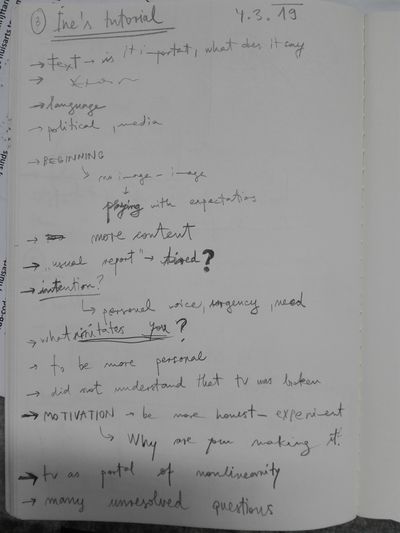
4. 3. 2019 - Javi's tutorial
dissect the TVACUUM:
- does not feel like a work in progress
- language that we do not understand - it places us in a certain context (environment) but it does not develop
- some viewers might feel there is a hidden layer of political meaning behind the speech
- feels like you lead audience in a certain direction and then do not develop it
- a blot with handwriting is a good part (doesn't matter if it is recycled)
- changing of channels - different realities that you wanted to overlap, it is not very obvious
- change collage parts, they do not fit in the whole
on the photobook:
- a short comment or message is necessary - instructions for audience
- you need to state somewhere what is your intention, invite people to intervene in the work with a message
- the form does not provoke the viewer to make marks in it
- you need to create a setting for this object that would make people feel invited to draw or leave marks in the book
- binding and cover could be more like a sketchbook: thin cover, spiral binding...
- ZINE?
- look into performative and participatory practices : FLUXUS (Event Score), HANS HAACKE (Moma Poll)
4. 3. 2019 - Simon's tutorial
dissect the TVACUUM:
- many drawing styles in one place (collage, rotoscopy, simplified drawing, tone, texture etc.)
- you should do more research on the modes of drawing - BOOKS:
Philip Rawson: Drawing
Deanna Petherbridge: The Primacy of Drawing: Histories and Theories of Practice
- you are combining drawing languages, but be more conceptual about them
- classical animation works with metamorphosis - but it gets interesting if it happens through the form
- freedom of taking, combining, recombining and melting BUT it works according to its own rules!
- What are the unchanging rules of this imaginative world? Are they formal rules?
- for instance: >>do not double information (with tone/line/shading/passive line)
- tactile aspects in animation
WHAT COULD I TAKE AWAY AND THE IMAGE WOULD STILL READ THE SAME?!
Research for Filmwerkplaats workshop: Celluloid: Cameraless Film
4. 3. 2019 - Ine's tutorial
on TVACUUM:
2. 4. 2019 - Trimester 3 Assessment
- seems as if your practice (EYE animation film) and reading-writing research do not come together
- in animation try and error can be a very time-consuming strategy - have an in-depth look into storytelling, animation planning and process
- invest your time in research on drawing (historical, theoretical and conceptual perspectives)
- research on animation (animation techniques, conceptual background of animating - what actually is animating, what makes the image 'become alive')
2. 4. 2019 - Tutorial with myself
- When you cannot do much, you can still do little
- next steps: take more individual tutorials, group crits, cine seminars - make use of the course's structure
- sketches, more sketches and more sketches... all sketches
- keep working on:
TVACUUM + reading on drawing&animation
PHOTOBOOK + reading on semiotics (prepare work and texts for exhibition)
15. 4. 2019 - Barend's Tutorial
- FOCUS
- dig deeper in the things that sparkle your enthusiasm
- produce a lot and through the work you discover what is interesting for you
13. 5. 2019 - Barend's Tutorial
14. 5. 2019 - David's Tutorial
- Index
- Adhesive foil, literally take the marks from somewhere and then think WHAT kind of objects in the outer world resonates with it
- Think specifically
- What do I photograph, WHY, HOW is it related or in clash with the drawing
- Personal monument – a fingerprint
- Make drawings – marks – first (not intentional lines but really traces, indexical elements of your body), have a close look at what you get (enlarged marks) and *THEN think about the object to photograph – what kind of picture resonates with these marks
- What kind of image has the same discussion with the marks (discussion of body, materiality, texture, traces, footprints) OR go for the exact opposite (What kind of object is completely sterile, clean, smooth, untextured etc.) and what happens if it merges with my marks
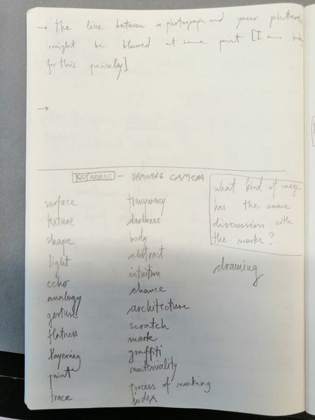
- Make a list of Key words you want to explore materially and subject-wise
- Through very precise and specific approach you arrive at the content and subject
- WHY is this mark-making important to you and what is it that you are trying to emphasise
- EXAMPLES:
- landscape, trees (splatter of ink) + Rotterdam Landscape of cranes and skyscrapers - what is this surrealist landscape?
- make a monument with your thumb and place it over a photograph of a historical monument (what happens with the clash of personal and common memory at this point?)
- Mark Bradford
...
20. 5. 2019 - Simon's Tutorial
- surface - depth
- through dirty glass on the street - 4 planes
- when do the 2 realities merge (abstract series)
- drawing (look into the book precisely, close reading)
- relation between photobook and the camera: surface, mark, trace, finding
- look at your practice from a very formal perspective
- what actually is going on in the process
- have you considered making a film?
- it can be an animation, or a slideshow-like film
- pictures do not have to change 12x per second, but can be a longer, slower transition
- it is a possibility of experimenting with all these pictures
- produce a lot more, see where it leads you
- key words of your research: surface, depth, mark, index, drawing, layers
- what happens if you slide the strip through at a longer exposure? (same suggestion as David)!! it is worth trying
23. 6. 2019 - Sonia's suggestions
- look into the work of artist Ian McKeever
- dividing the focal camera pictures in 3 groups (landscapes, abstract and abstract circles)
- would not crop the images entirely, but keep the vignettes where you have them (we complete the circles mentally, no need to make them perfect in the picture)
- levels, contrast
- BIG PLATES work with more minimalist pictures, but not with dense ones
- pictures with vignettes need more space around
- printing on very thin paper, or different materials (fabric, different papers, but NOT on canvas - can look cheap)
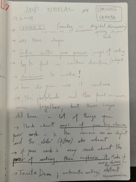
24. 6. 2019 - Javi's tutorial
- notes
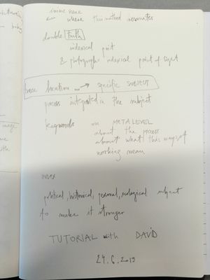
24. 6. 2019 - David's tutorial
24. 6. 2019 - Simon's tutorial
- focus on the surface, texture, layering, form is already a good step towards consistency and specificity
- landscapes are intriguing
- animation as a one of the next steps?
- example: work of animator Len Lye
- What would be the continuation of this practice
- ways of presentation
- materials - printing on photographic paper/digital print on different surfaces etc.
2nd YEAR
23.9. 2019 - Simon's tutorial
- showed prints of Drawing Camera series on polyester curtains
- the material is quite obvious, has a lot of texture, even too much (especially for the soft, lighter image)
- you should consider what different materials mean, not only in the sense of what tactile/physical qualities they determine but also what METAPHORICAL MEANING they bring to the work
- e.g. printed fabric - pattern (not that much of image) vs. printed paper - more as an autonomous image; if you as a female artist print on fabric (associated with the tradition of female crafts like sewing, clothing manufacturing, embroidery etc.) vs. print on paper (strong male printmaking tradition)
- explore other possibilities of printing (e.g. thin paper, stretched vs. hanging fabric, plexi glass, lightbox, etc.)
- think about MEANING and METAPHOR of the materials you use
- tip: make a list of materials you wish to try out and list all the associations they bring (in relation to tradition/ history/ culture/ nature)
- Question - What to read? READING: David Rawson: Drawing, John Berger: Berger on Drawing, Cy Twombly: Pompidou exhibition catalogue, Jackson Pollock: Drawing into Painting, Jonas Storsve: Cy Twombly
- MISC. talked about Anselm Kiefer in Voorlinden museum (monumental size, powerful images and objects etc.), about Rachael Whiteread (casting negative space), Do Ho Suh (rubbing, drawing, gesture, space)
23.9. 2019 - Ine's tutorial
- showed Drawing Camera prints on fabric
- we discussed the preparations for the exhibition in Pivka
- few tips: make as much as you can before, prepare and test, how many pictures do you actually need (how much space in-between is necessary)
- play with light on the spot (maybe you can make slightly darker space, subtle diffuse light vs. spotlight etc.)
- image 1 reminds me of a landscape, it is in-between, I cannot tell where photography ends and drawing begins, it is rich, seems old
- another reminds me of Japanese (erotic) woodcuts, or landscape and Asian ink drawings or writing, like a print
- polyester kills a bit the subtlety of the image, is too artificial
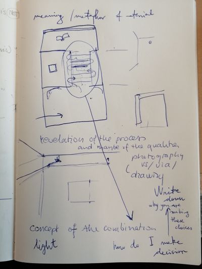
- think about the concept of the combination (which images you choose and why)
- Even with collage, write down a small text on How you make decisions, why are you making these choices
11.11. 2019 - Barend's tutorial
- talked about the exhibitions in Kranj and Pivka
- printing on glass vs. on fabric
- showed fibre based prints - potentially large size?
- EYE film project - I wish to participate only if I can integrate it in my practice somehow
- I do not wish to make an entirely new detached piece
- discussed 2 options - prints in the corridor and moving image piece
- moving image piece as the interpolated slideshow
- prototype in after effects: import sequence of images, slow them down (reduce speed as in slo-mo), apply effects such as time warp, cc wide time etc.
- possibly make a long (e.g. 10 min) composition, render at pro res, then cut it in premier and speed certain parts up - to achieve more dynamics in the flow
- something to try out and tinker with to see if it produces any interesting results
14. 11. 2019 - David's tutorial
- indexicality in the city/your surroundings indexicality of your own
- prints on fabric do not add anything new to the images
- layering is already inherent in the images and presentation in the space only repeats what is already there
- what is more valuable is in the pictures themselves and the decisions you make to take them the way you do
- the photographic print brings the concept and questions of indexicality much more than the fabric which brings political, feminist, historical connotations etc.
- consider making only 1 print and destroying the negative
- to bring uniqueness (or even aura from painting) back to the photograph, to make the picture a unique mark which is not reproducible anymore
- potential film for the EYE reality-illusion (which you can tweak or rephrase): reminds of Japanese landscape
- painted, photographed and printed landscape (art-historical context)
- being destroyed and becoming a cityscape?
- have an opening scene e.g. hand-print with the paint to contextualise and give an anchor that the viewer always refers later in the film (morphing of the landscape)
- abstracted - representational
- natural - man-made/urban
- still - moving image
- indexicality in the city, trace and mark as signs of past existence or non-existence
- Forensic architecture: Every trace is a photograph.

