User:Rita Graca/RW&RM: Difference between revisions
Rita Graca (talk | contribs) No edit summary |
Rita Graca (talk | contribs) No edit summary |
||
| Line 1: | Line 1: | ||
'''Personal Assignment''' | |||
Synopsis on the book: <br> | |||
Kenneth Goldsmith. ''Uncreative Writing: Managing Language in the Digital Age.'' <br> | |||
''Chapter 6: Infallible Processes. What Writing Can Learn from Visual Art'' | |||
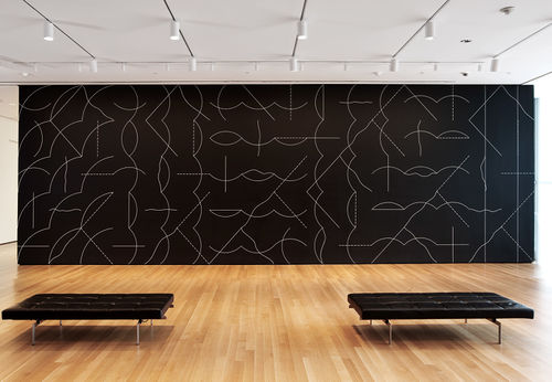
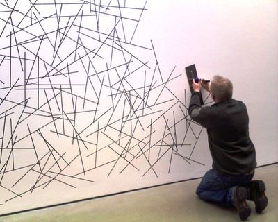
In the chapter Infallible Processes: What Writing Can Learn from Visual Art, Goldsmith makes an interesting parallelism between conceptual art and writing, looking at uncreativity as an acceptable starting point to create and increase creativity. The author gives as examples artists like LeWitt, Duchamp and Andy Warhol, whose works seen out of context may seem quite mundane. These artists praised the process of their creation instead of the final product. Their conceptual works strength the idea of an artist as an intellectual because they don’t rely on their skills as craftsmen. Consequently, they take the sacredness away from the artwork as you don’t need to be gifted as an artisan and they challenge the notion of authorship. Indeed, LeWitt created general guidelines that would be executed in posteriority by draftsmen. An example of a set of rules is: “Wall Drawing 852: A wall divided from the upper left to the lower right by a curvy line; left: glossy yellow; right: glossy purple.” | |||
Although constricted by the recipe, the draftsmen have to make choices and therefore they are also being creators. Even if the recipe is followed by other people the problem of originality it’s not important because the outcome will always be different. | |||
The author uses the mindset of the conceptual artists of the 20th century to illustrate how apparent uninteresting processes can lead to inspiration and help to face with less horror the start of a new piece. | |||
[[File:Lewitt.jpg|500px | Wall drawing]] | |||
[[File:Lewitt2.jpg | 400 px | Wall drawing 2]] | |||
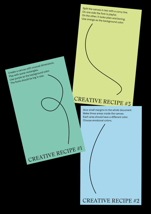
Task: make some graphic design recipes, initial tests | |||
1. Create a canvas with unusual dimensions. <br> | |||
Play with some rectangles.<br> | |||
Use purple as the background color.<br> | |||
The fonts should be big in size.<br> | |||
2. Give small margins to the whole document.<br> | |||
Make three areas inside the canvas.<br> | |||
Each area should have a different color. <br> | |||
Choose emotional colors.<br> | |||
3. Split the canvas in two with a curvy line.<br> | |||
On one side the font is playful. <br> | |||
On the other, it looks plain and boring. <br> | |||
Use orange as the background color.<br> | |||
[[File:Creative recipe.jpg|500px |]] | |||
'''Entreprecariat Reader''' | |||
'''What, Why, How''' | |||
[https://pzwiki.wdka.nl/mediadesign/Rita%27s_What_Why_How_26-9-18 "What How Why"] | [https://pzwiki.wdka.nl/mediadesign/Rita%27s_What_Why_How_26-9-18 "What How Why"] | ||
[https://pzwiki.wdka.nl/mediadesign/Entreprecariat_reader_synopses_and_abstracts Entreprecariat — Synopses and Abstracts]<br> | [https://pzwiki.wdka.nl/mediadesign/Entreprecariat_reader_synopses_and_abstracts Entreprecariat — Synopses and Abstracts]<br> | ||
Revision as of 23:34, 12 December 2018
Personal Assignment
Synopsis on the book:
Kenneth Goldsmith. Uncreative Writing: Managing Language in the Digital Age.
Chapter 6: Infallible Processes. What Writing Can Learn from Visual Art
In the chapter Infallible Processes: What Writing Can Learn from Visual Art, Goldsmith makes an interesting parallelism between conceptual art and writing, looking at uncreativity as an acceptable starting point to create and increase creativity. The author gives as examples artists like LeWitt, Duchamp and Andy Warhol, whose works seen out of context may seem quite mundane. These artists praised the process of their creation instead of the final product. Their conceptual works strength the idea of an artist as an intellectual because they don’t rely on their skills as craftsmen. Consequently, they take the sacredness away from the artwork as you don’t need to be gifted as an artisan and they challenge the notion of authorship. Indeed, LeWitt created general guidelines that would be executed in posteriority by draftsmen. An example of a set of rules is: “Wall Drawing 852: A wall divided from the upper left to the lower right by a curvy line; left: glossy yellow; right: glossy purple.” Although constricted by the recipe, the draftsmen have to make choices and therefore they are also being creators. Even if the recipe is followed by other people the problem of originality it’s not important because the outcome will always be different. The author uses the mindset of the conceptual artists of the 20th century to illustrate how apparent uninteresting processes can lead to inspiration and help to face with less horror the start of a new piece.
Task: make some graphic design recipes, initial tests
1. Create a canvas with unusual dimensions.
Play with some rectangles.
Use purple as the background color.
The fonts should be big in size.
2. Give small margins to the whole document.
Make three areas inside the canvas.
Each area should have a different color.
Choose emotional colors.
3. Split the canvas in two with a curvy line.
On one side the font is playful.
On the other, it looks plain and boring.
Use orange as the background color.
Entreprecariat Reader
What, Why, How


