Felix/Photobook: Difference between revisions
No edit summary |
|||
| (2 intermediate revisions by the same user not shown) | |||
| Line 1: | Line 1: | ||
[[User:Felix|< back to my page]] | |||
==Session Three: Making my own photobook== | ==Session Three: Making my own photobook== | ||
[[File:Wohnen smallgif.gif|800px|frameless|center]] | |||
The photobook, that is made like a magazine/catalogue, shows photographs of contemporary residential buildings that are new built and partially still uninhabited. The images show a semi-public/private space and include private gardens, views on windows and parts of the common space that is inculded in the area. The photographs are ordered and put together under different thematics that are incorporated in the architecture, as for example nature, neighbourship, borders, privacy, familiy, sojourn quality etc. These also represent the promises made by the inhabitation of one of the apartments in the neighborhood. Some objects also double and repeat only with minor changes in the image frame, which refers to the repetitions visible in the architecture itself. The spaces photographed completely without people and mostly with neutral (shady) daylight are contrary to the way the buildings are intended. Their actual intention is getting abstracted and is visible in the specific objects only. | The photobook, that is made like a magazine/catalogue, shows photographs of contemporary residential buildings that are new built and partially still uninhabited. The images show a semi-public/private space and include private gardens, views on windows and parts of the common space that is inculded in the area. The photographs are ordered and put together under different thematics that are incorporated in the architecture, as for example nature, neighbourship, borders, privacy, familiy, sojourn quality etc. These also represent the promises made by the inhabitation of one of the apartments in the neighborhood. Some objects also double and repeat only with minor changes in the image frame, which refers to the repetitions visible in the architecture itself. The spaces photographed completely without people and mostly with neutral (shady) daylight are contrary to the way the buildings are intended. Their actual intention is getting abstracted and is visible in the specific objects only. | ||
| Line 17: | Line 22: | ||
==Session One: Introduction== | ==Session One: Introduction== | ||
This was the introduction session | This was the introduction session. Nothing to show here. | ||
Latest revision as of 10:39, 4 December 2018
Session Three: Making my own photobook
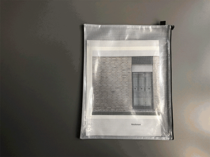
The photobook, that is made like a magazine/catalogue, shows photographs of contemporary residential buildings that are new built and partially still uninhabited. The images show a semi-public/private space and include private gardens, views on windows and parts of the common space that is inculded in the area. The photographs are ordered and put together under different thematics that are incorporated in the architecture, as for example nature, neighbourship, borders, privacy, familiy, sojourn quality etc. These also represent the promises made by the inhabitation of one of the apartments in the neighborhood. Some objects also double and repeat only with minor changes in the image frame, which refers to the repetitions visible in the architecture itself. The spaces photographed completely without people and mostly with neutral (shady) daylight are contrary to the way the buildings are intended. Their actual intention is getting abstracted and is visible in the specific objects only.
The book is printed as an A3 format on 70g recycled paper with a cover and two inlays printed on 160g "Airbrush-carton". The book is sewed with a green top- and a white bottom-thread. It is protected in a transparent plastic bag that closes with a zipper.
Things to improve if it would be published: Paper and printing quality: I intended to use newsprint paper but it turned our it did not work in the end with the digital printers I had access to. So the paper I used in the end is absorbing the colour too much and the print quality is very bad. This needs to be improved in a final version. Also a besser inkjet-quality print should be achieved.
Session Two: Presenting a Photobook
I presented Alec Soth's "Niagara". Flipthrough video shows Seidl's first edition (2006)
The second edition was published by MACK books, London, 2018 Link to MACK
Session One: Introduction
This was the introduction session. Nothing to show here.

