User:Karina/thesis publication: Difference between revisions
No edit summary |
No edit summary |
||
| (34 intermediate revisions by the same user not shown) | |||
| Line 1: | Line 1: | ||
__NOTOC__ | __NOTOC__ | ||
<div style="text-align: right; direction: ltr; margin-left: 1em;">[https://pzwiki.wdka.nl/mediadesign/User:Karina/thesis jump back to thesis page]</div> | <div style="text-align: right; direction: ltr; margin-left: 1em;">[https://pzwiki.wdka.nl/mediadesign/User:Karina/thesis jump back to thesis page]</div> | ||
<br> | |||
<br> | |||
===6 JUN=== | |||
Back it up dummy publication feedback | |||
<br> | |||
<br> | |||
* Shift inner / outer margin | |||
* Make inner margin bigger, outer smaller | |||
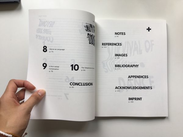
* Like the transparency of contents page - align the front / back | |||
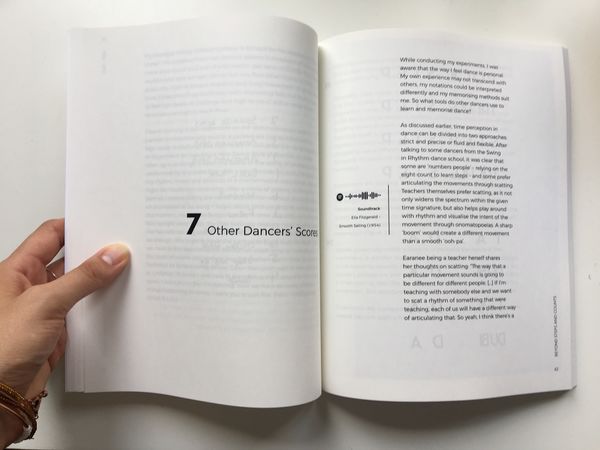
* Like transparency of text behind part 1-3 spread | |||
* Ask Stedelijk / Boijmans for images | |||
* Write back to MoMA have no budget. Anything free? | |||
* Make penguin logo smaller / nearer the spine | |||
* Indent for one of the speakers in interview. Indent for question. Check how others do it | |||
* ‘Hop’ in written in capital letter in Ilja’s interview | |||
* ‘Back It Up’ title in back in italic - both blurb and imprint | |||
<br> | |||
<br> | |||
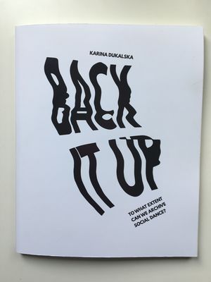
[[File: BIU publication dummy1.jpg | 300px]] | |||
<br> | |||
<br> | |||
[[File: BIU publication dummy2.jpg | 600px]] | |||
<br> | |||
<br> | |||
[[File: BIU publication dummy3.jpg | 600px]] | |||
<br> | |||
<br> | |||
<br> | |||
<br> | |||
===5 JUN=== | |||
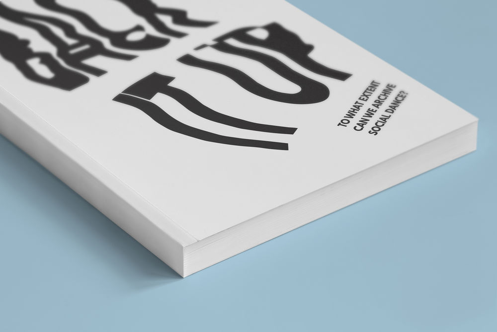
[[File: back it up mockup1.jpg | 1000px]] | |||
<br> | |||
<br> | |||
[[File: back it up mockup2.jpg | 1000px]] | |||
<br> | |||
<br> | |||
===1 JUN=== | |||
blurb trials | |||
<br> | |||
<br> | |||
Examining what makes social dance difficult to record | |||
<br> | |||
<br> | |||
Examining the themes of graphical notation systems, how the brain processes dance and how a dance compares to language. | |||
<br> | |||
<br> | |||
Examining social dancing through graphical notation systems, how the brain processes dance and the non-verbal dialogue between dancers. | |||
<br> | |||
<br> | |||
Social dances are intangible experiences which in their fleeting state create a disruptive beauty of pure fulfilment in the moment, as well as a yearning for the fleeting memory. | |||
<br> | |||
<br> | |||
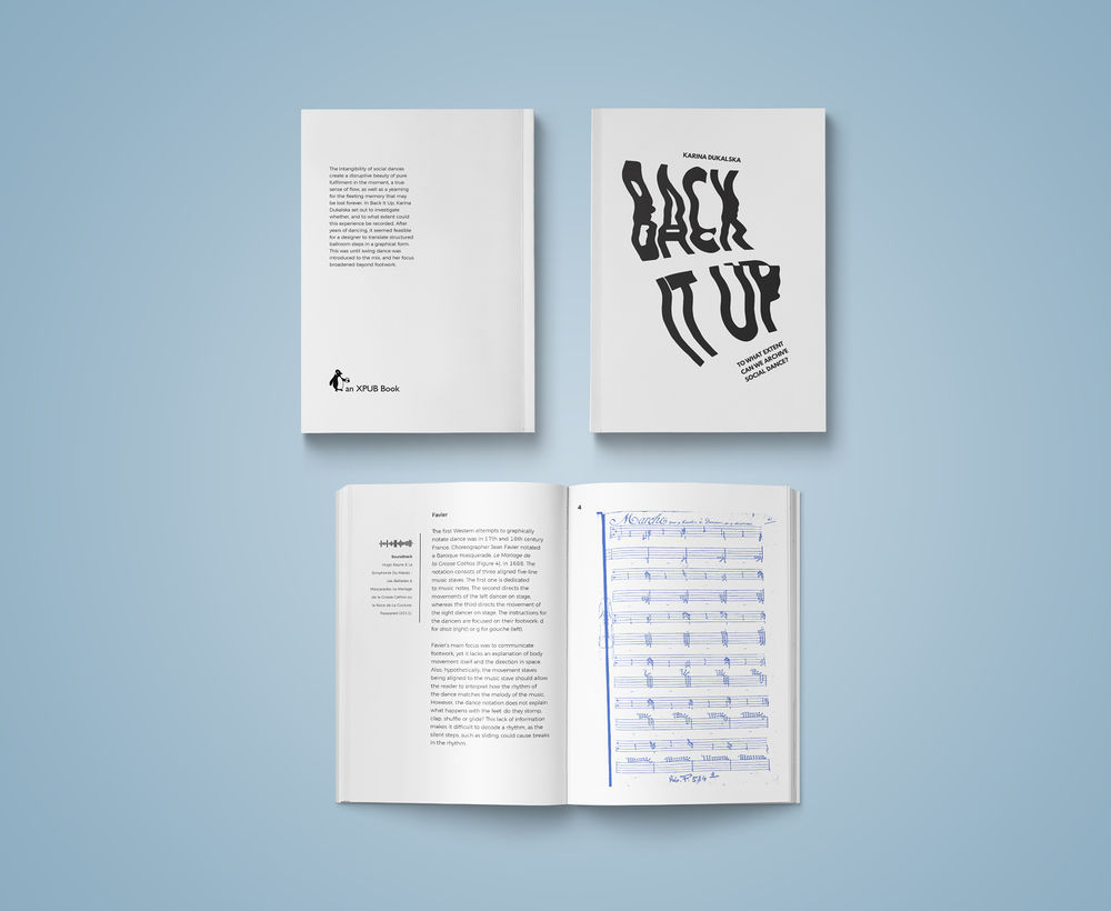
The intangibility of social dances create a disruptive beauty of pure fulfilment in the moment, as well as a yearning for the fleeting memory. In Back It Up, Karina Dukalska set out to investigate whether, and to what extent could this experience be recorded. After years of dancing, it seemed feasible for a designer to translate structured ballroom steps in a graphical form. This was until swing dance was introduced to the mix, and her focus broadened beyond footwork. | |||
<br> | |||
<br> | |||
The intangibility of social dances create a disruptive beauty of pure fulfilment in the moment, a true sense of flow, as well as a yearning for the fleeting memory that may be lost forever. In Back It Up, Karina Dukalska set out to investigate whether, and to what extent could this experience be recorded. After years of dancing, it seemed feasible for a designer to translate structured ballroom steps in a graphical form. This was until swing dance was introduced to the mix, and her focus broadened beyond footwork. | |||
<br> | |||
<br> | |||
<br> | |||
<br> | |||
imprint tests | |||
<br> | |||
<br> | |||
grid = 3 columns (text 2/3 of page) | |||
<br> | |||
[[File: cover 2.3.pdf]] | |||
<br> | |||
<br> | |||
grid = 2 columns (text 1/2 of page) | |||
<br> | |||
[[File: cover 1.2.pdf]] | |||
<br> | |||
<br> | |||
3 column grid | |||
* (text 2/3 of page) is too wide | |||
* would need larger font (12pt) which starts looking like a children's book | |||
* there would be fewer lines (bigger width of text box) | |||
<br> | |||
2 column grid | |||
* (text 1/2 of page) looks fine, neat | |||
* font can stay consistent as rest of book (10-11pt?) easier on the eye | |||
* narrower text box = more lines = more white space ''next to'', instead of ''under'' text box | |||
<br> | |||
<br> | |||
===31 MAY=== | |||
Colour treatment options for images: | |||
* blue monotone (0, 87, 184) | |||
* orange monotone (253, 80, 0) | |||
<br> | |||
<br> | |||
Monotone picks up all that is meant to be black and changes to the desired colour - unlike [http://colorlibrary.ch/test-it/#orange-blue Colour Library] | |||
<br> | |||
It also gives an scanner effect when you can choose to either scan in colour, B&W or a specific colour from printer's palette. | |||
<br> | |||
<br> | |||
In images such as scripts or scans of handwritten notes, both colours look good. | |||
<br> | |||
[[File: 9orange_feuillet.jpg | 400px]] | |||
[[File: 9blue_feuillet.jpg | 400px]] | |||
<br> | |||
<br> | |||
In images which are photographs, the blue option is easier on the eye. | |||
<br> | |||
[[File:30orange_Frimframjam.jpg | 400px]] | |||
[[File:30blue_Frimframjam.jpg | 400px]] | |||
<br> | |||
<br> | |||
Although orange is more vibrant and may represent the goofy and light-spirited energy of present Lindy hop, blue relates back to Louis Armstrong's famous [https://www.youtube.com/watch?v=-vDm1lomVHU Black And Blue] from 1929. Black text with blue images. | |||
<br> | <br> | ||
<br> | <br> | ||
| Line 23: | Line 131: | ||
* 15: [https://archiveshub.jisc.ac.uk/search/archives/353bbb16-7c07-3973-bfda-e92055519fff Ann Hutchinson Guest Collection] | * 15: [https://archiveshub.jisc.ac.uk/search/archives/353bbb16-7c07-3973-bfda-e92055519fff Ann Hutchinson Guest Collection] | ||
* 18: ask Andre, make own version | * 18: ask Andre, make own version | ||
<br> | |||
PZI and WdKA logos in the imprint | |||
<br> | |||
Delphine will write out imprint | |||
<br> | |||
include type designers | |||
<br> | |||
<br> | |||
penguin logo (git clone) | |||
<br> | |||
<br> | |||
ABC Wed. 6th @ 13:00 | |||
<br> | |||
ideally everything printed by 21st June | |||
<br> | |||
<br> | |||
Delphine back on 14th June to help with grad show / set up | |||
<br> | |||
1st half: individual tutorials | |||
<br> | |||
2nd half: group rehearsal | |||
<br> | |||
<br> | |||
once have copyright clearance, can remove html links in references | |||
<br> | |||
<br> | |||
send compressed file to Delphine (wetransfer) | |||
<br> | |||
abc.nl (self publishing) | |||
<br> | |||
betty@abc.nl (follow guidelines) | |||
<br> | |||
send before Friday 12:00 | |||
<br> | |||
<br> | |||
===29 MAY=== | |||
[[File: ABC thesis 6 colour.pdf]] | |||
<br> | |||
[[File: ABC thesis 6 blue monotone.pdf]] | |||
<br> | |||
[[File: ABC thesis 6 orange monotone.pdf]] | |||
<br> | |||
<br> | |||
Colour Library doesn't work with images that cannot have a colour to enhance (B&W, scripts, etc). Example below looks almost the same as original | |||
<br> | |||
<br> | |||
[[File: Screen Shot 2018-05-25 at 00.52.20.png | 900px]] | |||
<br> | |||
<br> | |||
===28 MAY=== | |||
Meeting with Delphine | |||
<br> | |||
<br> | |||
spotify link is too dominant - try inverting colours | |||
<br> | |||
place all references in alphabetical order in the back with rest of references - no need for separate 'music' section | |||
<br> | |||
<br> | |||
get rid of flip book idea - too much | |||
<br> | |||
can go back to diagonal meta data in margins | |||
<br> | |||
<br> | |||
text blue / photos orange? test | |||
<br> | |||
<br> | |||
chapter page always left - no need for spread, takes away from value of part 1-3 spreads | |||
<br> | |||
<br> | |||
MD in acknowledgements (not dedication) | |||
<br> | |||
<br> | |||
===27 MAY=== | |||
[[File: ABC thesis 4.pdf]] | |||
<br> | |||
<br> | |||
tried to recreate colour library orange & blue - failed | |||
<br> | |||
<br> | |||
[[File:_MG_0379web2.jpg]] | |||
<br> | <br> | ||
<br> | <br> | ||
===26 MAY=== | ===26 MAY=== | ||
[http://colorlibrary.ch/test-it/#orange-blue Colour Library: orange & blue] | [http://colorlibrary.ch/test-it/#orange-blue Colour Library: orange & blue] | ||
<br> | |||
<br> | |||
original image vs colour library (orange & blue) | |||
<br> | |||
<br> | |||
[[File: _MG_0379web.jpg | 700px]] | |||
<br> | |||
<br> | |||
[[File: orange-blue-mg-0379web.jpg | 700px]] | |||
<br> | <br> | ||
<br> | <br> | ||
| Line 46: | Line 243: | ||
<br> | <br> | ||
===24 MAY=== | ===24 MAY=== | ||
[[File: ABC thesis 3.pdf]] | |||
<br> | |||
<br> | |||
Meeting with Delphine | Meeting with Delphine | ||
<br> | <br> | ||
| Line 106: | Line 306: | ||
<br> | <br> | ||
think of Cunningham-esque task for inside publication | think of Cunningham-esque task for inside publication | ||
<br> | |||
<br> | |||
[[File: Screen Shot 2018-05-19 at 18.54.56.png | 650px]] | |||
<br> | <br> | ||
<br> | <br> | ||
===17 MAY=== | ===17 MAY=== | ||
Meeting with Delphine | Meeting with Delphine | ||
<br> | |||
<br> | |||
* imprint + acknowledgements - at the end | |||
* info about school in imprint | |||
* make it feel less like thesis | |||
<br> | |||
'book launch' won't work. not allowed to sell. could have 'donation to student' | |||
<br> | |||
<br> | |||
leave experiences as we lived them | |||
<br> | |||
Ian Wilson - against preservation | |||
<br> | |||
Tino Segal - contracts | |||
<br> | |||
<br> | |||
what is the materiality of the event? | |||
<br> | |||
according to me, this is how my work should be preserved. recorded does not mean more valid. | |||
<br> | |||
<br> | |||
Ian Kapprow - script to repeat performance | |||
# before: planning | |||
# during: recording in different forms (software / props) | |||
# after: trace of performance | |||
<br> | |||
<br> | |||
Joan Jonnas | |||
<br> | |||
preservation becomes the work | |||
<br> | |||
<br> | |||
That's my statement. How it should be recorded, this is what I want it to become | |||
<br> | |||
<br> | |||
Each section has different role | |||
# Group 1: instructions using buttons | |||
# G2: record / trace | |||
# G3: interpretation? | |||
# G4: record crowd / room / atmosphere | |||
# G5: record connection / non-verbal dialogue between dancers | |||
<br> | |||
<br> | |||
pieces of paper with instruction / give choice? | |||
<br> | |||
how do you communicate this in your practise? | |||
* book to performance | |||
* manual / companion | |||
<br> | |||
<br> | |||
* discount at ABC for printing | |||
* check whether can use budget | |||
* check copyright for images | |||
<br> | |||
first page | |||
* Back It Up | |||
* Q | |||
* Name | |||
* (no word count) | |||
<br> | |||
in margins | |||
<br> | |||
instructions "read at 90 BPM" | |||
<br> | |||
<br> | |||
* figure # not necessary | |||
* just put # next to image | |||
* colour treatment for images, some B&W | |||
<br> | |||
folding indications? spread images | |||
* propose different ways to fold page | |||
* each person has own perception | |||
<br> | |||
<br> | |||
===16 MAY=== | |||
Back It Up title scan with League Spartan font | |||
<br> | |||
<br> | |||
scan 1 - not enough fluidity / movement | |||
<br> | |||
scan 5 - like the kink in the second line | |||
<br> | |||
[[File: League scan 1.jpg | 250px]] | |||
[[File: League scan 5.jpg | 250px]] | |||
<br> | |||
<br> | |||
scan 14 - first line too illegible | |||
<br> | |||
scan 19 - almost good, not great yet | |||
<br> | |||
[[File: League scan 14.jpg | 250px]] | |||
[[File: League scan 19.jpg | 250px]] | |||
<br> | |||
<br> | |||
scan 20 - just right | |||
<br> | |||
[[File: League scan 20.jpg | 250px]] | |||
<br> | |||
<br> | |||
===26 APR=== | |||
Trials with printer / fluidity in text | |||
<br> | |||
<br> | |||
[[File: Back It Up Title Avenir scan.jpg | 500px]] | |||
<br> | |||
<br> | |||
[[File: Back It Up-Scan 17-vector.png | 500 px]] | |||
<br> | <br> | ||
<br> | <br> | ||
| Line 219: | Line 530: | ||
===16 APR=== | ===16 APR=== | ||
Meeting with Delphine | Meeting with Delphine | ||
<br> | |||
<br> | |||
My main approach in this publication is to communicate the tension between structure and fluidity, highlighting rhythm and movement using only layout and design. | |||
<br> | |||
<br> | |||
options | |||
* flipbook for motion | |||
* rhythm and repetition in layout | |||
* organ scores / cut outs (difficult for espresso) | |||
* motion in physicality of the book | |||
* some pages could be folded (by hand) | |||
* invitation to interact | |||
* different direction for text | |||
* Cage Silence rhythm in text (white space) | |||
<br> | <br> | ||
<br> | <br> | ||
Latest revision as of 15:23, 8 June 2018
6 JUN
Back it up dummy publication feedback
- Shift inner / outer margin
- Make inner margin bigger, outer smaller
- Like the transparency of contents page - align the front / back
- Like transparency of text behind part 1-3 spread
- Ask Stedelijk / Boijmans for images
- Write back to MoMA have no budget. Anything free?
- Make penguin logo smaller / nearer the spine
- Indent for one of the speakers in interview. Indent for question. Check how others do it
- ‘Hop’ in written in capital letter in Ilja’s interview
- ‘Back It Up’ title in back in italic - both blurb and imprint
5 JUN
1 JUN
blurb trials
Examining what makes social dance difficult to record
Examining the themes of graphical notation systems, how the brain processes dance and how a dance compares to language.
Examining social dancing through graphical notation systems, how the brain processes dance and the non-verbal dialogue between dancers.
Social dances are intangible experiences which in their fleeting state create a disruptive beauty of pure fulfilment in the moment, as well as a yearning for the fleeting memory.
The intangibility of social dances create a disruptive beauty of pure fulfilment in the moment, as well as a yearning for the fleeting memory. In Back It Up, Karina Dukalska set out to investigate whether, and to what extent could this experience be recorded. After years of dancing, it seemed feasible for a designer to translate structured ballroom steps in a graphical form. This was until swing dance was introduced to the mix, and her focus broadened beyond footwork.
The intangibility of social dances create a disruptive beauty of pure fulfilment in the moment, a true sense of flow, as well as a yearning for the fleeting memory that may be lost forever. In Back It Up, Karina Dukalska set out to investigate whether, and to what extent could this experience be recorded. After years of dancing, it seemed feasible for a designer to translate structured ballroom steps in a graphical form. This was until swing dance was introduced to the mix, and her focus broadened beyond footwork.
imprint tests
grid = 3 columns (text 2/3 of page)
File:Cover 2.3.pdf
grid = 2 columns (text 1/2 of page)
File:Cover 1.2.pdf
3 column grid
- (text 2/3 of page) is too wide
- would need larger font (12pt) which starts looking like a children's book
- there would be fewer lines (bigger width of text box)
2 column grid
- (text 1/2 of page) looks fine, neat
- font can stay consistent as rest of book (10-11pt?) easier on the eye
- narrower text box = more lines = more white space next to, instead of under text box
31 MAY
Colour treatment options for images:
- blue monotone (0, 87, 184)
- orange monotone (253, 80, 0)
Monotone picks up all that is meant to be black and changes to the desired colour - unlike Colour Library
It also gives an scanner effect when you can choose to either scan in colour, B&W or a specific colour from printer's palette.
In images such as scripts or scans of handwritten notes, both colours look good.
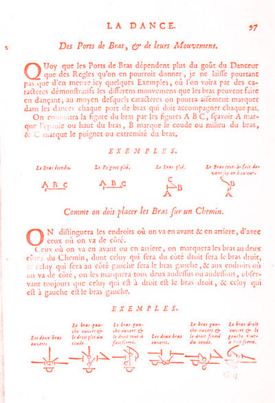
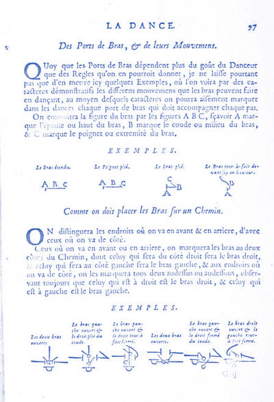
In images which are photographs, the blue option is easier on the eye.
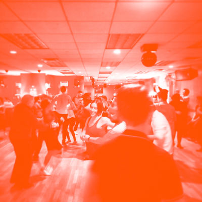
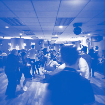
Although orange is more vibrant and may represent the goofy and light-spirited energy of present Lindy hop, blue relates back to Louis Armstrong's famous Black And Blue from 1929. Black text with blue images.
30 MAY
Meeting with Delphine
Artists backing up the notion of recording becoming the artwork itself:
Figures that need copyright clearance
- 01: try another creative commons
- 02: email Herrang
- 03: make screenshot of youtube video of kizomba dancers like this one
- 04-09: might be public domain - terence library
- 10: contact Benesh Institute
- 11: creative commons! CC BY-SA 3.0
- 12: contact MoMA
- 13-14: email Merce Cunningham Trust
- 15: Ann Hutchinson Guest Collection
- 18: ask Andre, make own version
PZI and WdKA logos in the imprint
Delphine will write out imprint
include type designers
penguin logo (git clone)
ABC Wed. 6th @ 13:00
ideally everything printed by 21st June
Delphine back on 14th June to help with grad show / set up
1st half: individual tutorials
2nd half: group rehearsal
once have copyright clearance, can remove html links in references
send compressed file to Delphine (wetransfer)
abc.nl (self publishing)
betty@abc.nl (follow guidelines)
send before Friday 12:00
29 MAY
File:ABC thesis 6 colour.pdf
File:ABC thesis 6 blue monotone.pdf
File:ABC thesis 6 orange monotone.pdf
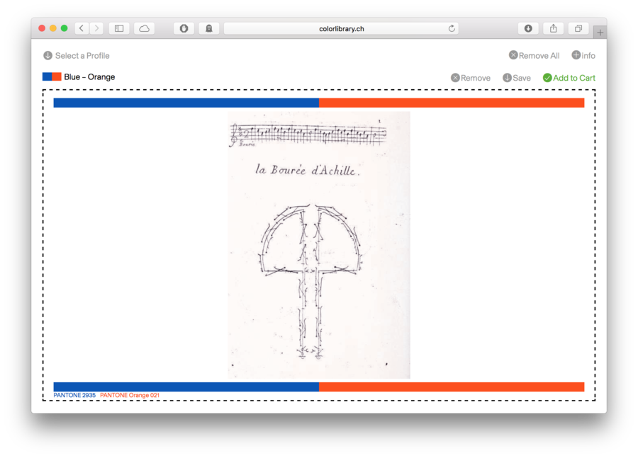
Colour Library doesn't work with images that cannot have a colour to enhance (B&W, scripts, etc). Example below looks almost the same as original
28 MAY
Meeting with Delphine
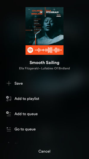
spotify link is too dominant - try inverting colours
place all references in alphabetical order in the back with rest of references - no need for separate 'music' section
get rid of flip book idea - too much
can go back to diagonal meta data in margins
text blue / photos orange? test
chapter page always left - no need for spread, takes away from value of part 1-3 spreads
MD in acknowledgements (not dedication)
27 MAY
File:ABC thesis 4.pdf
tried to recreate colour library orange & blue - failed
26 MAY
Colour Library: orange & blue
original image vs colour library (orange & blue)

Colour treatment options if not Colour Library
25 MAY
24 MAY
File:ABC thesis 3.pdf
Meeting with Delphine
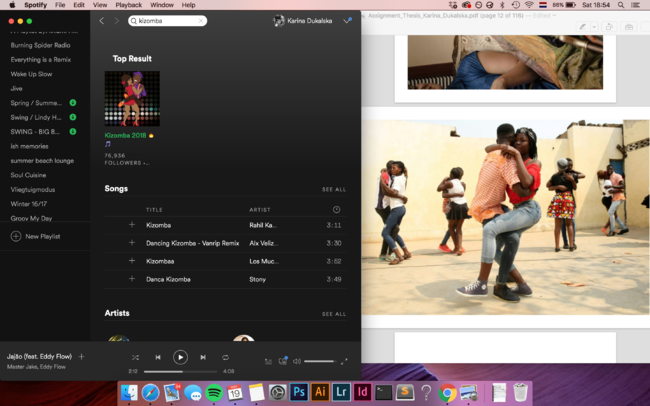
reference to spotify link in the back of publication
colour treatment
- 2 colours
- blue/ red or orange /blue
- Chi Long Trieu
- http://colorlibrary.ch/test-it/
- white page before title page
- title page always on right
font
- too large
- change to 10pt
- or play with tracking and kerning
- or change font http://design-research.be/by-womxn/
- try making flip book dots bigger
- sharpen pixelated images
- figure # always next to image (not inside)
- bring page # down
- get rid of 'part 1-3' in margins and contents page
- get rid of lines in contents page
- try 'conclusion' in scanned type (in contents page)
- annexes represented by '+'
- keep to original image size (don't crop)
- email Earanee and Ilya for permission (have it in writing)
- email Steve and Aymeric for copyright (images)
printing 6th and 12th June
6th: have one copy for assessment - HAVE IT READY BY 30TH MAY
12th: final copies
19 MAY
After contents page have instructions / manual on how to use the publication
you will need:
- phone
- Spotify
- coins
Spotify = instead of QR code to link to music
check whether it works from print to phone
coin = not many people have dice anymore
think of Cunningham-esque task for inside publication
17 MAY
Meeting with Delphine
- imprint + acknowledgements - at the end
- info about school in imprint
- make it feel less like thesis
'book launch' won't work. not allowed to sell. could have 'donation to student'
leave experiences as we lived them
Ian Wilson - against preservation
Tino Segal - contracts
what is the materiality of the event?
according to me, this is how my work should be preserved. recorded does not mean more valid.
Ian Kapprow - script to repeat performance
- before: planning
- during: recording in different forms (software / props)
- after: trace of performance
Joan Jonnas
preservation becomes the work
That's my statement. How it should be recorded, this is what I want it to become
Each section has different role
- Group 1: instructions using buttons
- G2: record / trace
- G3: interpretation?
- G4: record crowd / room / atmosphere
- G5: record connection / non-verbal dialogue between dancers
pieces of paper with instruction / give choice?
how do you communicate this in your practise?
- book to performance
- manual / companion
- discount at ABC for printing
- check whether can use budget
- check copyright for images
first page
- Back It Up
- Q
- Name
- (no word count)
in margins
instructions "read at 90 BPM"
- figure # not necessary
- just put # next to image
- colour treatment for images, some B&W
folding indications? spread images
- propose different ways to fold page
- each person has own perception
16 MAY
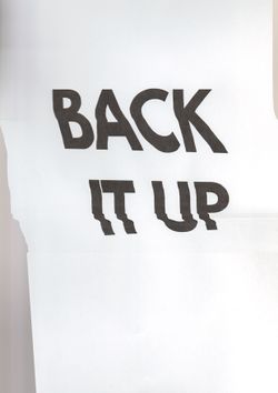
Back It Up title scan with League Spartan font
scan 1 - not enough fluidity / movement
scan 5 - like the kink in the second line
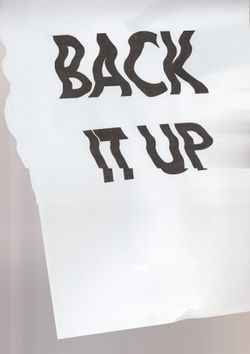
scan 14 - first line too illegible
scan 19 - almost good, not great yet
scan 20 - just right
26 APR
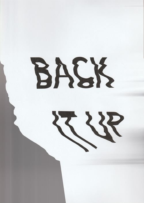
Trials with printer / fluidity in text

23 APR
Session with Delphine
ways to publish your work
- blog
- Medium
- academic journals
- journals can get conferences
who is your public?
- historians
- psychologists / anthropologists
- dancers
- dance teachers
- designers
abstract / blurb
- on cover
- back cover
- 3rd page
- 3rd last page
open source fonts made by women
Argentum Sans by Julieta Ulanovsky
Montreal by Julieta Ulanovsky
Andada by Carolina Giovagnoli
League Spartan by Caroline Hadilaksono, Micah Rich (man) and Tyler Finck (man)
Junction by Caroline Hadilaksono and Tyler Finck (man)
Chunk by Meredith Mandel
Milkshake by Laura Worthington
Fjord by Viktoria Grabowska
Kotta One by Ania Kruk
cover ideas
Innovation in Dance for Young Audiences
Sound Posters
electric paint
ways to unify collection
- sticker
- emboss
- X anywhere on the cover
- logo on spine
18 APR
Newspaper Club
Magnum Chronicles: A Brief Visual History in the Time of ISIS
group pad
printing date: 4th June
could show all thesis publications during grad show
how to make it feel like a collection
- have one one parameter fixed (height, different widths)
- large X on the cover for XPUB
fixed terms from ABC / budget
- 12 copies each
- 150-200 pages
- no higher than A4
Mon Petit Alphabet by Martina Sofie Wildberger
---
Brand for 'Back It Up'
Mikser Festival 2012 take on Helvetica
16 APR
Meeting with Delphine
My main approach in this publication is to communicate the tension between structure and fluidity, highlighting rhythm and movement using only layout and design.
options
- flipbook for motion
- rhythm and repetition in layout
- organ scores / cut outs (difficult for espresso)
- motion in physicality of the book
- some pages could be folded (by hand)
- invitation to interact
- different direction for text
- Cage Silence rhythm in text (white space)
14 FEB
I'd like to find different ways to communicate sound and video inside the printed publication, instead of placing QR codes
those take attention away from the content itself
also could cause technical difficulties for the viewers / readers
augmented reality could be a solution
YouTube: Soundwave Tattoos: Audible Body Art
website of Skin Motion
 ?
?
22 JAN
Meeting with Michael
More excited to make thesis publication than graduation project
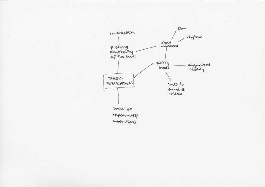
Go back to making quirky books
https://www.kickstarter.com/projects/551648271/papier-machine-vol0-the-interactive-electronic-pap?ref=pl979s&token=97c680b6
https://ksr-ugc.imgix.net/assets/019/815/420/4fecc17bdf2e6c78a0565ffda7528acf_original.gif?w=680&fit=max&v=1515533769&auto=format&gif-q=50&q=92&s=3c8884bbe2776a4934488620e9fdfb97
...
go back to layers
one dance in different ways
experience same dance in different ways
there's no single documentation
multiple ways / perspectives, showing slightly different stories
(highlights something another element doesn't. "this one can show rhythm, that one cannot, but focuses more on shape")
https://guttormsgaardsarkiv.no/node/10/item/1891
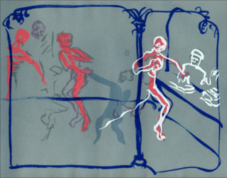
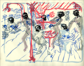
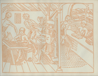
gather material!
- collect images (people's scores)
- film foot (limited gestures, not whole dancers)
- record sound
retrace people's scores
- better quality
- make them uniform
- my perception / interpretation of their work
Laughter at [01:46]
https://www.youtube.com/watch?v=aNLsUUnfTxM
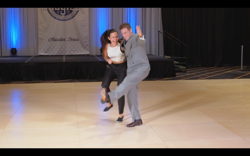
deconstruct a 2 minute dance
nodes to know where you are
a clap / something falling / a laughter
Discursive Selves
Excerpt from In the Vein of the Father by Elliott Jerome Brown Jr.
highlight dialogue
2 silhouettes changing colour - highlight when she initiated / made variations
decode with numbers
ball passes back and forth
similar to previous project: Decode
QR code -> turn into own code
connect print / book to video
augmented reality too much tech with possibly less effect / dry / industrial
put collected material to thesis too
