User:Renee Oldemonnikhof/internet world map: Difference between revisions
| Line 18: | Line 18: | ||
show a different way of perceiving and viewing the vast quantities | show a different way of perceiving and viewing the vast quantities | ||
of information the Internet is giving us. | of information the Internet is giving us. | ||
---- | ---- | ||
[http://pzwart3.wdka.hro.nl/~rmonnikhof/cgi-bin/newsgraph.cgi Internet News Graph] | [http://pzwart3.wdka.hro.nl/~rmonnikhof/cgi-bin/newsgraph.cgi CLICK HIER Internet News Graph] | ||
---- | ---- | ||
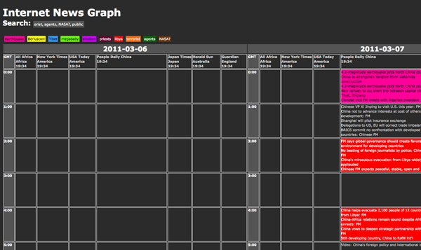
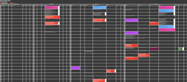
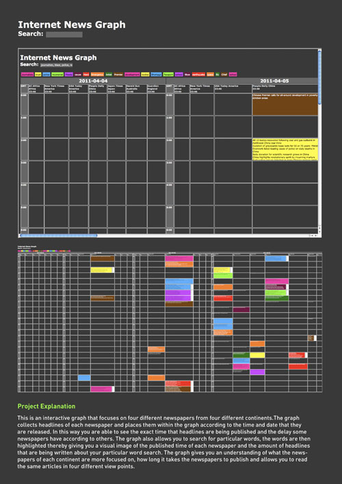
'''Website screenshots''' | |||
<br> | |||
<br> | |||
[[File:ING 1.png]] | [[File:ING 1.png]] | ||
Revision as of 17:33, 12 April 2011
Internet World Map
The project is an interactive graph that focuses on four different newspapers from four different continents. The graph collects headlines of each newspaper and places them within the graph according to the time and date that they are released. In this way you are able to see the exact time that headlines are being published and the delay some newspapers have according to others. The graph also allows you to search for particular words, the words are then highlighted thereby giving you a visual image of the published time of each newspaper and the amount of headlines that are being written about your particular word search. I believe that this project was successful because it truly gave you a understanding of what the newspapers of each continent are more focused on, how long it takes the newspapers to publish and allows you to read the same articles in four different view points. The reason I made this graph is because I wanted to show a different way of perceiving and viewing the vast quantities of information the Internet is giving us.
CLICK HIER Internet News Graph


