Karina/workshops: Difference between revisions
No edit summary |
No edit summary |
||
| (17 intermediate revisions by the same user not shown) | |||
| Line 1: | Line 1: | ||
__NOTOC__ | __NOTOC__ | ||
===4 SEPT=== | |||
Creating Double Exposure in Photoshop trial 2 | |||
<br> | |||
<br> | |||
Obvious tips: | |||
* choose contrasting images (light subject on dark background, or vice versa) | |||
* faster to work with subjects easy to cut out (with magic wand tool) | |||
Less obvious tips: | |||
* portrait layer was set to 'darken' in blending tool | |||
* backdrop image was set to 'lighten' in blending tool | |||
<br> | |||
Chose a composition of a simple portrait with mountain 'filler'. Didn't do a great job at removing the background near the hair with the magic wand tool, but it's not too visible in this case. | |||
<br> | |||
[[File: Screen Shot 2017-09-04 at 12.47.54.png | 700px]] | |||
<br> | |||
<br> | |||
Correcting the levels (cmd + L) can balance the image composition. Tip: lighten the object, darken the texture. | |||
<br> | |||
<br> | |||
[[File: Screen Shot 2017-09-04 at 12.48.54.png | 700px]] | |||
<br> | |||
<br> | |||
[[File: Screen Shot 2017-09-04 at 12.49.17.png | 700px]] | |||
<br> | |||
<br> | |||
<br> | |||
Played around with composition to find where the eyes are best seen and top of filler image could end | |||
<br> | |||
[[File: Screen Shot 2017-09-04 at 12.53.57.png | 700px]] | |||
<br> | |||
<br> | |||
As background was set to a solid white, there is a visible colour difference between the top of the man's head and the background. | |||
<br> | |||
[[File: Screen Shot 2017-09-04 at 12.55.59.png | 700px]] | |||
<br> | |||
<br> | |||
The solid background colour was set to match the filler image's (sky) colour. | |||
<br> | |||
[[File: Screen Shot 2017-09-04 at 12.57.10.png | 700px]] | |||
<br> | |||
<br> | |||
===2 SEPT=== | ===2 SEPT=== | ||
Creating Double Exposure in Photoshop | Creating Double Exposure in Photoshop | ||
| Line 9: | Line 50: | ||
<br> | <br> | ||
<br> | <br> | ||
[File: Screen Shot 2017-09-04 at 00.44.55.png] | [[File: Screen Shot 2017-09-04 at 00.44.55.png | 700px]] | ||
<br> | |||
<br> | |||
[[File: Screen Shot 2017-09-04 at 00.45.11.png | 700px]] | |||
<br> | <br> | ||
<br> | <br> | ||
[File: Screen Shot 2017-09-04 at 00. | [[File: Screen Shot 2017-09-04 at 00.48.02.png | 700px]] | ||
<br> | <br> | ||
<br> | <br> | ||
Latest revision as of 12:55, 5 September 2017
4 SEPT
Creating Double Exposure in Photoshop trial 2
Obvious tips:
- choose contrasting images (light subject on dark background, or vice versa)
- faster to work with subjects easy to cut out (with magic wand tool)
Less obvious tips:
- portrait layer was set to 'darken' in blending tool
- backdrop image was set to 'lighten' in blending tool
Chose a composition of a simple portrait with mountain 'filler'. Didn't do a great job at removing the background near the hair with the magic wand tool, but it's not too visible in this case.
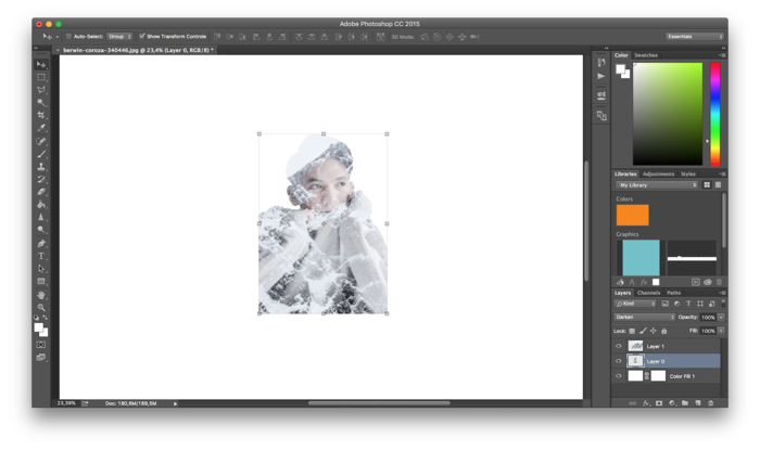
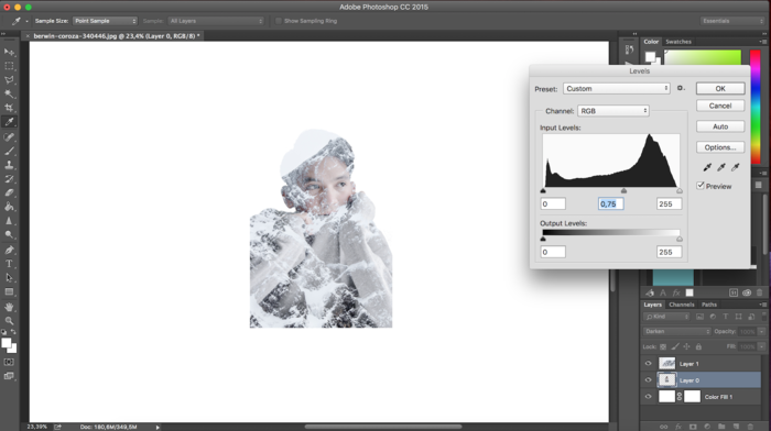
Correcting the levels (cmd + L) can balance the image composition. Tip: lighten the object, darken the texture.
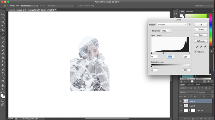
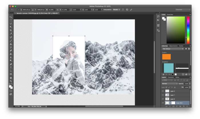
Played around with composition to find where the eyes are best seen and top of filler image could end
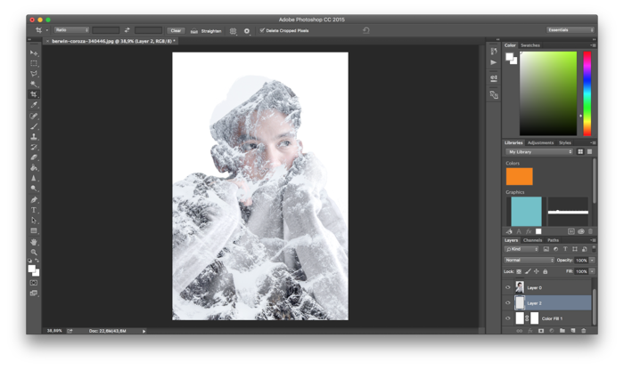
As background was set to a solid white, there is a visible colour difference between the top of the man's head and the background.
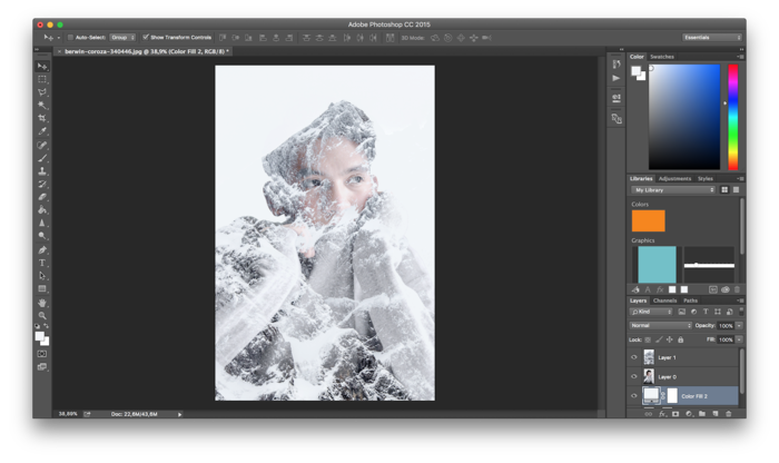
The solid background colour was set to match the filler image's (sky) colour.
2 SEPT
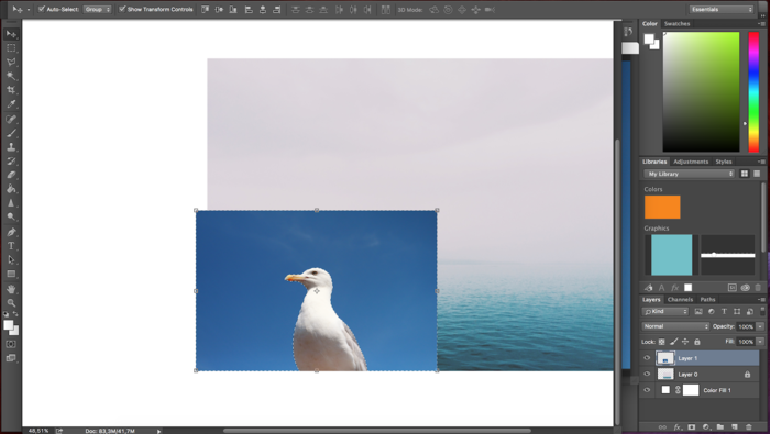
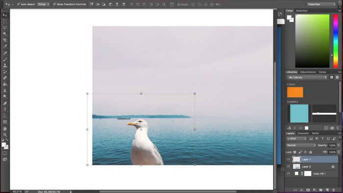
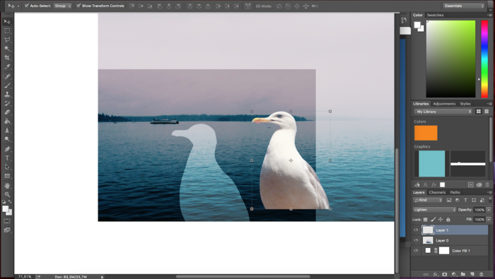
Creating Double Exposure in Photoshop
https://www.youtube.com/watch?v=-bjYAcButKg
Photos from Unsplash
5 MAY
Photoshop Tutorial - Paper Cutout Text Effect (Lettering)
https://www.youtube.com/watch?v=Y75J5LE5iR0
29 APRIL
Found a photoshop bundle that would be great to recreate: 'Retro Glitch'
25 OCT
BOOK BINDING
13 OCT
LETTERPRESS
4-12 OCT
RISO WALLPAPER-MAKING
Workshop by Wilco Lamberts
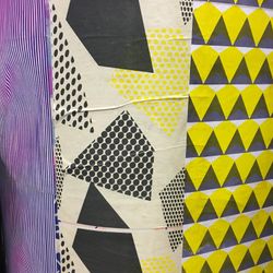
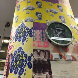
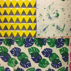
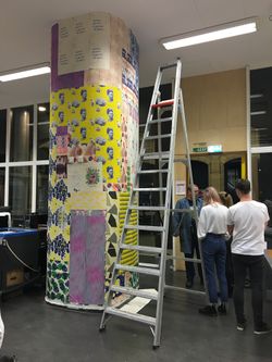
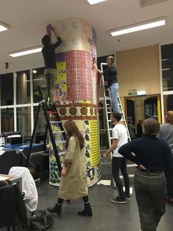
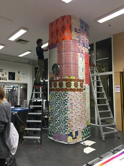
These are examples of work form previous year. The plan is to make new wallpaper designs (lesson 1), learn how to use the riso printer (lesson 2) and cover the pillar with new work (lesson 3.)
Julia Rothman's tips on pattern making
http://www.designsponge.com/2008/05/welcome-julia-and-how-to-make-a-repeat-pattern.html
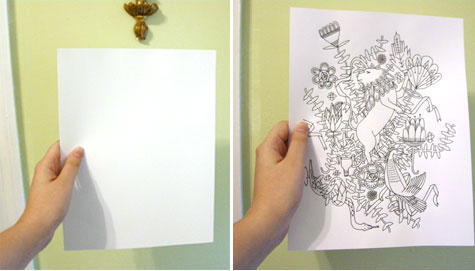
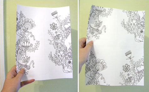
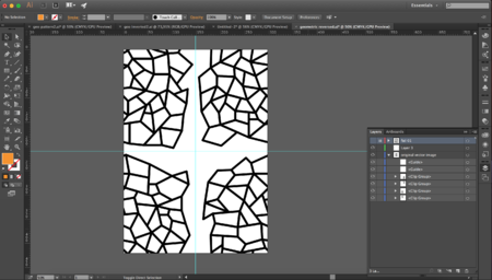
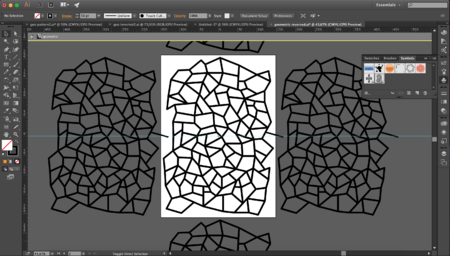
Manually drawing, cutting and rearranging didn't give me freedom to use vector images from Illustrator as patterns. Found that creating a symbol within a symbol does the same thing.
12 OCT
STICKER MAKING
(spontaneous) mini explanation by Wilco Lamberts
The sticker cutting 'printer' can only read Illustrator files. Stoke needs to be 0,025 pt in red
