Thematic: Photobook Analysis ''Ik ben jou'': Difference between revisions
No edit summary |
No edit summary |
||
| (11 intermediate revisions by the same user not shown) | |||
| Line 1: | Line 1: | ||
== Book facts == | == Book facts == | ||
Title: Ik ben jou | '''Title''': Ik ben jou | ||
Photographer: Milou Abel | '''Photographer''': Milou Abel | ||
Year: 2013 | '''Year''': 2013 | ||
Edition: 300 | '''Edition''': 300 | ||
Size: | '''Size''': ca 20 x 25 cm | ||
'''Language''': Dutch | |||
'''Price''': 60 EUR | |||
== Content == | |||
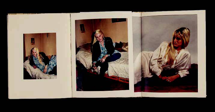
'''Subject''': The book is about a woman around the age of 40. She looks like she doesn't take good care of herself: her hair is greasy, her skin is bad and her apartment is messy. The images of the photographer show the woman in her apartment and the apartment itself which is full of clothes which seem to be cheap and from second hand stores. There are also images of the woman in younger years where she likes to pose for the camera, sometimes nude. These images are intertwined with the current images by the photographer. | |||
'''Photography''': The images by the photographer are in a directly flashed giving them a snapshot style. Almost all images of the photographer show the woman sitting or lying on her bed which suggests some sort of stagnation. You get the impression she does't expect much from life anymore. The older images are staged amateur style photos with studio lighting, some of them nude shots. | |||
'''Cover''': The book is beautifully covered in gold foil. It only gives the title, there is no image on the cover | |||
'''Publisher''': Self-publised | |||
== Form == | |||
'''Overall design''': The book is delicately designed. The book opens to the left and right so zyou get three pages at the same time. Sometimes three images are placed next to each other, sometimes one vertical images stretches over two pages and therefore the page displays two images. There is a strict reading order because the pages are intertwined left and right. You can only look at the book if you follow the given order. The paper is slightly yellow which gives the images an old feeling. | |||
<div style="text-align: left"> | |||
[[File:abel.jpg]] | |||
</div> | |||
Latest revision as of 14:51, 21 November 2016
Book facts
Title: Ik ben jou
Photographer: Milou Abel
Year: 2013
Edition: 300
Size: ca 20 x 25 cm
Language: Dutch
Price: 60 EUR
Content
Subject: The book is about a woman around the age of 40. She looks like she doesn't take good care of herself: her hair is greasy, her skin is bad and her apartment is messy. The images of the photographer show the woman in her apartment and the apartment itself which is full of clothes which seem to be cheap and from second hand stores. There are also images of the woman in younger years where she likes to pose for the camera, sometimes nude. These images are intertwined with the current images by the photographer.
Photography: The images by the photographer are in a directly flashed giving them a snapshot style. Almost all images of the photographer show the woman sitting or lying on her bed which suggests some sort of stagnation. You get the impression she does't expect much from life anymore. The older images are staged amateur style photos with studio lighting, some of them nude shots.
Cover: The book is beautifully covered in gold foil. It only gives the title, there is no image on the cover
Publisher: Self-publised
Form
Overall design: The book is delicately designed. The book opens to the left and right so zyou get three pages at the same time. Sometimes three images are placed next to each other, sometimes one vertical images stretches over two pages and therefore the page displays two images. There is a strict reading order because the pages are intertwined left and right. You can only look at the book if you follow the given order. The paper is slightly yellow which gives the images an old feeling.

